We’re in the design stages of developing a tabletop wargame. Check the original manifesto here. Some cool cats have chimed in already with their thoughts and some things they’d like to see in this. Very awesome, thanks for that!
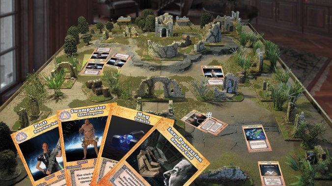
It’s time to nail down the look and feel of the cards, which is turning out to be a bit of a thing. And since I’m not only the Art Department, I’m also Graphic Design – it’s more of a thing than it probably should be. Anyway, probably more than any other facet of miniature wargames or trading cards games like Magic: The Gathering, it’s the look and feel that attracts folks into the game’s world. The lore and great mechanics keep them there; but it’s the art and design that opens the door.
So, let’s try and nail down the aesthetic elements that best resonate with Grailrunner’s Salt Mystic worldbuilding. Hear me out here – I’ll need your input on this. The core mythology and backdrop of the Salt Mystic universe is as follows:
- An alternate world a thumbnail’s width away, strewn with gargantuan monuments, statues, and ruins
- Pocket remnants of a shattered world government exist as mighty stand-alone nations with bloodthirsty fleets of land and sea based forces
- Fleets clash in monstrous battles of shrieking guided tornadoes, tanks the size of cities, vehicles that climb up vertical walls, and men made of poisonous fog. Gunslingers duel face to face with ball lightning carbines.
- Thousands of years before, a mysterious old lady-philosopher stumbled out of the salt flats muttering her vision of the forces of history, and how to harness them to shape human events. Fearing what mankind would make of the world, she hid the makings of world-shaking guardians in folklore and set tripwires to raise them up at pivotal moments.
- In the worst of apocalypses, when doom thunders around you, anyone at all may suddenly understand the cunningly engineered fables of the Salt Mystic and be inspired into a larger-than-life figure capable of shattering world events.
So, you’re seeing stone and statues there, not just slick machines. Big freaking statues and outlandish stone architecture comes to mind. Glaring lightning blasts come to mind as well, lighting up the stone. I’m thinking big, ominous, almost religious aesthetic like you sometimes see with Dune.
The unique stuff has to shine – the forearm weapons that fire balls of lightning, vehicles climbing walls of buildings, stupid-huge tornadoes with entrained steel shrapnel tossing battlefield warriors like toys…gotta be a big deal in the art, I would think.
Here’s a mistake I made, to help you see my point in how tricky it’s been for me to get this right:


The original placeholder art is the orange dealie-o on the left, as we got into playtesting rules to see if this card-based wargame thing makes any sense. Honestly, though, the celtic box for flavor text and weird orange was getting to me. So I took a stab at something different on the right. I mean, I think it looks better. Less annoying, certainly. But surely you see that’s not exactly the aesthetic I was hoping for. Looks like a bajillion other sci-fi whatnots out there. No screaming statues, no ominous chanting…not quite the way this gig is supposed to go.
Here again, another goof (at least a potential one, you tell me):


The back of the cards had placeholder art as on the left in these early days. This week, I wanted to upgrade a bit as I started thinking about the aesthetic. The pic on the right, blue background versus black (to avoid the Halloween look), was intended to match up. that symbol is the graphic representation of her philosophy, that history repeats on fractal levels and the patterns can be harnessed almost supernaturally. Contrasts nicely with the blue; but the statue of the Salt Mystic hovering in the back makes me a question this decision a bit. Of course, the more I look at it, the better I like it.
I don’t know. What do you think goes on the art manifesto? The bullets of what things should look like and what design elements should go on the cards?
Let us know what you think – the colors, the backgrounds, especially the design elements that should recur on the character and vehicle cards. At a glance, the cards need to be striking, but also need to be undeniably something from the world of the Salt Mystic.
And oh yeah, there’s a game in here somewhere. Needs to look fun too.
Help!
