Harper’s Volume 80: an illustration master class from 1890

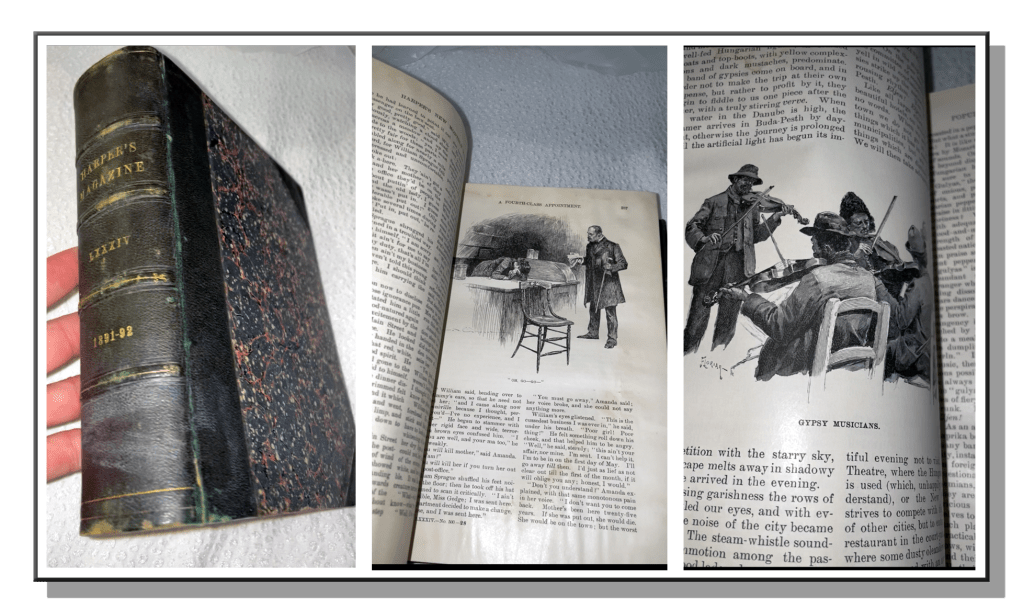
Last July, I told you about a hardback bound volume of Harper’s New Monthly Magazine from the 1890’s that I’d found in an old antique mall and which contained the most face-melting pen & ink illustration I’d ever seen. Check that out here. I’m still obsessing, of course, and that’s why I’m here again with another round of highlighted drawings from the golden age of illustration.

I thought I’d go back a bit, possibly to collect a good thirty year expanse, and showcase some of the more inspiring artwork and exquisite pen & ink craftsmanship. I’ve gotten my hands on Volume 80, covering Dec 1889 to May 1890. Welcome back, and I hope you enjoy perusing these master works as much as I did discovering them. Flipping these pages is an exploration I can’t get enough of!

Shall we head inside?

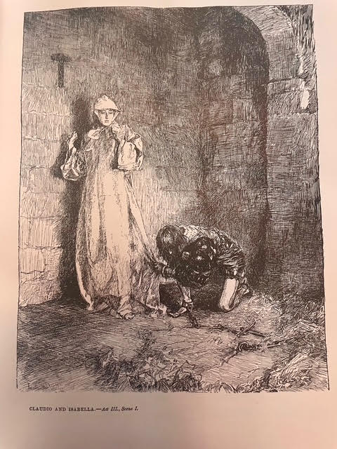
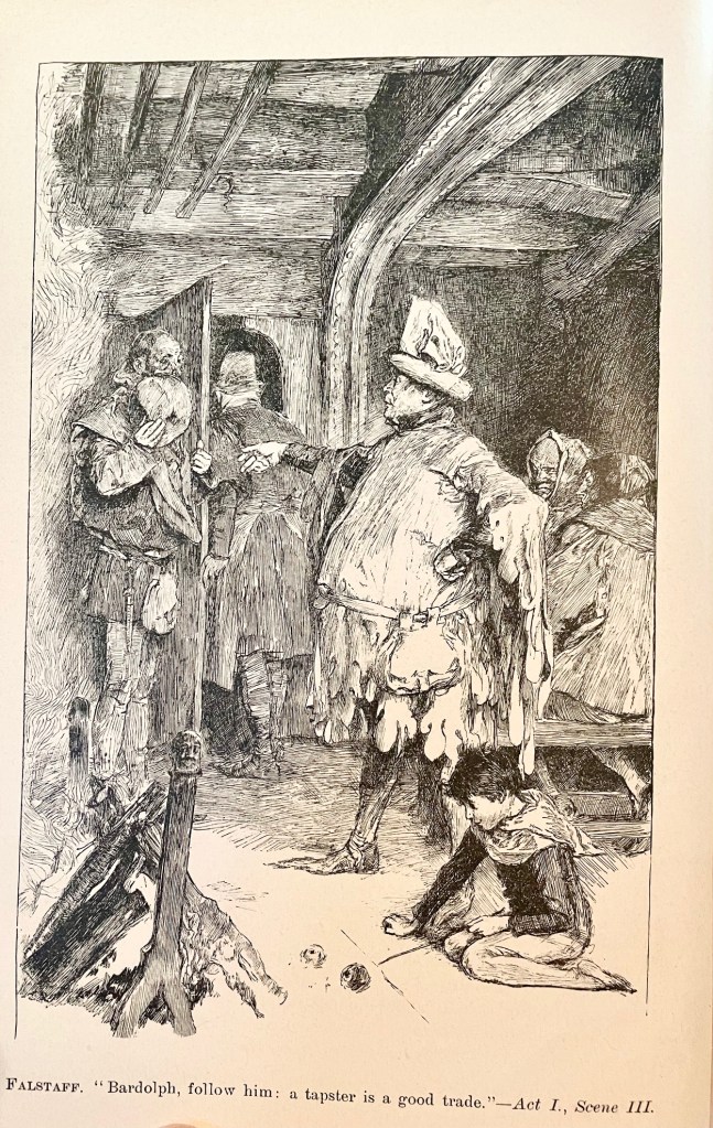
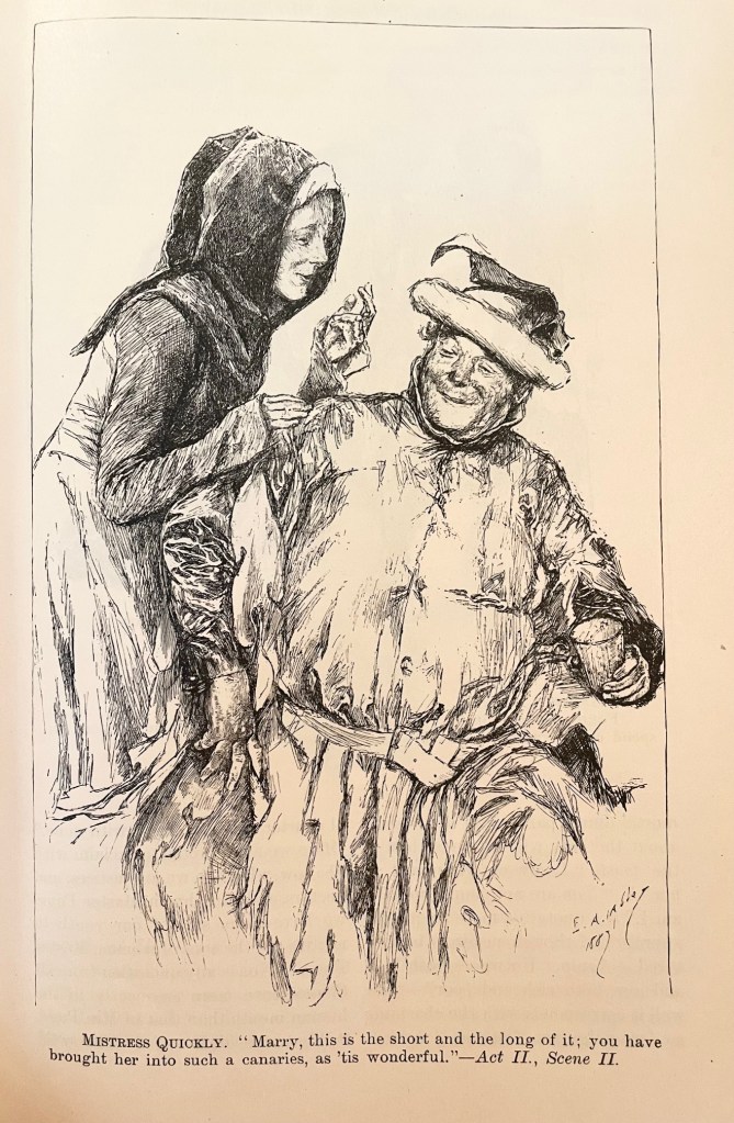
Here are two by Edwin Austin Abbey, best known for his Shakespearean and Victorian images, illustrating scenes from The Merry Wives of Windsor. Hands and fabric folds drive me crazy, and Abbey makes it look effortless.

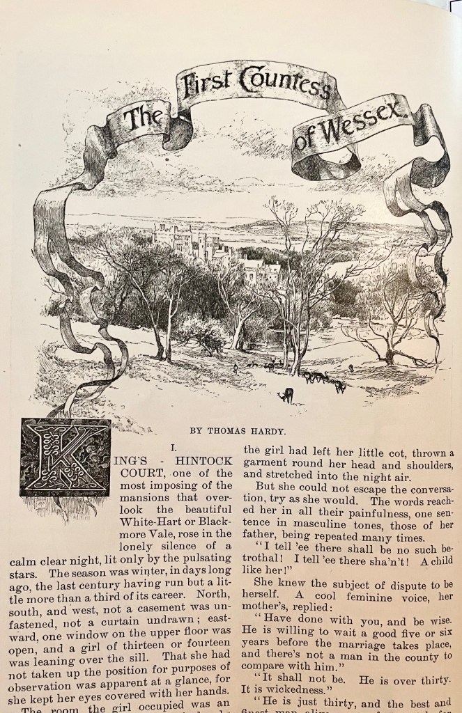
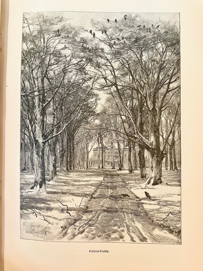
Here are two by Alfred Parsons, who was an illustrator, landscape painter, and garden designer. I found a citation suggesting that the author of the article (Thomas Hardy) took Parsons to the location so he could depict it accurately. You’ll find engraver signatures in the lower right-hand corner of some of these, as in the majestic estate scene on the right, but the original artwork was Parsons all the way.

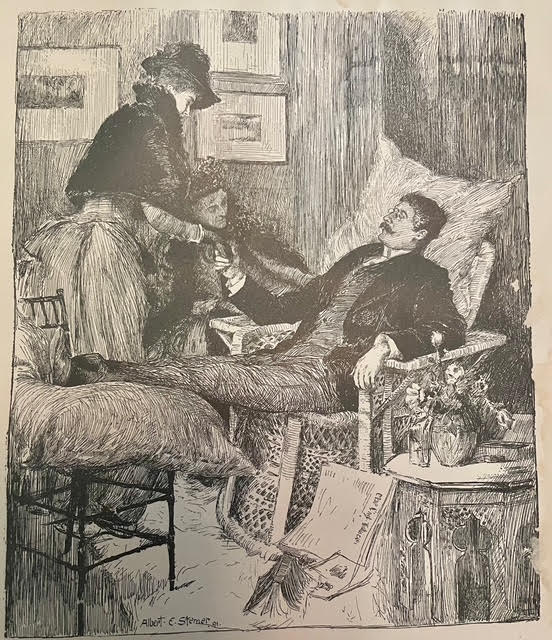
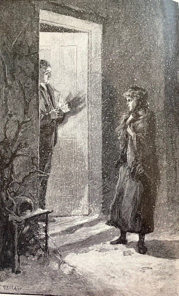
This masterpiece was by Charles Dater Weldon, and it’s the first I’ve come across anything by him (that I remember). He seems to have struggled for the kind of attention some of his peers found at Harper’s, but this drawing is a master class in leaving white space for effect. Zoom in and check out how he depicted the snow!

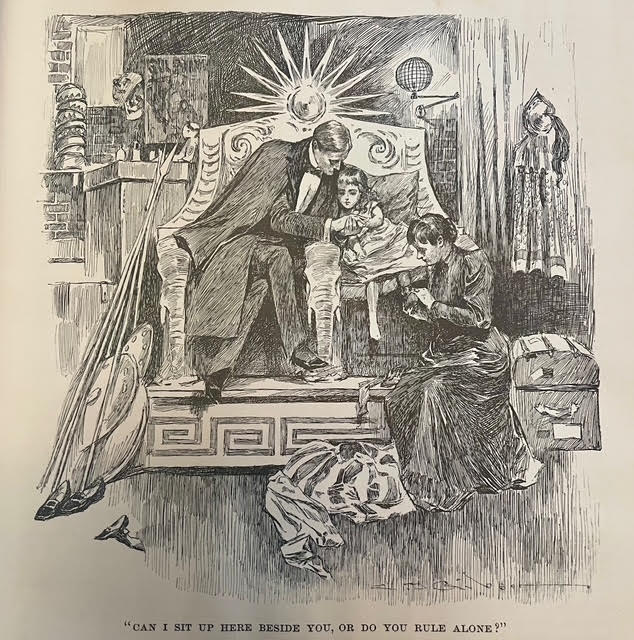
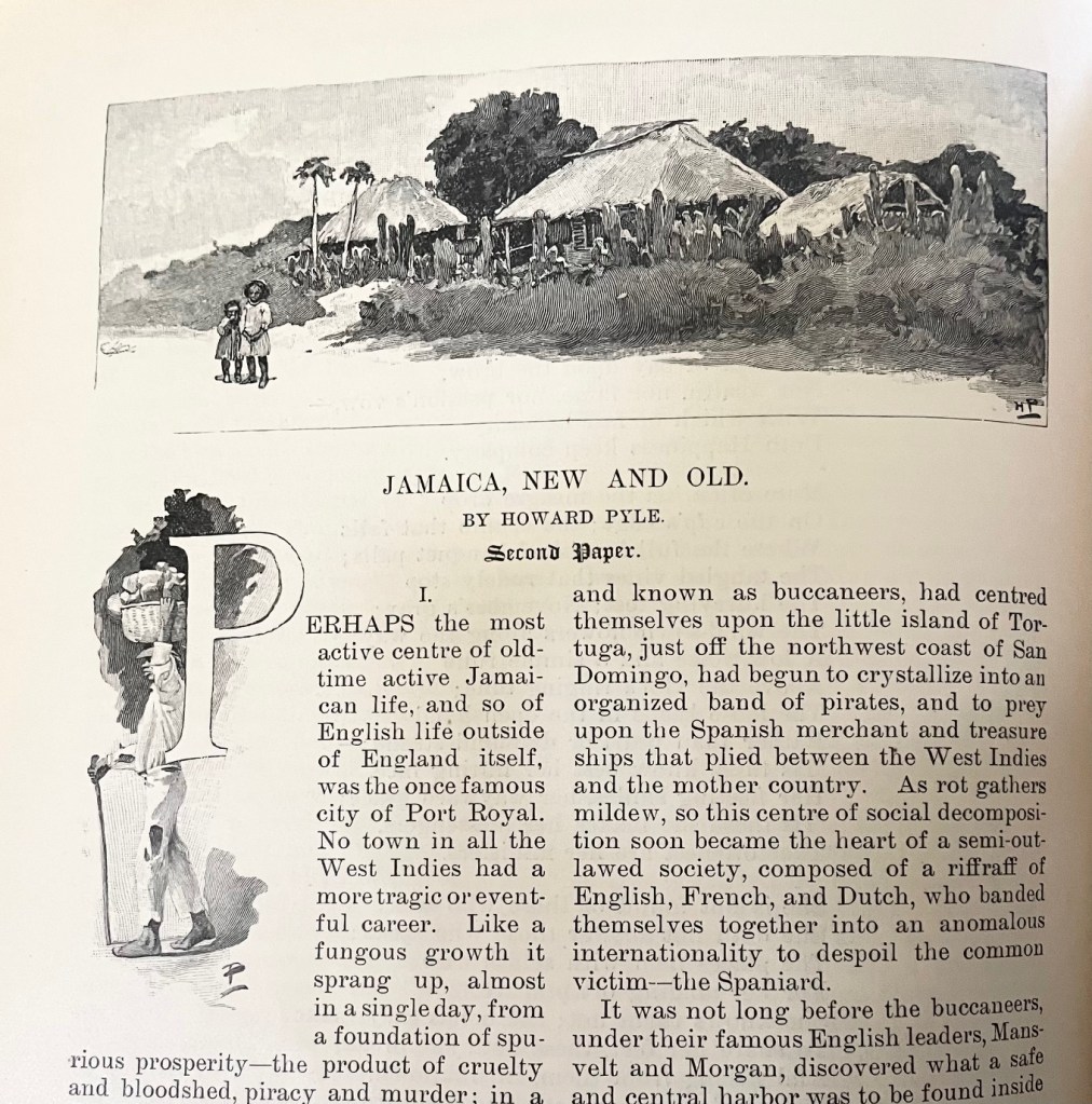
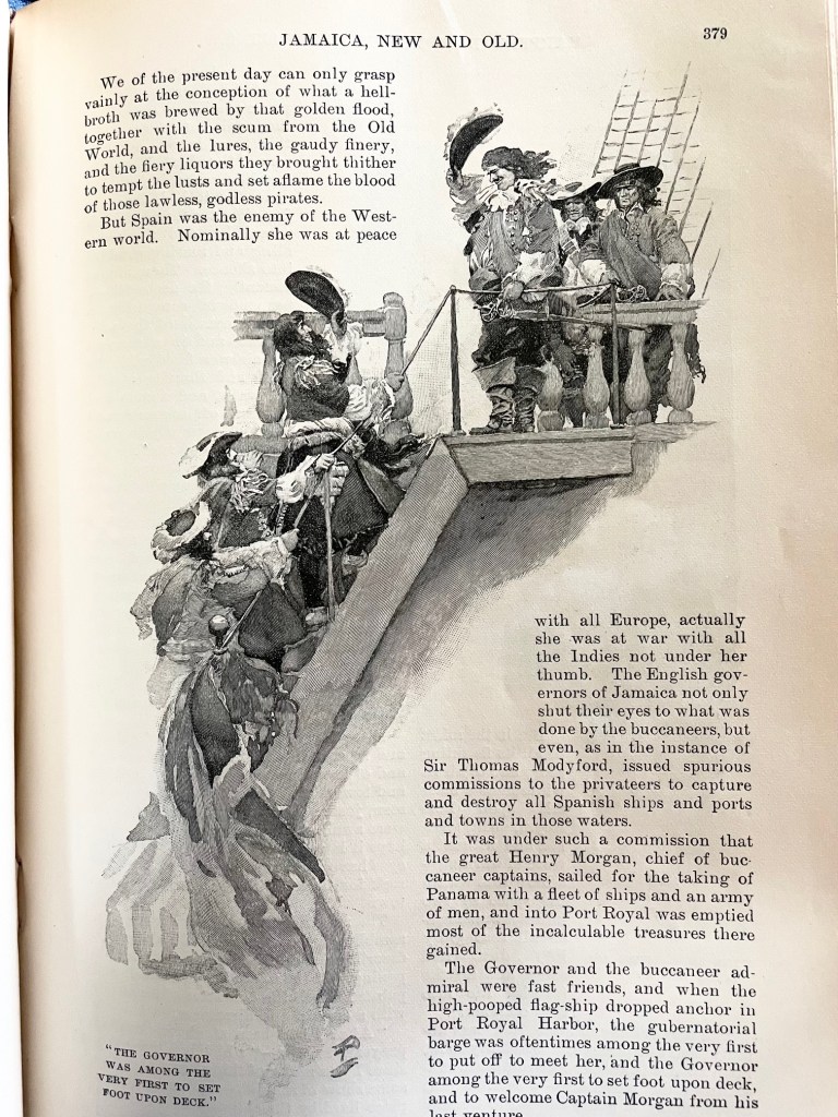
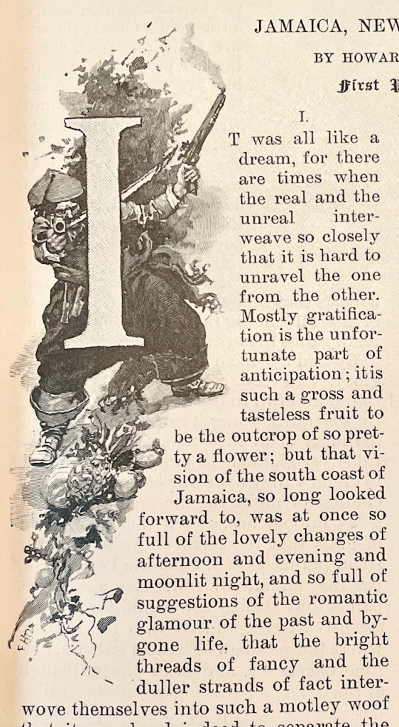
And now we come to Howard Pyle, and he was a genius. A groundbreaking genius. Not only are his drawings tiny little masterpieces all their own, but he cultivated the entire experience on the page. He would sometimes write, illustrate, and design the layout all in an integrated fashion to drive the effect he wanted. Pay special attention to how he forms the text around the drawings. The pirate drop-cap is especially fascinating – apparently these are called ‘historiated initials’.

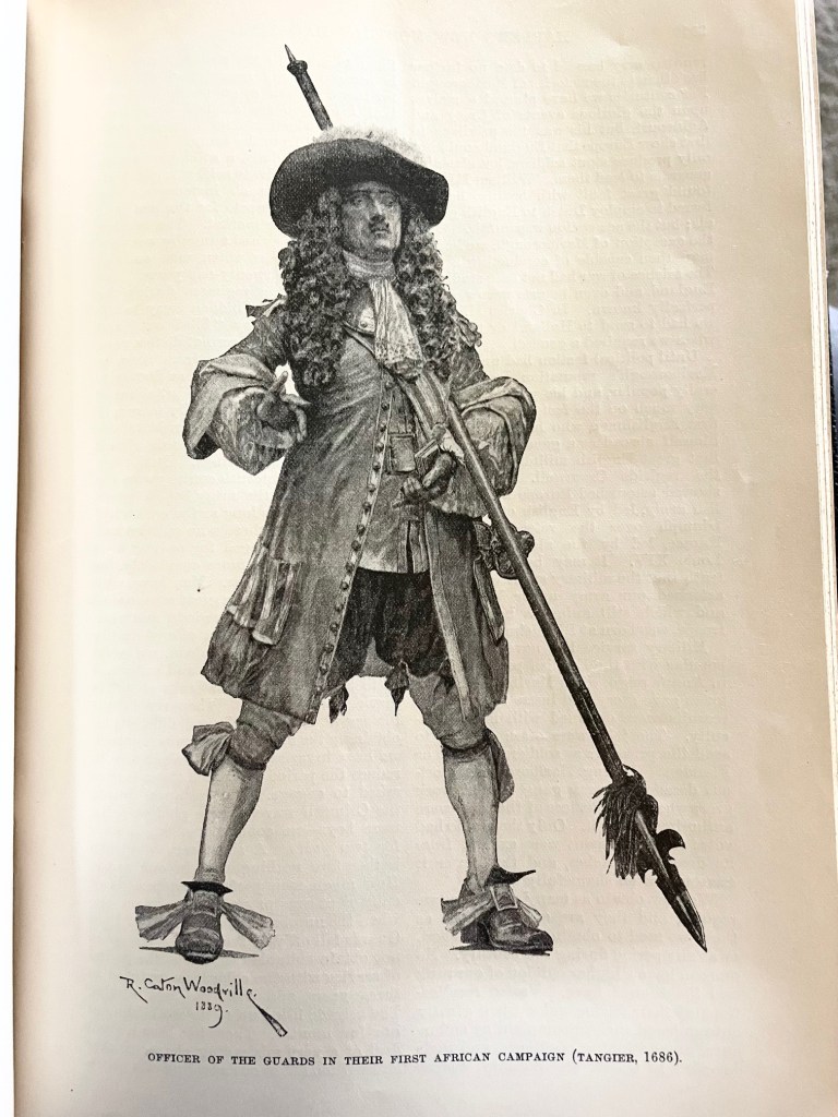
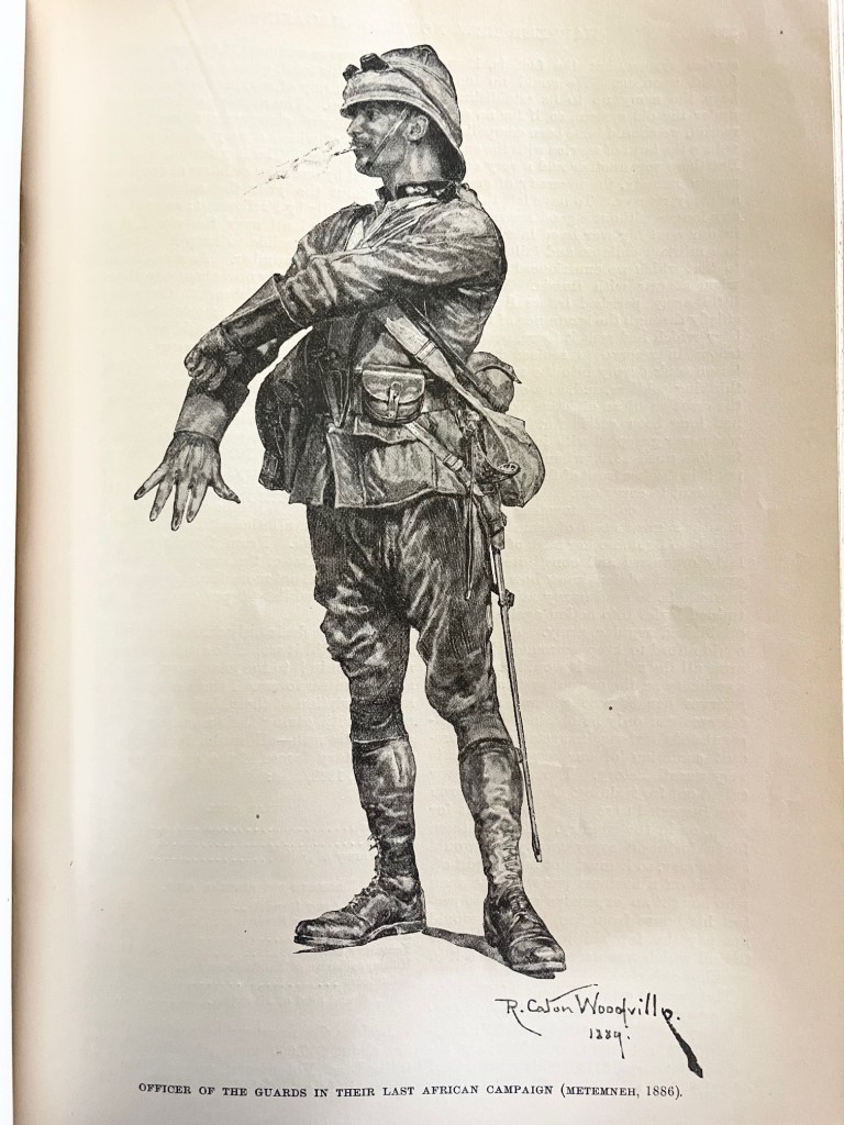
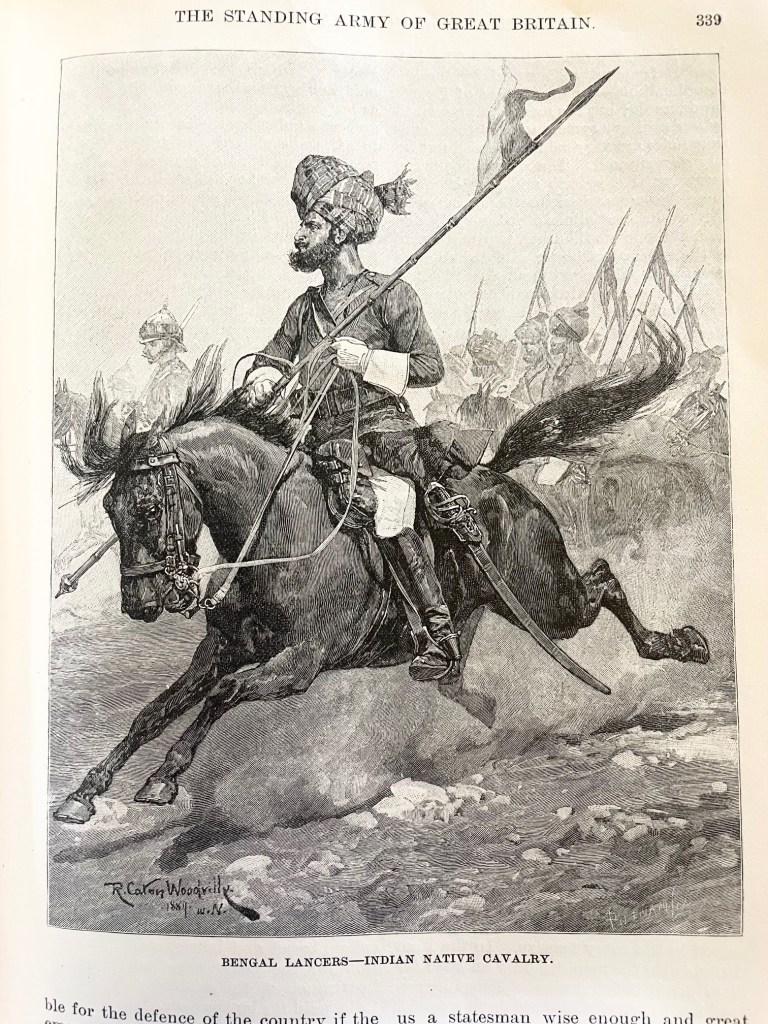
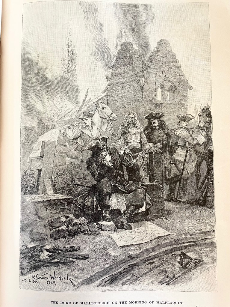
These next four were by Richard Caton Woodville, an artist renowned for his depictions of battle and military scenes. That last one is especially impressive for its perspective and scope, the strategic hatching and shading to draw your attention to the central figure, and – I don’t know why – but for the shadows and texture on the map lying on the ground. I really love it!

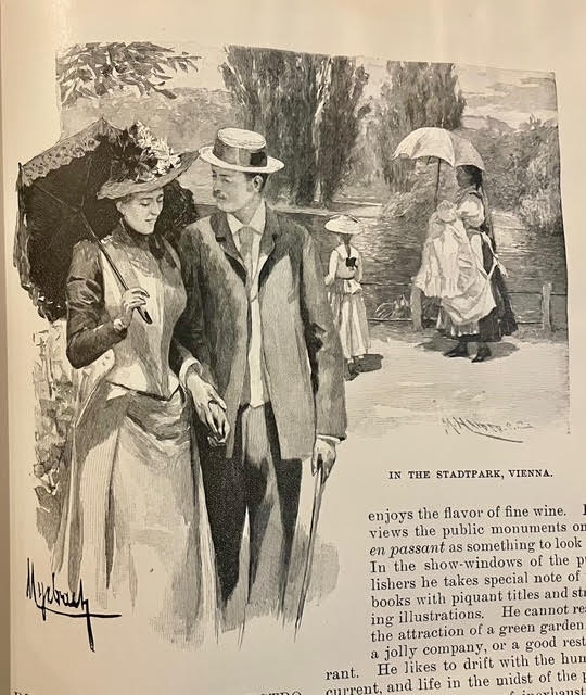
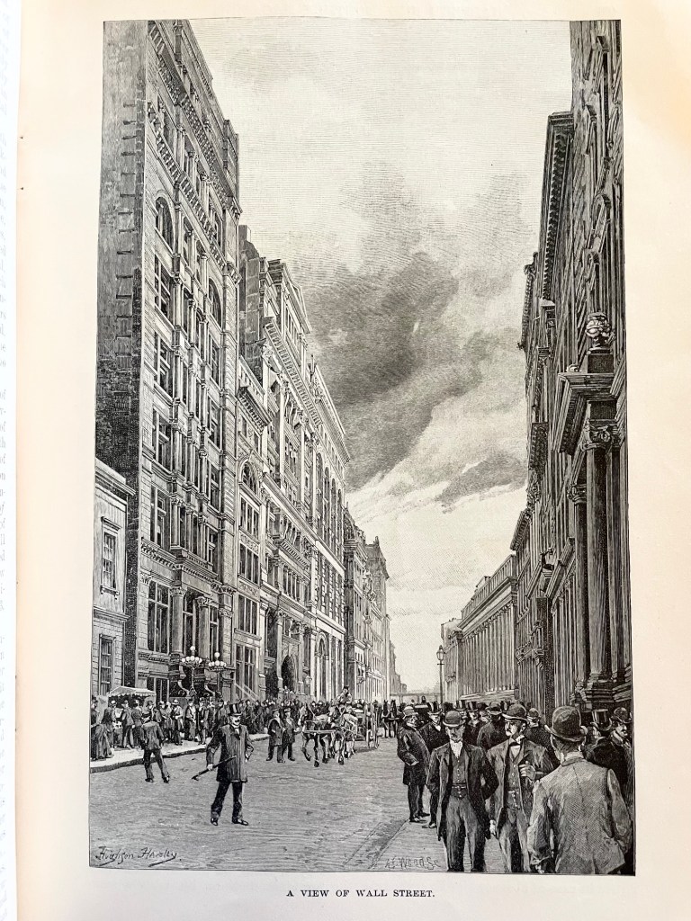
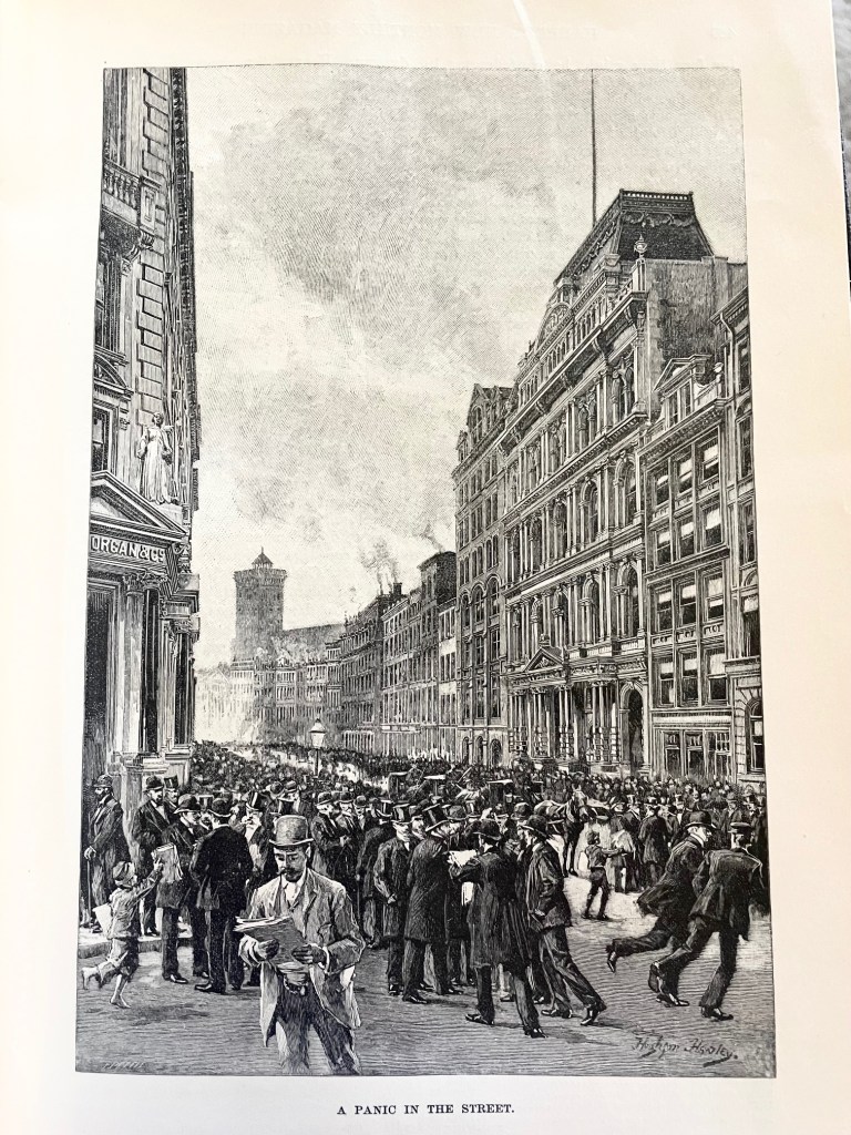
These two were by Hughson Hawley, who started his career as a scenery painter for Christmas pantomimes at Covent Garden in London. He was known for his architectural renderings. The illustrations accompanied an article about Wall Street, and their vertical orientation with exposed sky and building details make them really shine!

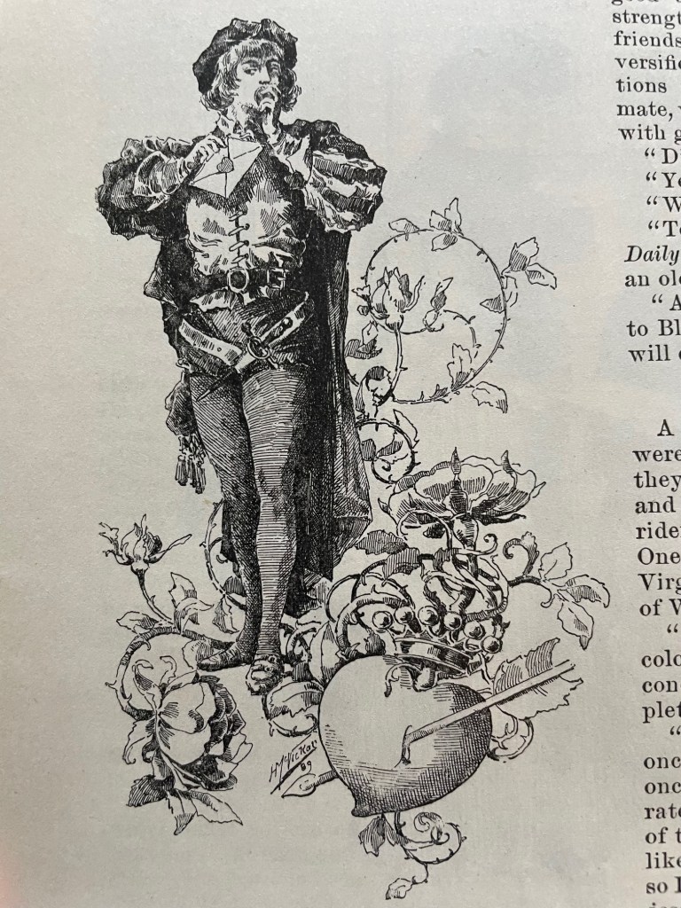
This is the only one I’m showing from Harry Whitney McVickar, an artist, illustrator, and real estate investor. He was also one of the founders of Vogue Magazine. This piece was just a flourish embellishing an article, but it stood out to me for its wonderful hatching and detail.

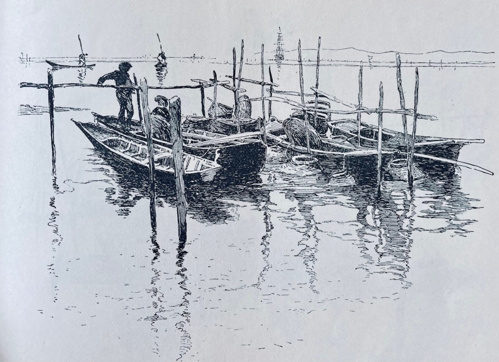
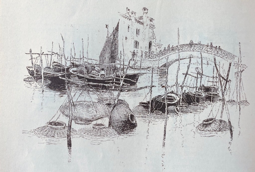
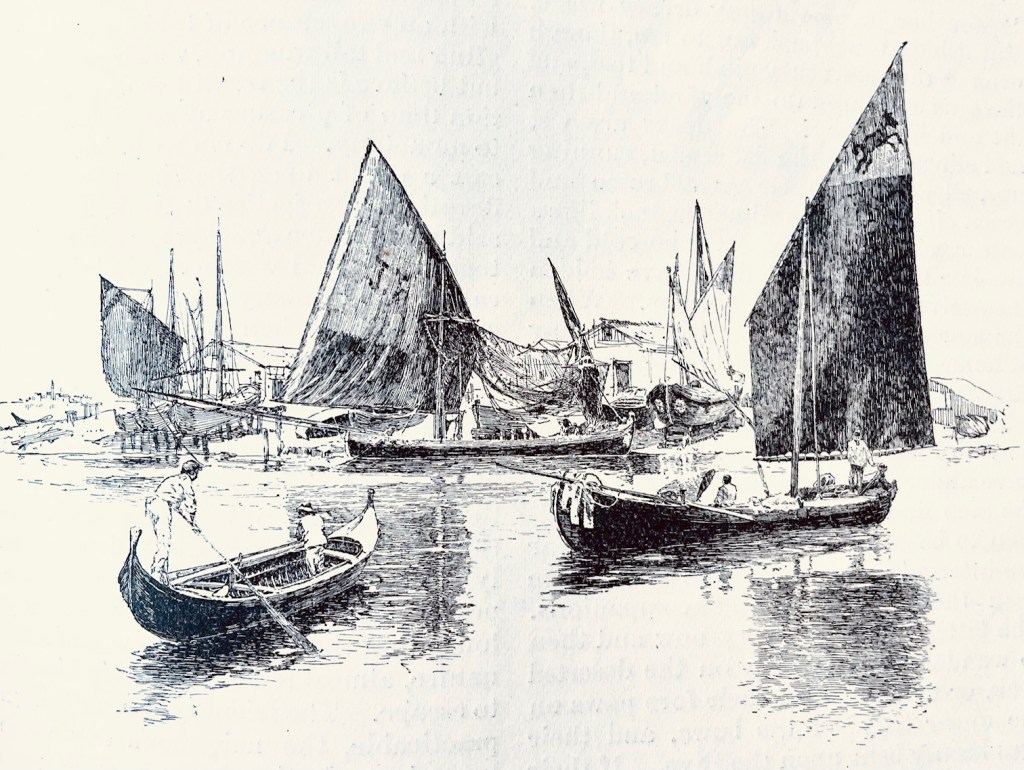
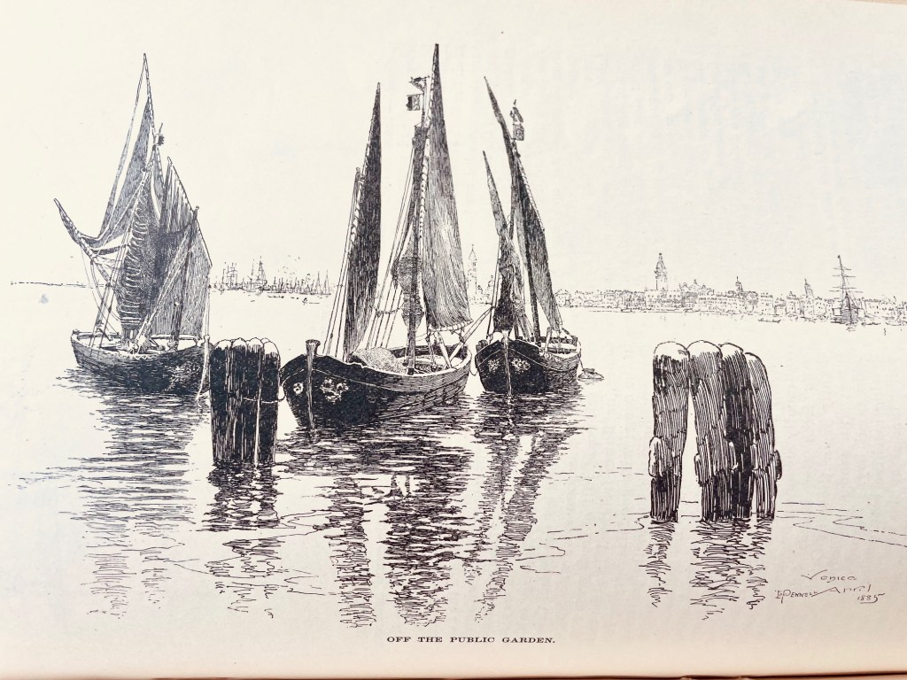
These next four are by Joseph Pennell, who was known for his on-location immediacy over polished artwork. Imagine him hurriedly dashing these off in open air at the scene he’s illustrating! The water reflections alone make these worth studying, but the hatching on the sails is equally impressive.

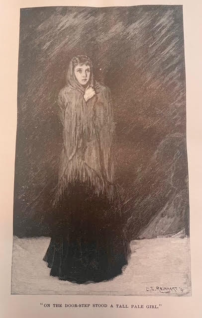
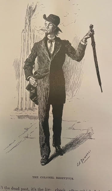
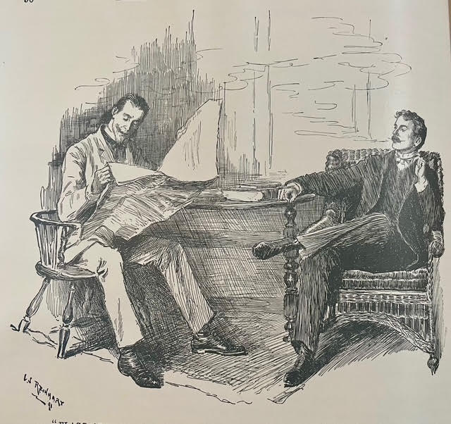
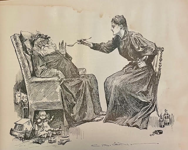
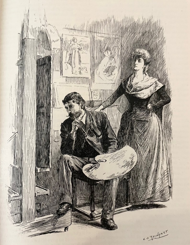
C. S. Reinhart was known for his character depictions, and that’s usually where Harper’s hired him. Here’s an especially well-done illustration of an artist in contemplation. Notice how he’s creating folds, shadows, and texture with his hatchwork. That’s super difficult!

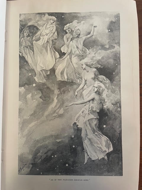
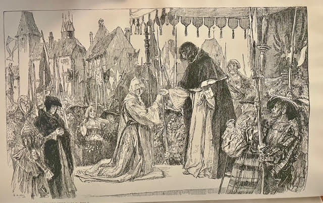
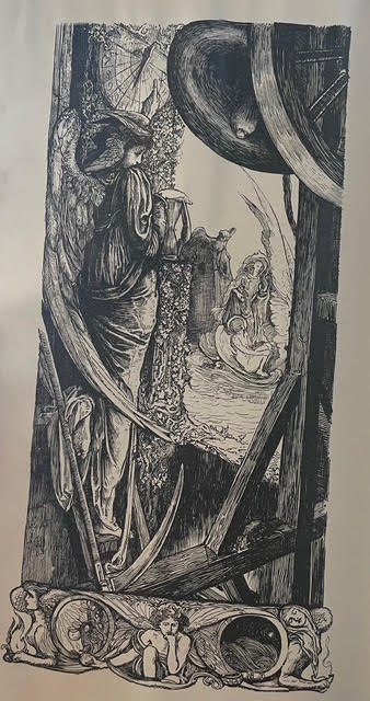
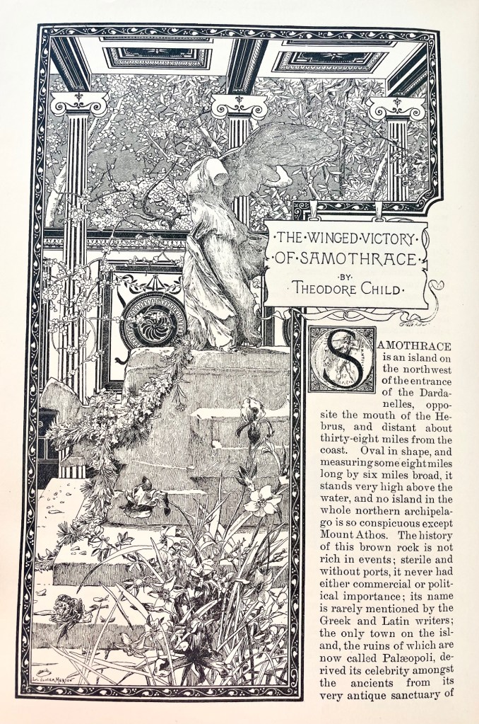
Our last highlight is a stunning splash page by Luc-Olivier Merson, who became known for his postage stamp and currency illustrations. It’s one of the most astounding introductory pages for an article in the entire volume. The border and roof design are both gorgeous, and the florals jump off the page!

*

Anyway, I was worried when I ordered this volume off eBay that it wouldn’t recreate the experience of that first volume, stumbling in awe across forgotten masterpieces on every other page. But I wasn’t disappointed. It’s a shame so many of these craftsmen are forgotten today.

I hope you found something to impress and inspire. As always at Grailrunner, that’s why we’re here.

Till next time,

I found a pen & ink masterclass in an old antique mall!

Last week, I took a road trip down the Mississippi Blues Trail out of Memphis. It was incredible, and I might write that one up as well. Seriously, we ate at the Hollywood beside the piano where Mark Cohn was inspired to write “Walking In Memphis”, saw BB King’s famous Lucille guitar, and walked Dockery Farms where the Delta Blues were born. Amazing trip.

The only reason I mention it now though is we were headed back on a route through Little Rock and back to Kansas City when we stopped at an old antique mall. If you’ve hung around here at Grailrunner before, you well know how much we’re into old bookstores and the forgotten but mind-expanding wonders you can find on dusty old shelves. And man, have I got one for you today!

This guy here. Smash the image below for a short video showing what I mean.

It’s a hardback compilation of Harper’s Magazines from 1891 through 1892. Harper’s is a monthly magazine covering culture, finance, literature and the arts that was launched in 1850 and is still continuously published today. I didn’t have any particular fondness or interest in that magazine so much as just seeing what people read about in the 1890’s. I’m also a little obsessed with the 1893 Chicago World’s Fair, also known as the Columbian Exposition, and I was hoping there would be a mention or two in here, and there was.

That’s why I first picked it up.

As I flipped through the pages, I was stunned by the quality and craftmanship of the pen & ink and engraved illustrations inside. I use the word carefully…stunned! Some of the artists were familiar to me, but for many of the pieces inside, I couldn’t even tell who the artist was. Credits weren’t always given, and signatures were too stylized to read.

I used ChatGPT to analyze some of the more interesting works to research the artist when it wasn’t obvious, and it was surprisingly useful for that. Often wrong, but with some caution and follow-up research, you can usually zero in on a likely name.

Thought I’d share some of these beauties with you today, and maybe introduce you to some wonder-workers of the past who could summon sparkling magic with a simple fountain pen. I’m offering 20 vintage illustrations here for admiration and craftmanship study.

Care to join me?

By Felician Myrbach

Myrbach was an Austrian-born artist and leading illustrator of the 19th century. Also acting as director of the Vienna Academy of the Fine Arts, he was known for detailed illustrations of military scenes and historical costumes. This image struck me with its sense of depth, balance of light and shadow, and elegant washes. Looks like it’s coming out of the page.

By John Reinhard Weguelin

I loved the subject here, and the haunting feel of it. The artist was J.R. Weguelin, who was primarily known for his dreamy watercolors and oil paintings, though he supplemented his income by slumming to draw masterpieces like this one for magazines.

When I came across a simple article about Native Americans, I couldn’t believe I was seeing an original Frederic Remington illustration there just as a picture for a magazine. Then another. And another. These seven images are all by Remington, and they’re all beautiful. He was known for paintings and drawings mainly depicting the American west.

These three were all by Charles Stanley Reinhart, an American painter and illustrator who was also responsible for artwork on certain silver certificates commissioned by the U.S. Bureau of Engraving and Printing said by many to be the most beautiful monetary designs ever produced by the United States. That last image, of the two guys sitting and smoking is an absolute master class in pen & ink linework. I struggle in my own drawings to avoid outlines, to use contrasting light and dark for the silhouettes, and to choose the right directions for hatching that don’t distract from the shapes and mood. Reinhart entirely nailed it with that one.

These two were by Edwin Austin Abbey, an American muralist, painter and illustrator known most for Victorian and Shakespearean subjects. Perhaps most dear to our hearts at Grailrunner, Abbey was the artist behind the famous “Quest and achievement of the Holy Grail” murals at the Boston Central Library.

I really loved these two, as they independently stuck out for me on their own merits before I realized they were by the same artist and in fact, an artist whose work I thought I knew. Charles Dana Gibson was an American artist typically cited as being the creator of the “Gibson girl”, the iconic representation of the independent American woman at the turn of the 20th century. I think that puts the poor guy in a box that is unfair, as his composition, linework and hatching are among the finest of his age. He did a little more than ads with girls in them. Seriously, these two images are firecrackers!

These two architectural pieces just made me stare in awe. I can’t draw buildings, no matter how careful I am. They always turn into heavily lined, overly simplified, often leaning, caricatures of buildings. Not my thing, unfortunately. But these two by John Tavenor-Perry (at least I think so) are masterworks. ChatGPT couldn’t do anything with that weird signature (looking like a stylized rune but supposedly initials). After some heavy back-and-forth, I think we landed on a likely artist though I’m open to correction.

By Albert Sterner, this piece is a treasure-trove of hatching. I love it. Somehow, he’s managed to keep all these disparate elements in the composition cleanly segregated: the ladies and the cushion, his legs and vest, the flowers, the chair, shadows…all of it clearly silhouetted and easily read despite being a jumble of things. No way could I have figured out how to get all that detail into a drawing without feeling I needed to strip it way down so you could tell what it was.

And now finally, the mystery piece.

This one.

I was mesmerized. It accompanies a poem by James Russell Lowell titled “His Ship”, appearing in the December 1891 issue of Harper’s Magazine. No credit given anywhere, including the “Editor’s Drawer” where many other attributions for illustrations are provided.

The signature is maddeningly concealed in the drawing. I think. Hard to say if that’s a signature or not. Here’s what I mean:

Anyway, I contacted Harper’s in case somebody’s maintaining an archive of some kind to help identify the genius who did this. It’s gorgeous. If I get any kind of response or make headway on the identification, I’ll come back and update you.

*

But that’s what I wanted to bring you today. Masters of their craft in the golden age of illustration, doing what they did and generating timeless works of art. For whatever reason, and not just as an aspiring artist myself, these drawings are unearthly and hypnotizing to me.

What do you think?