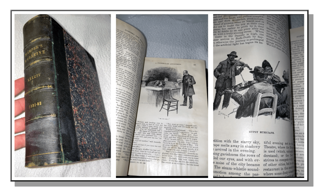
Last July, I told you about a hardback bound volume of Harper’s New Monthly Magazine from the 1890’s that I’d found in an old antique mall and which contained the most face-melting pen & ink illustration I’d ever seen. Check that out here. I’m still obsessing, of course, and that’s why I’m here again with another round of highlighted drawings from the golden age of illustration.
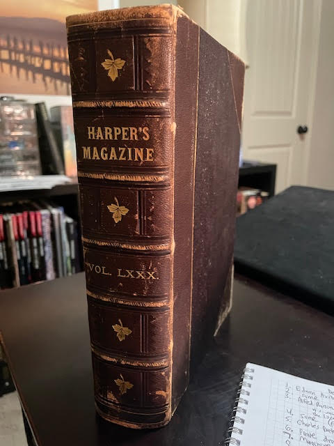
I thought I’d go back a bit, possibly to collect a good thirty year expanse, and showcase some of the more inspiring artwork and exquisite pen & ink craftsmanship. I’ve gotten my hands on Volume 80, covering Dec 1889 to May 1890. Welcome back, and I hope you enjoy perusing these master works as much as I did discovering them. Flipping these pages is an exploration I can’t get enough of!
Shall we head inside?
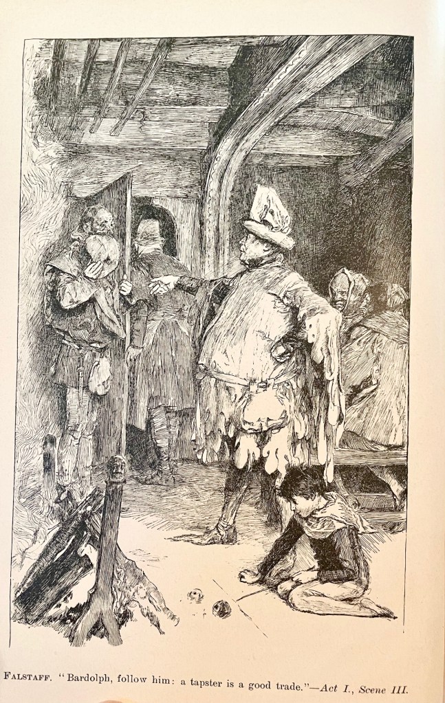
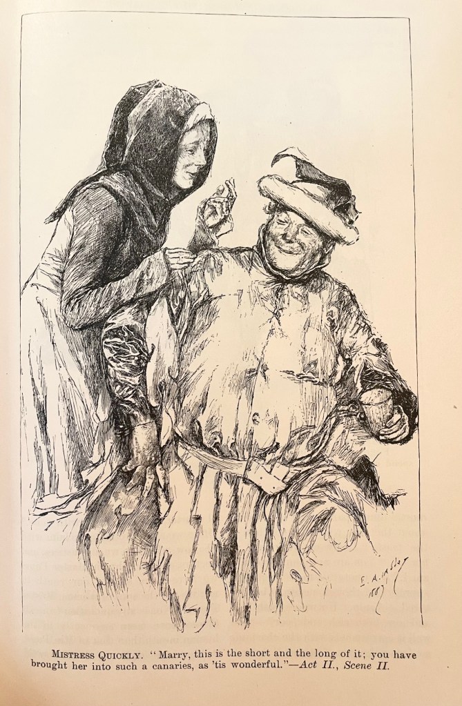
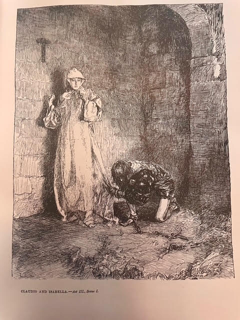
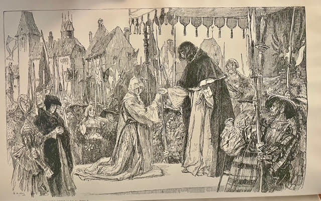
Here are two by Edwin Austin Abbey, best known for his Shakespearean and Victorian images, illustrating scenes from The Merry Wives of Windsor. Hands and fabric folds drive me crazy, and Abbey makes it look effortless.
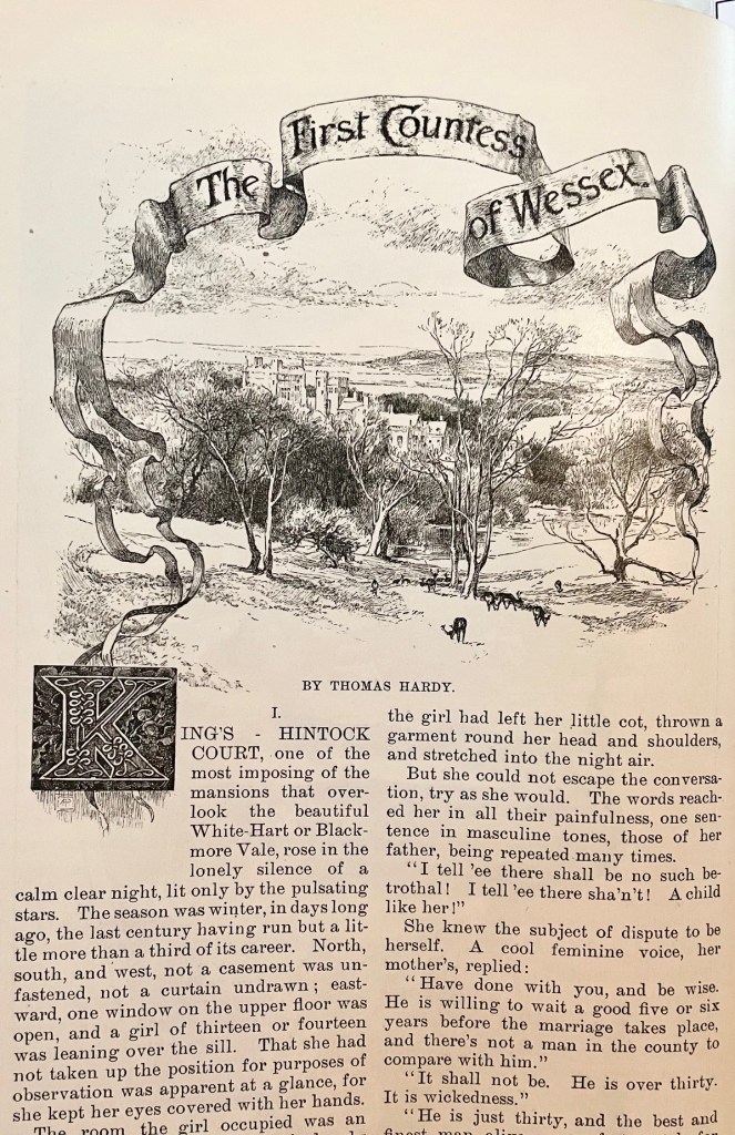
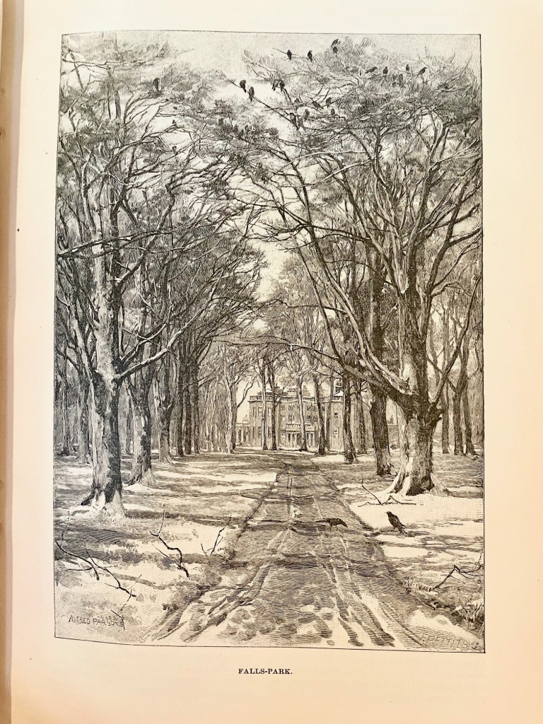
Here are two by Alfred Parsons, who was an illustrator, landscape painter, and garden designer. I found a citation suggesting that the author of the article (Thomas Hardy) took Parsons to the location so he could depict it accurately. You’ll find engraver signatures in the lower right-hand corner of some of these, as in the majestic estate scene on the right, but the original artwork was Parsons all the way.
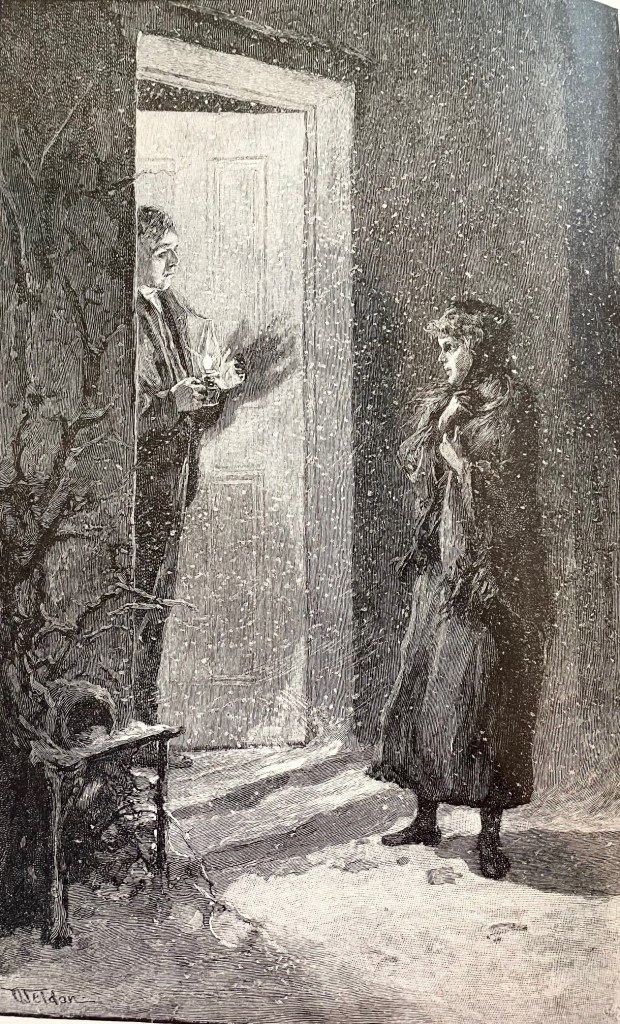
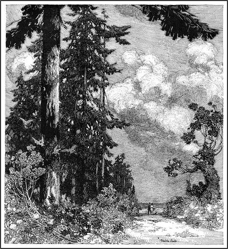
This masterpiece was by Charles Dater Weldon, and it’s the first I’ve come across anything by him (that I remember). He seems to have struggled for the kind of attention some of his peers found at Harper’s, but this drawing is a master class in leaving white space for effect. Zoom in and check out how he depicted the snow!
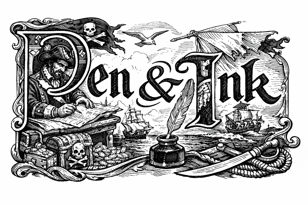
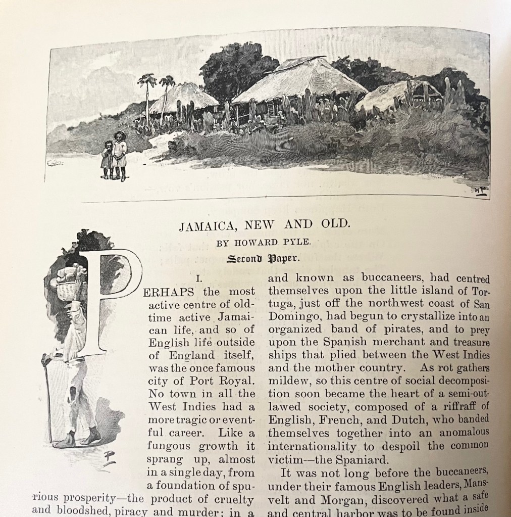
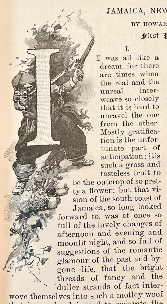
And now we come to Howard Pyle, and he was a genius. A groundbreaking genius. Not only are his drawings tiny little masterpieces all their own, but he cultivated the entire experience on the page. He would sometimes write, illustrate, and design the layout all in an integrated fashion to drive the effect he wanted. Pay special attention to how he forms the text around the drawings. The pirate drop-cap is especially fascinating – apparently these are called ‘historiated initials’.
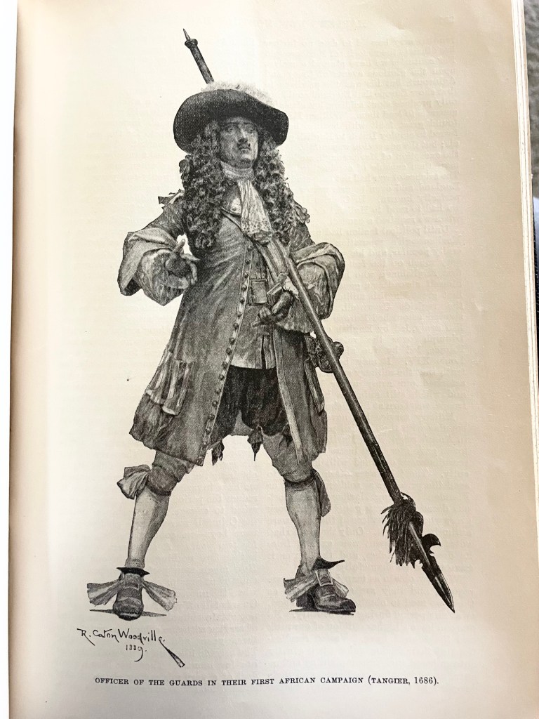
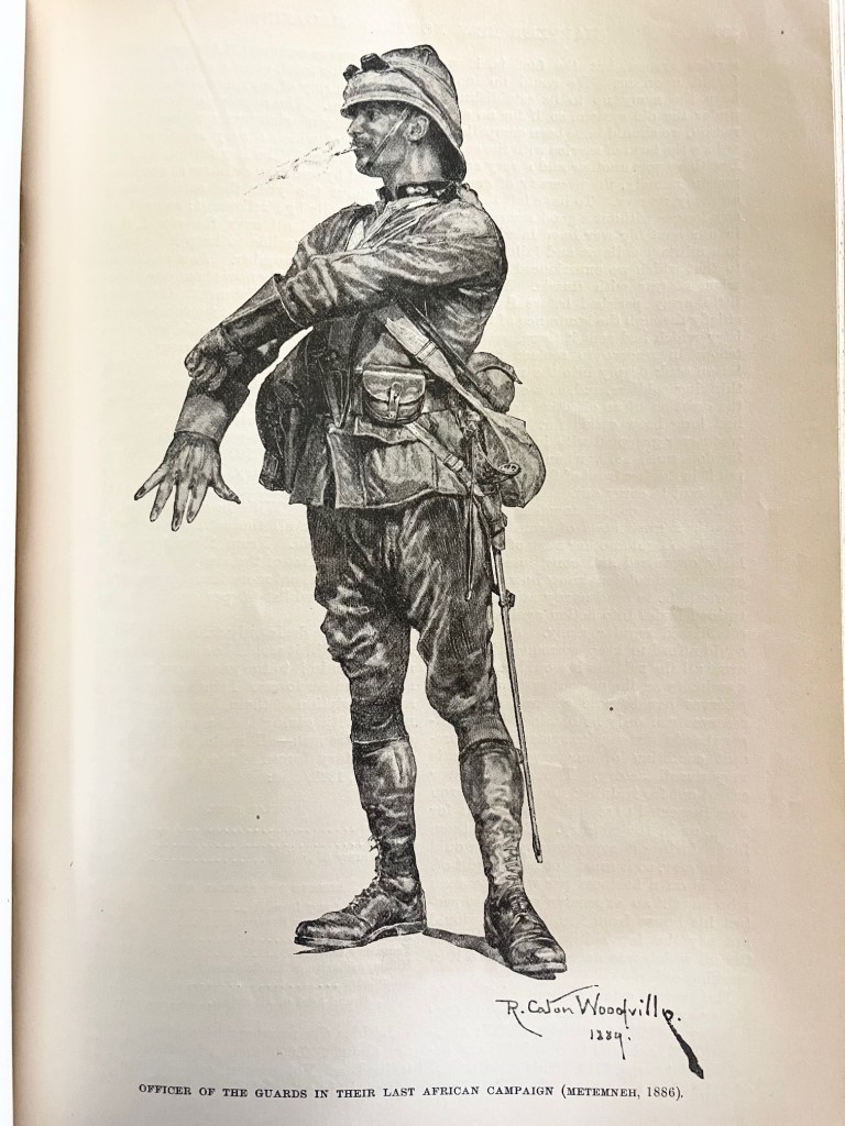
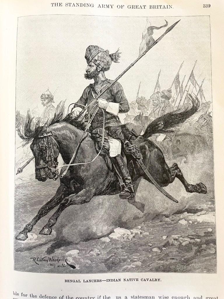
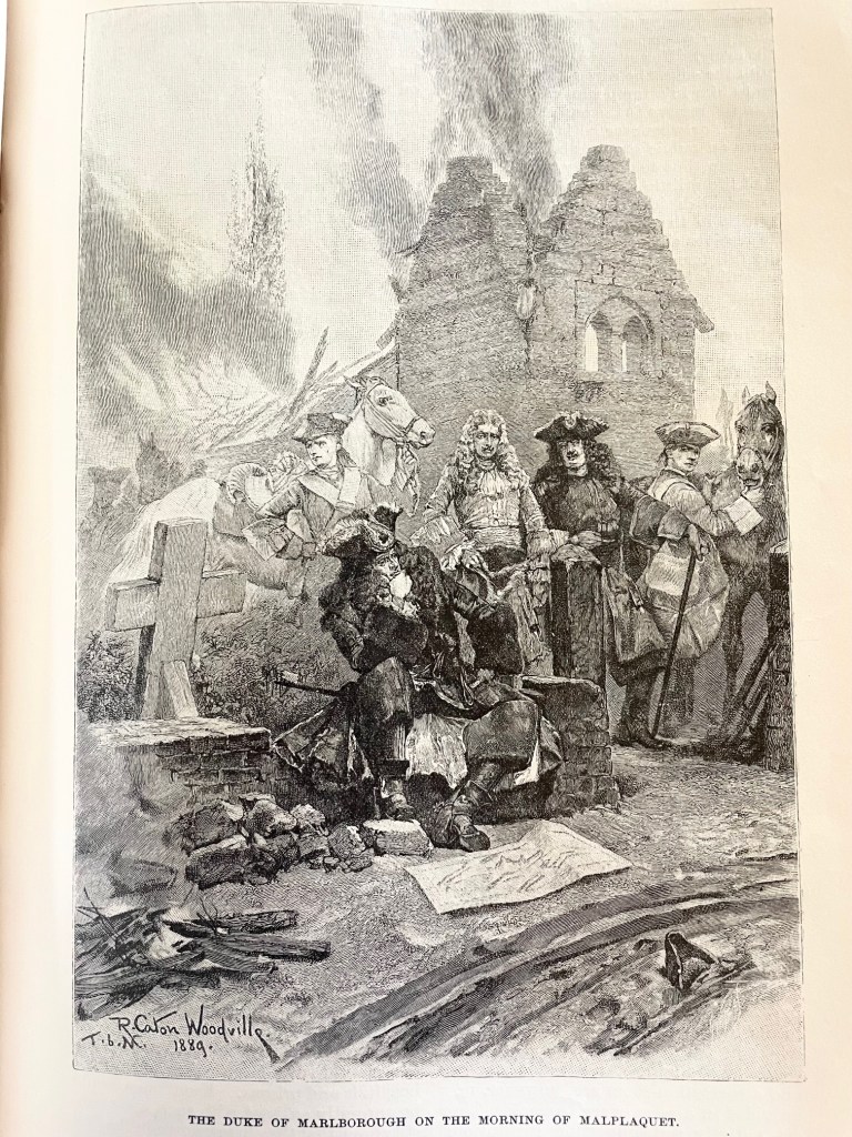
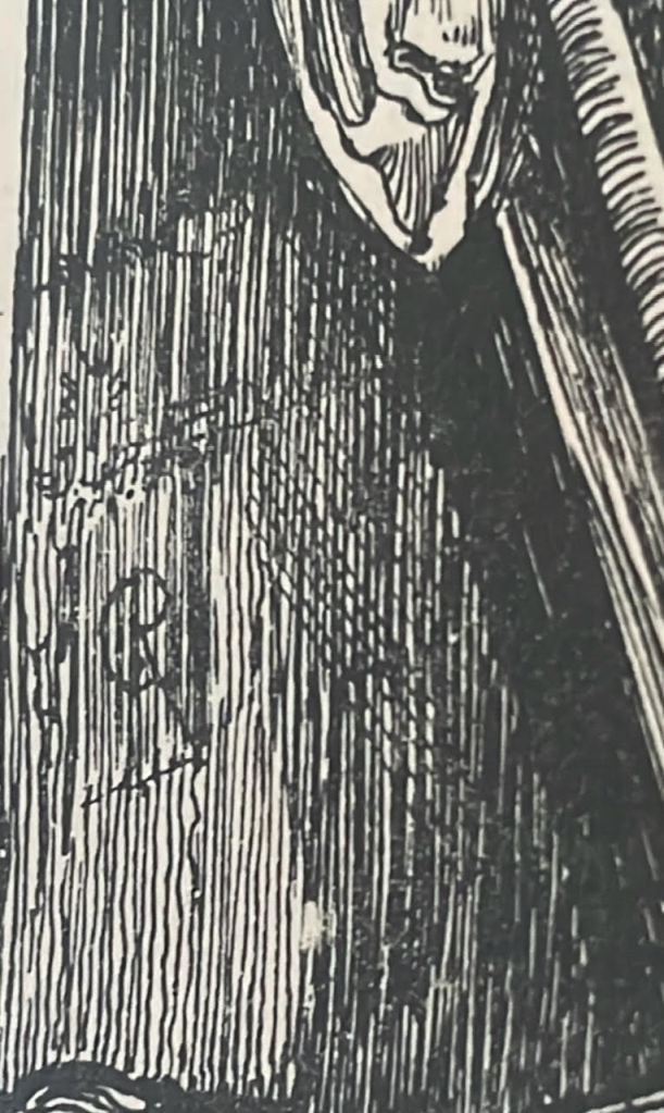
These next four were by Richard Caton Woodville, an artist renowned for his depictions of battle and military scenes. That last one is especially impressive for its perspective and scope, the strategic hatching and shading to draw your attention to the central figure, and – I don’t know why – but for the shadows and texture on the map lying on the ground. I really love it!
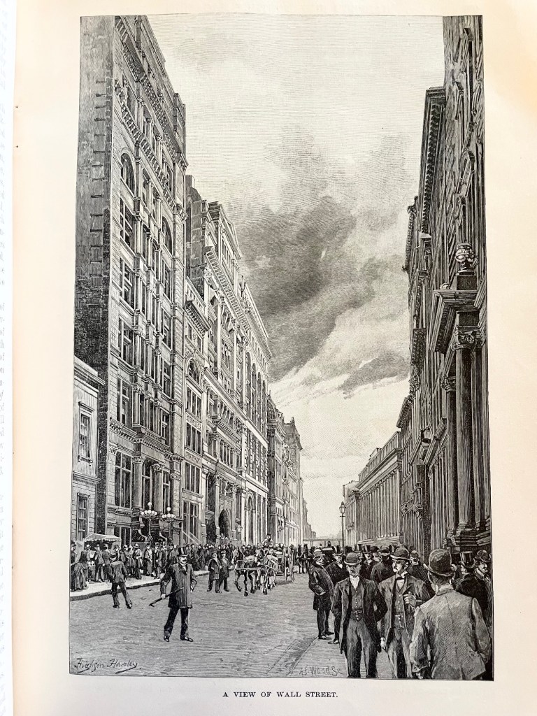
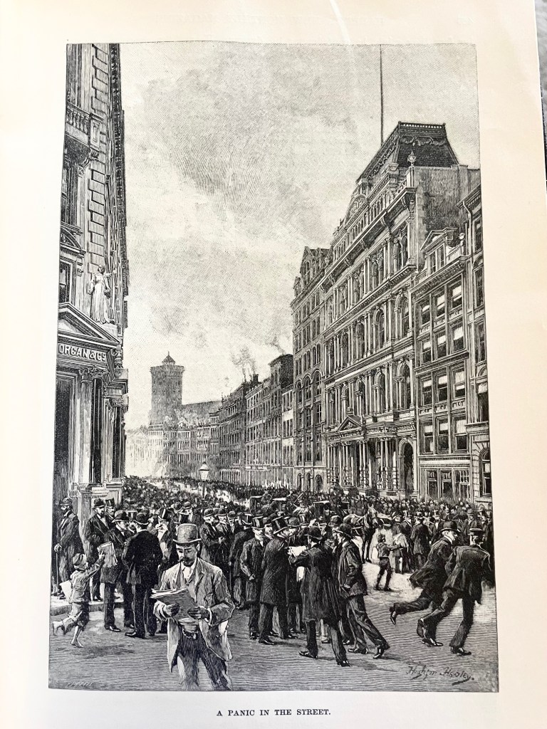
These two were by Hughson Hawley, who started his career as a scenery painter for Christmas pantomimes at Covent Garden in London. He was known for his architectural renderings. The illustrations accompanied an article about Wall Street, and their vertical orientation with exposed sky and building details make them really shine!
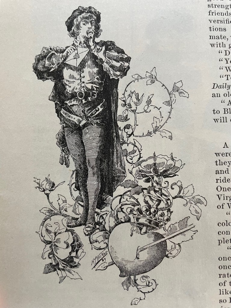
This is the only one I’m showing from Harry Whitney McVickar, an artist, illustrator, and real estate investor. He was also one of the founders of Vogue Magazine. This piece was just a flourish embellishing an article, but it stood out to me for its wonderful hatching and detail.
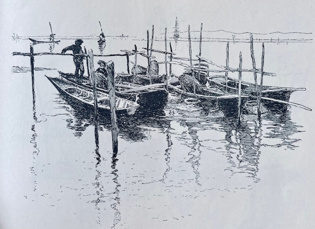
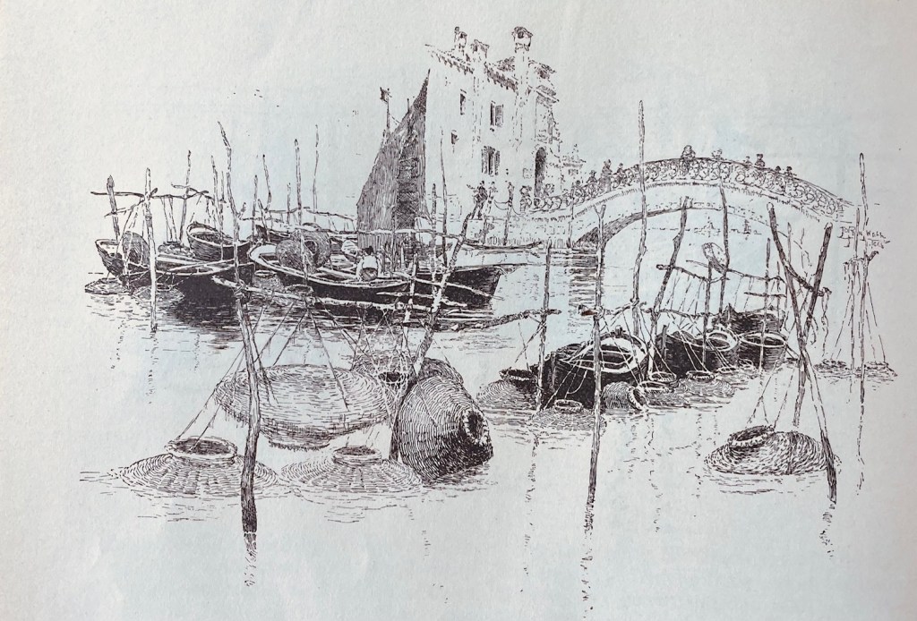
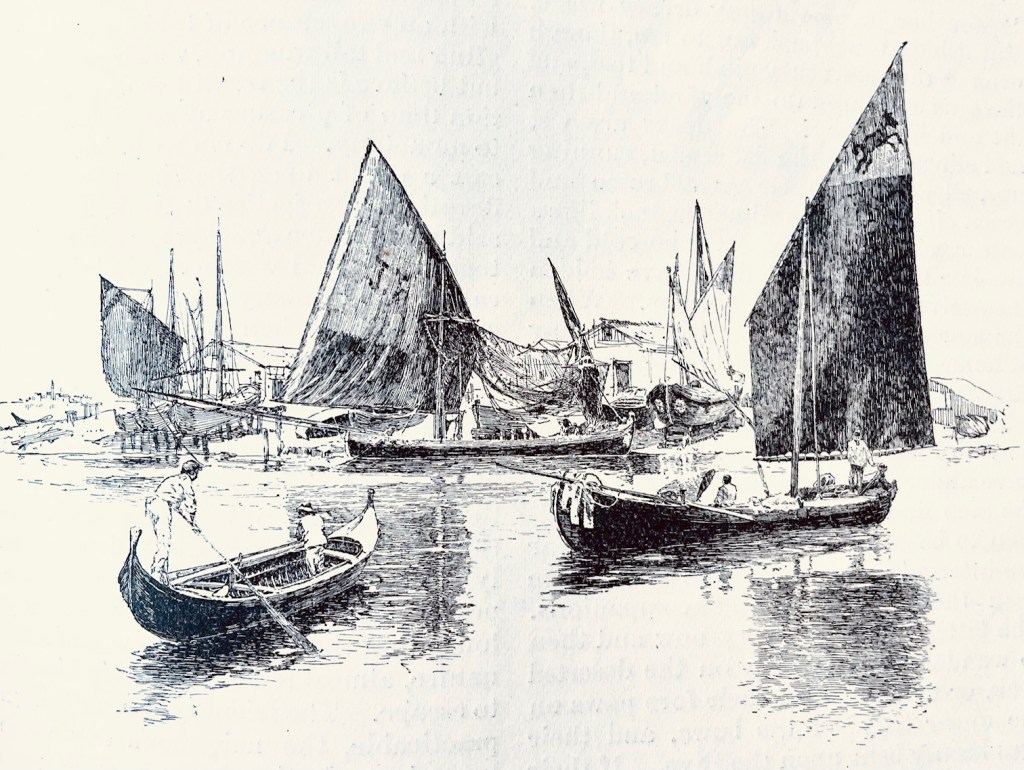
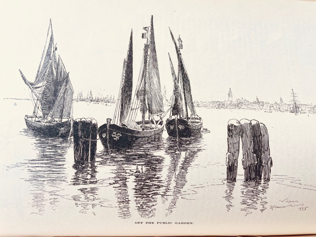
These next four are by Joseph Pennell, who was known for his on-location immediacy over polished artwork. Imagine him hurriedly dashing these off in open air at the scene he’s illustrating! The water reflections alone make these worth studying, but the hatching on the sails is equally impressive.
C. S. Reinhart was known for his character depictions, and that’s usually where Harper’s hired him. Here’s an especially well-done illustration of an artist in contemplation. Notice how he’s creating folds, shadows, and texture with his hatchwork. That’s super difficult!
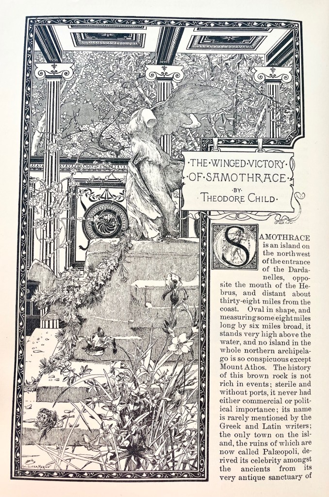
Our last highlight is a stunning splash page by Luc-Olivier Merson, who became known for his postage stamp and currency illustrations. It’s one of the most astounding introductory pages for an article in the entire volume. The border and roof design are both gorgeous, and the florals jump off the page!
*
Anyway, I was worried when I ordered this volume off eBay that it wouldn’t recreate the experience of that first volume, stumbling in awe across forgotten masterpieces on every other page. But I wasn’t disappointed. It’s a shame so many of these craftsmen are forgotten today.
I hope you found something to impress and inspire. As always at Grailrunner, that’s why we’re here.
Last week, I took a road trip down the Mississippi Blues Trail out of Memphis. It was incredible, and I might write that one up as well. Seriously, we ate at the Hollywood beside the piano where Mark Cohn was inspired to write “Walking In Memphis”, saw BB King’s famous Lucille guitar, and walked Dockery Farms where the Delta Blues were born. Amazing trip.
The only reason I mention it now though is we were headed back on a route through Little Rock and back to Kansas City when we stopped at an old antique mall. If you’ve hung around here at Grailrunner before, you well know how much we’re into old bookstores and the forgotten but mind-expanding wonders you can find on dusty old shelves. And man, have I got one for you today!
This guy here. Smash the image below for a short video showing what I mean.
It’s a hardback compilation of Harper’s Magazines from 1891 through 1892. Harper’s is a monthly magazine covering culture, finance, literature and the arts that was launched in 1850 and is still continuously published today. I didn’t have any particular fondness or interest in that magazine so much as just seeing what people read about in the 1890’s. I’m also a little obsessed with the 1893 Chicago World’s Fair, also known as the Columbian Exposition, and I was hoping there would be a mention or two in here, and there was.
That’s why I first picked it up.
As I flipped through the pages, I was stunned by the quality and craftmanship of the pen & ink and engraved illustrations inside. I use the word carefully…stunned! Some of the artists were familiar to me, but for many of the pieces inside, I couldn’t even tell who the artist was. Credits weren’t always given, and signatures were too stylized to read.
I used ChatGPT to analyze some of the more interesting works to research the artist when it wasn’t obvious, and it was surprisingly useful for that. Often wrong, but with some caution and follow-up research, you can usually zero in on a likely name.
Thought I’d share some of these beauties with you today, and maybe introduce you to some wonder-workers of the past who could summon sparkling magic with a simple fountain pen. I’m offering 20 vintage illustrations here for admiration and craftmanship study.
Care to join me?
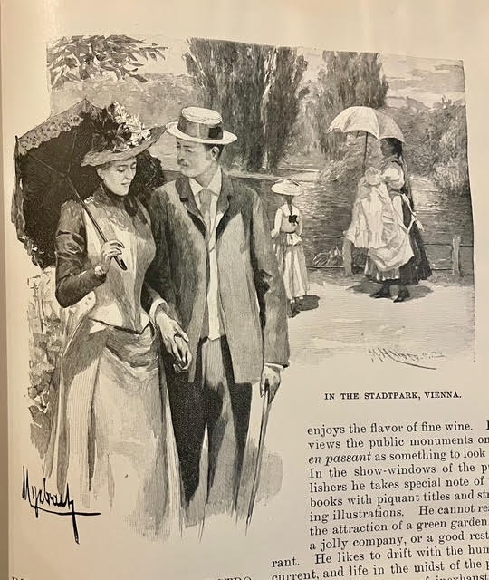
By Felician Myrbach
Myrbach was an Austrian-born artist and leading illustrator of the 19th century. Also acting as director of the Vienna Academy of the Fine Arts, he was known for detailed illustrations of military scenes and historical costumes. This image struck me with its sense of depth, balance of light and shadow, and elegant washes. Looks like it’s coming out of the page.
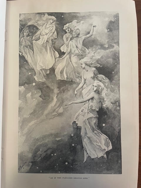
By John Reinhard Weguelin
I loved the subject here, and the haunting feel of it. The artist was J.R. Weguelin, who was primarily known for his dreamy watercolors and oil paintings, though he supplemented his income by slumming to draw masterpieces like this one for magazines.
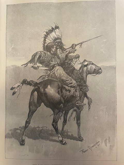
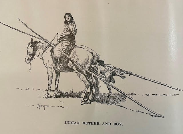
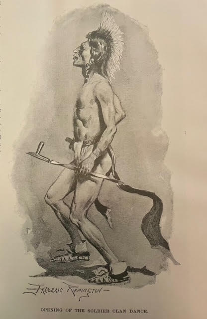
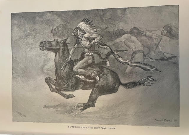
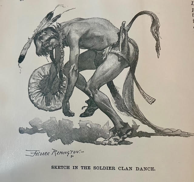
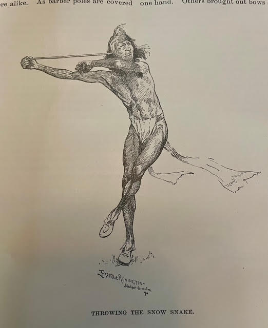
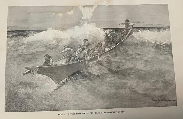
When I came across a simple article about Native Americans, I couldn’t believe I was seeing an original Frederic Remington illustration there just as a picture for a magazine. Then another. And another. These seven images are all by Remington, and they’re all beautiful. He was known for paintings and drawings mainly depicting the American west.
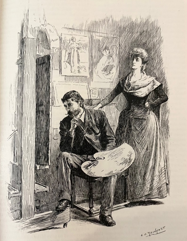
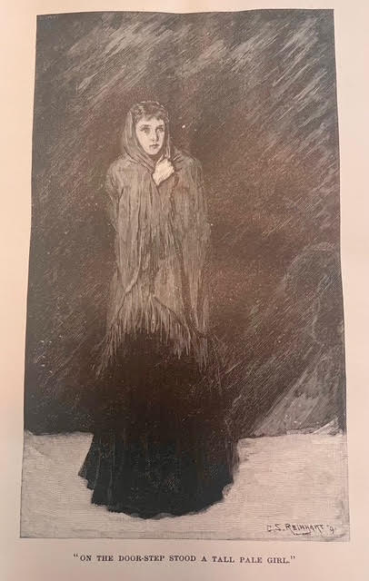
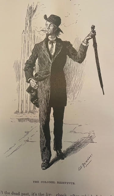
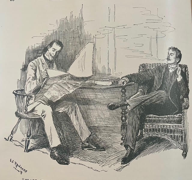
These three were all by Charles Stanley Reinhart, an American painter and illustrator who was also responsible for artwork on certain silver certificates commissioned by the U.S. Bureau of Engraving and Printing said by many to be the most beautiful monetary designs ever produced by the United States. That last image, of the two guys sitting and smoking is an absolute master class in pen & ink linework. I struggle in my own drawings to avoid outlines, to use contrasting light and dark for the silhouettes, and to choose the right directions for hatching that don’t distract from the shapes and mood. Reinhart entirely nailed it with that one.
These two were by Edwin Austin Abbey, an American muralist, painter and illustrator known most for Victorian and Shakespearean subjects. Perhaps most dear to our hearts at Grailrunner, Abbey was the artist behind the famous “Quest and achievement of the Holy Grail” murals at the Boston Central Library.
I really loved these two, as they independently stuck out for me on their own merits before I realized they were by the same artist and in fact, an artist whose work I thought I knew. Charles Dana Gibson was an American artist typically cited as being the creator of the “Gibson girl”, the iconic representation of the independent American woman at the turn of the 20th century. I think that puts the poor guy in a box that is unfair, as his composition, linework and hatching are among the finest of his age. He did a little more than ads with girls in them. Seriously, these two images are firecrackers!
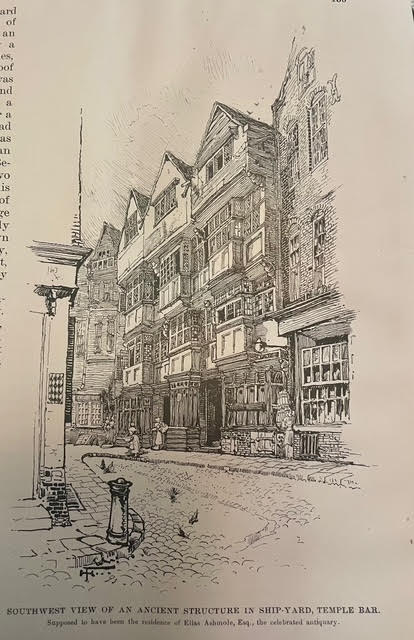
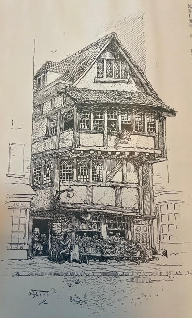
These two architectural pieces just made me stare in awe. I can’t draw buildings, no matter how careful I am. They always turn into heavily lined, overly simplified, often leaning, caricatures of buildings. Not my thing, unfortunately. But these two by John Tavenor-Perry (at least I think so) are masterworks. ChatGPT couldn’t do anything with that weird signature (looking like a stylized rune but supposedly initials). After some heavy back-and-forth, I think we landed on a likely artist though I’m open to correction.
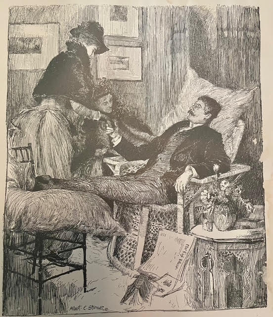
By Albert Sterner, this piece is a treasure-trove of hatching. I love it. Somehow, he’s managed to keep all these disparate elements in the composition cleanly segregated: the ladies and the cushion, his legs and vest, the flowers, the chair, shadows…all of it clearly silhouetted and easily read despite being a jumble of things. No way could I have figured out how to get all that detail into a drawing without feeling I needed to strip it way down so you could tell what it was.
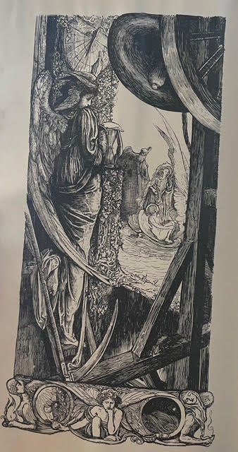
And now finally, the mystery piece.
This one.
I was mesmerized. It accompanies a poem by James Russell Lowell titled “His Ship”, appearing in the December 1891 issue of Harper’s Magazine. No credit given anywhere, including the “Editor’s Drawer” where many other attributions for illustrations are provided.
The signature is maddeningly concealed in the drawing. I think. Hard to say if that’s a signature or not. Here’s what I mean:
Anyway, I contacted Harper’s in case somebody’s maintaining an archive of some kind to help identify the genius who did this. It’s gorgeous. If I get any kind of response or make headway on the identification, I’ll come back and update you.
*
But that’s what I wanted to bring you today. Masters of their craft in the golden age of illustration, doing what they did and generating timeless works of art. For whatever reason, and not just as an aspiring artist myself, these drawings are unearthly and hypnotizing to me.
I have some marvelous freebies for you today, so stick with me.
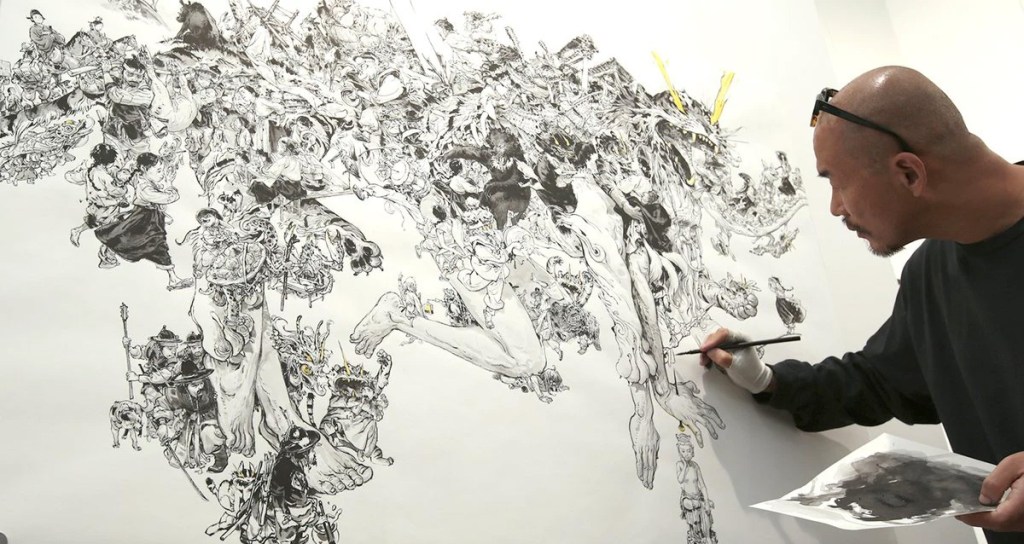
I’ve been burrowing into a particular rabbit hole these recent weeks, studying and practicing traditional pen & ink drawing. It started with this:
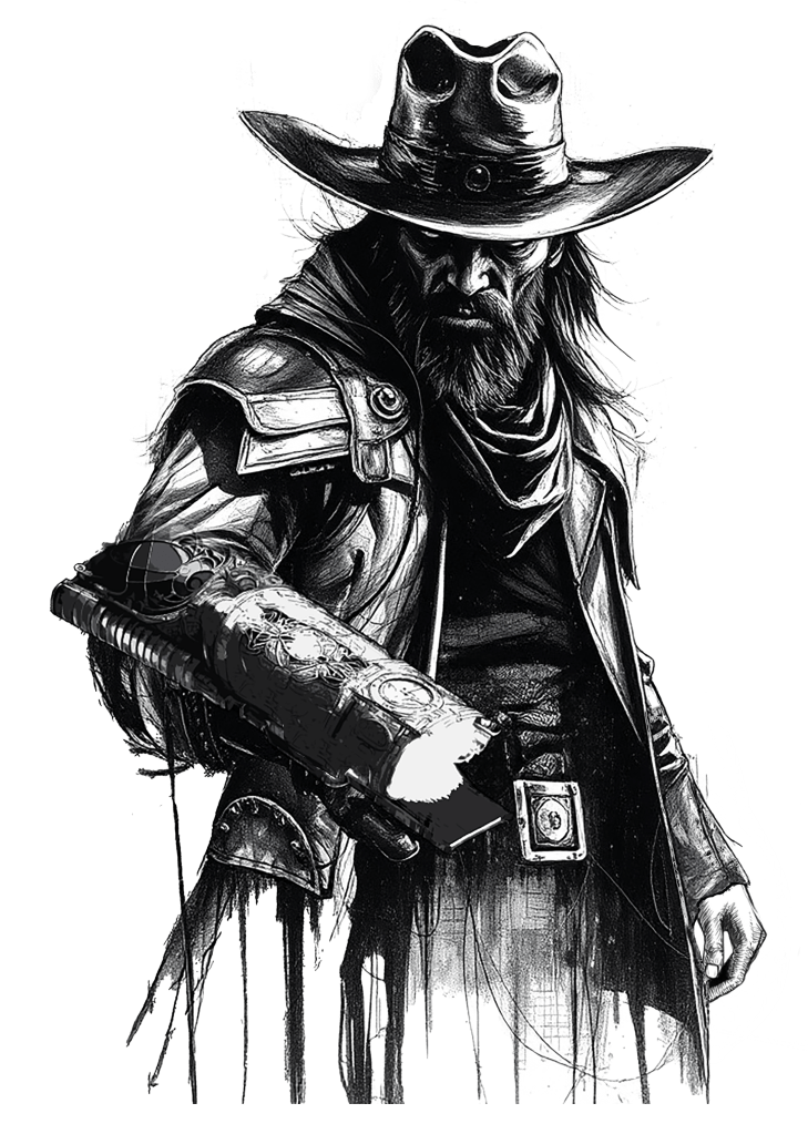
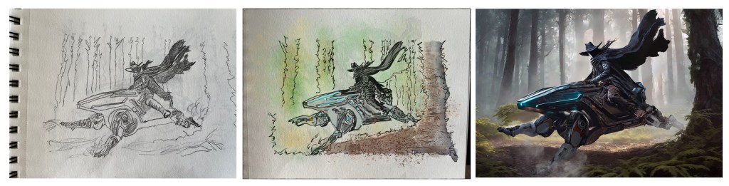
That’s interior art for SALT MYSTIC: BOOK OF LOTS. I did it, but I cheated. The base gunslinger was a couple of AI-generated pieces, drained of color and mashed together, cleaned up a bit, and mashed into an original 3D render of the plasma weapon on his forearm. I composited all that into the one image for a splash page as you first open the book.
But it got me thinking that this idea of grungey ink drawings as interior art looks really great and could be a nice distinguishing factor in future Grailrunner books. So I started practicing and studying the great ink masters (which you can read about here) to hone my craft and work directly Pigma Micron and Pentel Brush Pen on paper. No blending modes, no AI bases, no 3d paintovers or stock image composites. No digital tricks at all. Just pen and ink and paper and the satisfying swoosh sound that makes.
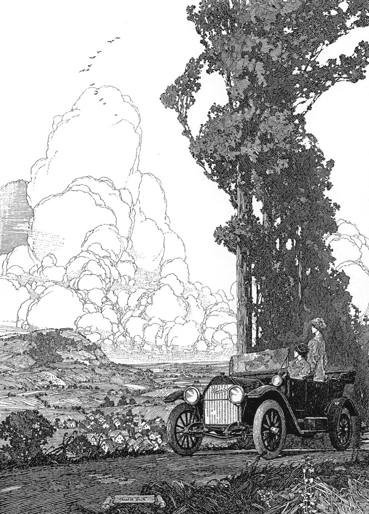
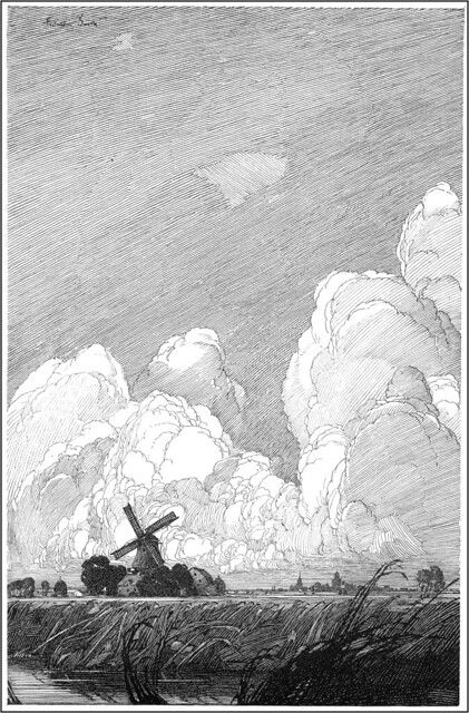
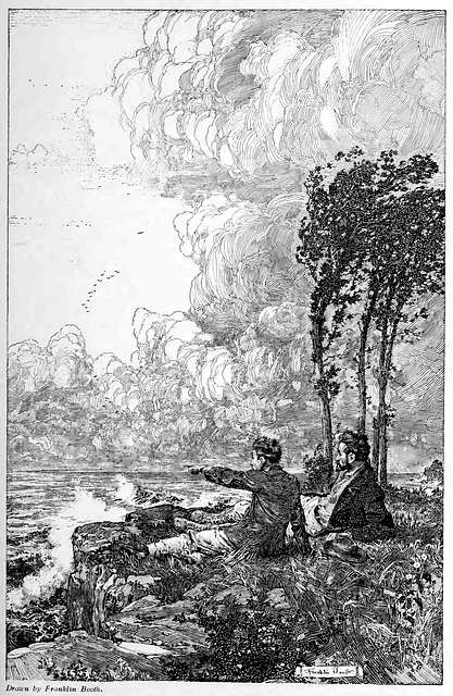
It’s a life changer, honestly. But anyway, it led me to Bernie Wrightson and Sergio Toppi and the guy I want to talk about today: Franklin Booth.
I’d ask you to keep in mind that the pen & ink artist has exactly one way to generate values and shadows, and that’s with black marks. Usually, lines. If they want shades of gray, they draw lines.
Like this:
I mean, just take a look at some of those drawings by Booth! The patience and craftmanship is insane! Honestly, I wanted to learn more about the guy and found that it’s kind of difficult to do that. He didn’t make much of a splash with his personality or how he lived his life – just with his work. Here’s a great, though short, overview of him and his work on Youtube.
We’re also several posts in to a new ongoing series here on Grailrunner called CONVERSATIONS FROM THE ABYSS where we’re applying AI tools in some innovative ways as a sort of experimental lab. That got me thinking I’d like to read a decent, illustrated biography of Booth and get to know him a little better, mainly to understand his influences and how he learned to do what he did. So I had ChatGPT write me one and it was terrible. I asked for a 50k word detailed biography and got slop. Seriously, at one point I even asked it why the final product was so bad when it suggested we work section by section in much shorter passages with me approving things along the way.
I tried iterating section by section, making my own suggestions as we went till it started to take a kind of shape that might be worth reading. Then I scavenged the internet and the Internet Archive specifically to grab public domain images that were either referenced in the sections or appropriate to the time period being described, all done by Booth himself. We’re not selling you anything here – the final product will be the last download button on this post. I included them as well throughout the text.
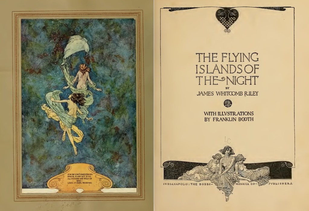
In all that, I learned about the fantasy play he illustrated titled Flying Islands of the Night by James Whitcomb Riley, which you can peruse below by smashing the splash page below. It’s vintage beauty at its finest.
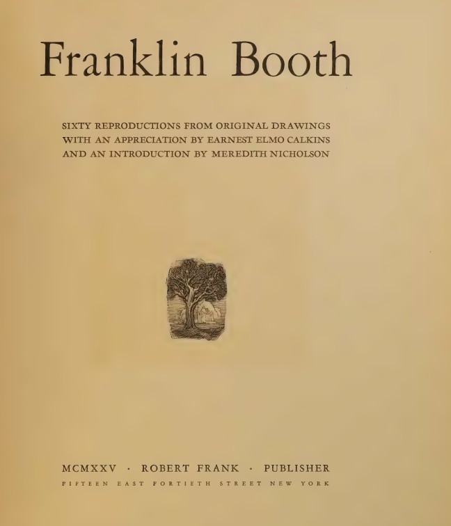
I found a scan of a 1925 book containing 60 reproductions of Booth’s drawings with sourcing and titles, details which are almost impossible to find on the internet (as everyone just posts the pictures out of context). That’s available by smashing the title page here:
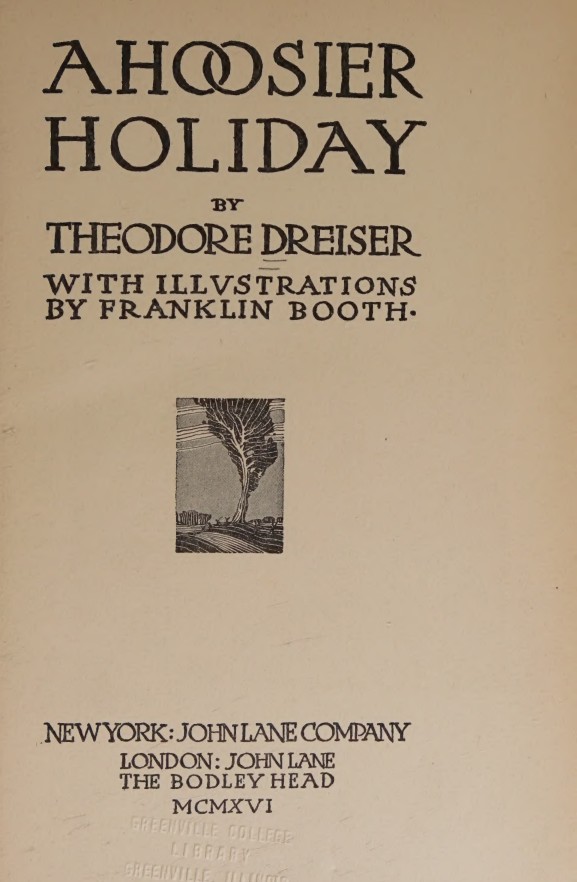
And here’s a real gemstone that I found which took on an entirely different function than its author intended: a 1916 travelogue written by Theodore Dreiser where he went on a road trip with Booth himself! It’s called A Hoosier Holiday, available by smashing the title page button below:
Where Dreiser thought he’d describe the trip and his musings along the way, I found an intimate and first-hand means of hearing Booth’s exact words, descriptions of his facial expressions and the fact that he ate all the popcorn he could get his hands on, things and sites he found interesting, and even charcoal sketches he made along the way. I found Dreiser to be an arrogant nuisance, but Booth seemed genuinely like a guy I’d road trip with. I liked him even more after reading it.
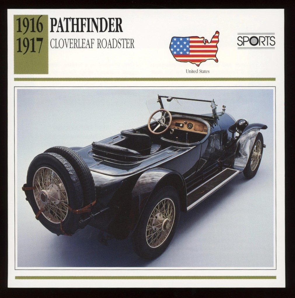
It was Booth’s 1916 Pathfinder, by the way, which he paid $3k for ($100k in today’s money), and they had a chauffeur as well. Booth was doing pretty well for himself, it seemed.
Quick and painful anecdote – ChatGPT was including factual errors. Some were easy to find, like a bold statement that Booth never married when that was demonstrably untrue. It provided several explicit quotes, which I asked it to source. Each time I called out something like that, it bailed and said it made those up. I think that’s my fault, as I’d named some historians I like as the basis for the voice and tone the software should take to write the text, and it took that to mean it should hallucinate.
Anyway, I wanted to find and include Booth’s very first published illustration. Turned out, the first amateur publication was in a newspaper, which I found in a publicly available scan and screenshotted to included in the book. That was a great find. But ChatGPT was telling me his first professional published work was in a trade magazine called The Inland Printer. I eyeballed 6 years worth of that stupid magazine and found zippo from Booth, eventually going back to call ChatGPT out on that as well. Sheepishly, it admitted that internet claims suggest he appeared in that magazine but since I’d looked and couldn’t find it, it supposed that was incorrect.
But the book I wanted to read was taking shape and becoming something worth spending time reading. The illustrations were helpful and interesting. I liked what I was getting, but it needed one final flourish.
I asked Booth to comment on his own biography.
By instructing ChatGPT to analyze everything we knew about Booth’s personality and values, I asked it at last to speak in his voice and comment on the book we’d produced about his life. That’s the final section of the book.
What a great journey that was! I really enjoyed the immersion and learning about this fascinating guy. Take a look and let me know what you think.
[UPDATE July 8, 2025]
I found myself in Indianapolis for business and with a half-day free, so I drove to Carmel, Indiana to the boyhood home of Franklin Booth, which is listed as a historical site though also is still a private home (in surprisingly good shape). It’s super close to a beautiful downtown, in fact walking distance…a quiet and cozy neighborhood with no sign whatsoever that a famous artist lived and worked there. Not even a plaque.
And I understand the backyard shed was where he maintained the workshop which he visited every summer and completed so many of those famous works I’ve highlighted here.
A year ago, I wrote here about the worst art advice I’d ever gotten, and I posted pages from my sketchbook at the time to stay accountable in some way for improving. It turned out kind of popular, maybe out of the general public’s desire to see car wrecks in motion. Those pages were fairly early in getting back to traditional art versus digital and were mostly pencil work with some light-table ink drawings. And by light-table, I mean tracing things and so…cheating.
I updated you guys in November with some more pages and then again a couple of months ago (bottom of the same post). Those include watercolors, some digital stuff in Procreate, and also ink drawings. Somewhere in all of that, traditional pen & ink drawing kind of caught fire with me.
It’s kind of all I can think about these past couple of weeks. Those delicious hatching lines and stipples, deep, gorgeous washes of black, and intricate patterns of black and white condensing beautifully into a striking, eye catching work of art! It’s all very satisfying, if I’m honest. And the feel of a Pentel pocket brush pen swishing on toothed paper feels a little like watching somebody make a chocolate cake, almost mesmerizing.
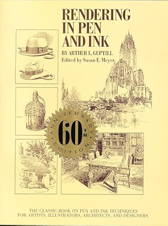
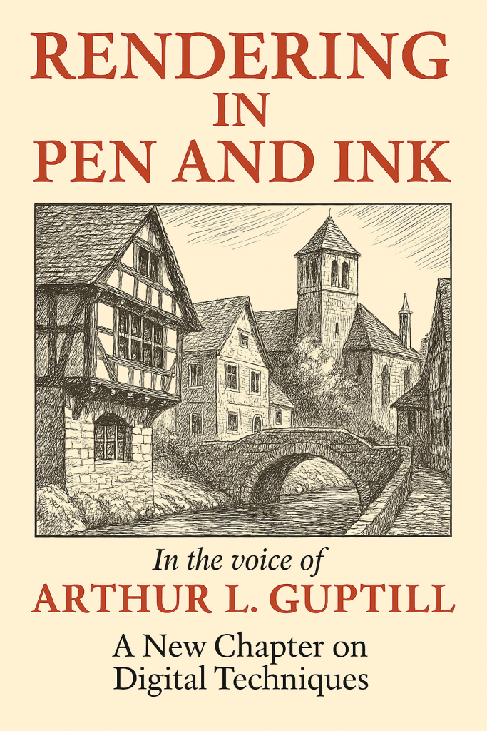
I found this amazing resource free on the Internet Archive (smash the cover image to take a look for yourself):
Written by Arthur Guptill, this is a classic instructional book on pen and ink drawing, widely regarded as one of the most comprehensive and authoritative resources on the subject. His writing style was patient, articulate, and he was clearly a master of clean, simple line work and exhibited craftsmanship in how he approached both drawing itself but also how he framed his instruction materials. The guy was a natural teacher.
I was approaching my learning by a combination of master studies and daily practice, at first using a Copic alcohol marker for shading and eventually moving to just the brush pen and Pigma liners to focus on learning hatching and cross-hatching.
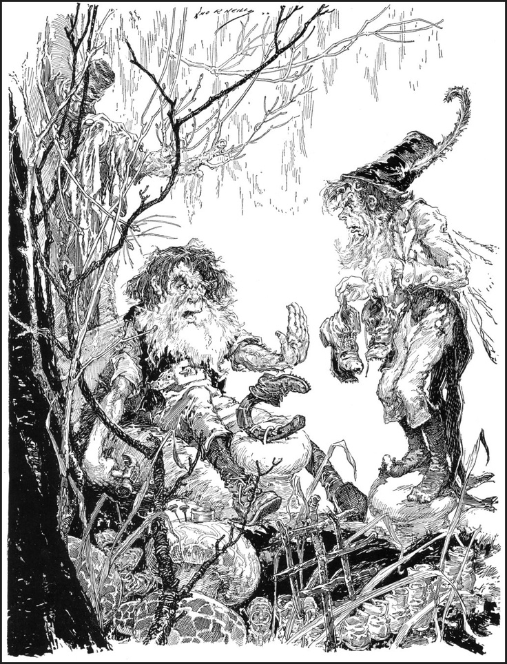
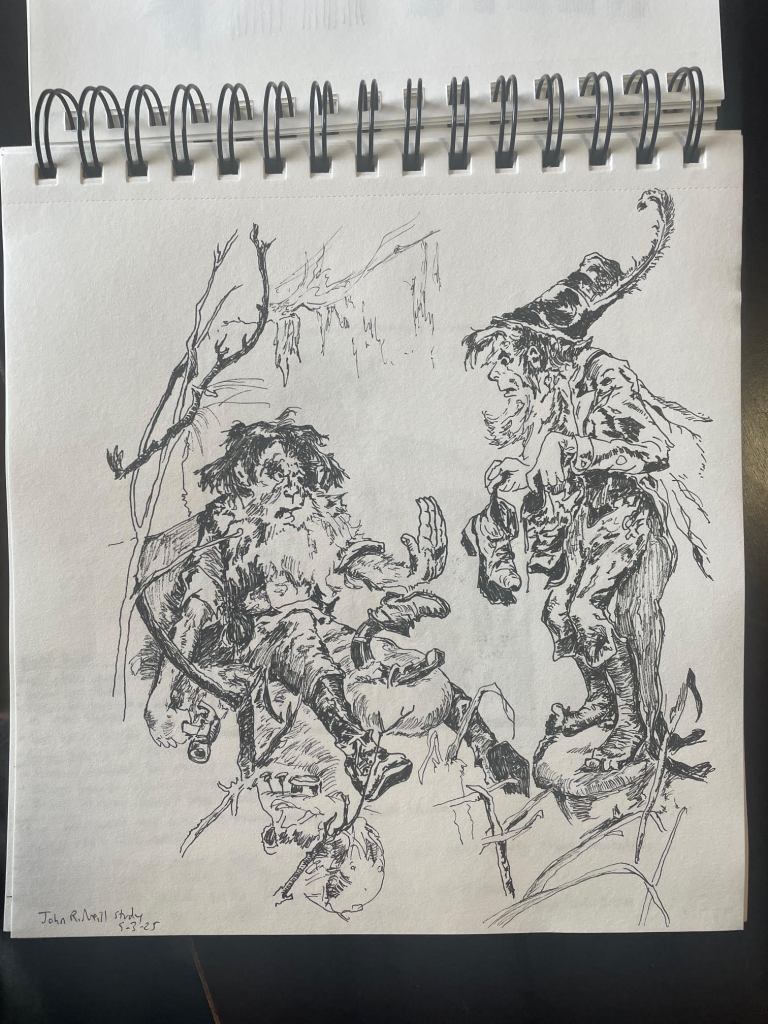
Here’s an example, a dazzling piece called “The Cobbler”, by John R. Neill:
I learned quite about overlapping structures for depth, clean linework, effective use of contrast, and detailed volumes just by copying this thing.
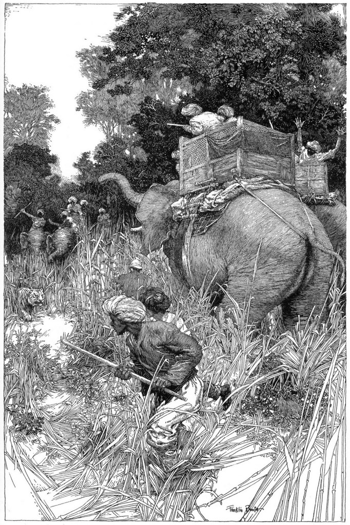
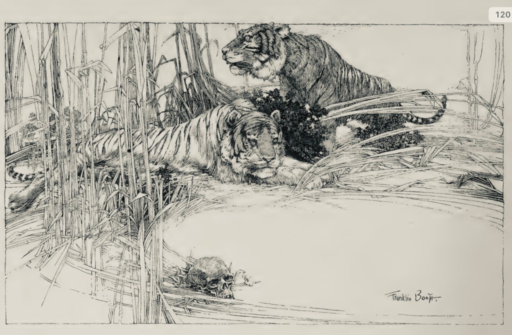
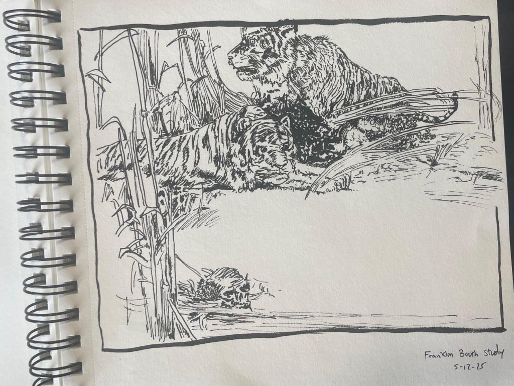
Here’s another study, by Franklin Booth – a real beauty he titled “Hunting The Tigers”:
Loads of things to absorb by this one regarding overlapping structures, use of negative space, balance of value, simulating water in black and white, and fur textures with ink. Honestly, I’m not happy at all with my copy, but I was being ambitious.
Anyway, we’re four articles in to a new series titled “Conversations from the abyss” where we use advanced AI tools like ChatGPT and also Suno music generation to bring back creators from the past for interesting debates, dialogues, or other entertaining diversions. Nothing for sale – all available free here on the site. It struck me this past week that it would be amazing if I could receive art critiques directly from Arthur Guptill as I’m practicing various bits and bobs I’m learning from the master studies and other practice drawings.
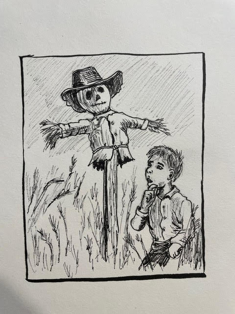
I’ve got a soft spot for Frank Baum’s OZ books and thought an image of a young Baum coming across a scarecrow in a field and pondering it with his wild imagination might be an interesting image for ink practice. I gave it a shot, then uploaded it to ChatGPT and tested this prompt: “Acting as Arthur Guptil, critique this image and provide guidance on how to improve it.”
Here’s what happened, and it honestly blew my mind:
“You have achieved a fine effort in line drawing, and there is evident care in your composition and subject choice. The nostalgic theme—a young boy in thoughtful contemplation before a scarecrow—is charming and well-suited to ink. Now, let us refine your rendering through a few key observations and recommendations:
1. Line Quality and Variation
Your line work shows promise, but greater variety in line weight will enhance dimensionality and focus. At present, the lines are largely uniform, which causes elements to flatten together.
Suggestion: Use thicker lines for foreground elements (such as the boy’s arm or the hat’s brim) and finer, lighter lines for background elements like grass or sky hatching.
Vary the stroke pressure as a tool of emphasis and mood. For instance, a light cross-hatching for distant tones vs. a bolder hatching for areas of core shadow (beneath the scarecrow’s hat or the boy’s jaw).
2. Compositional Framing
The rectangular frame is sound, but the internal balance feels slightly off-kilter. The scarecrow dominates the space while the boy feels pinched in the lower right.
Suggestion: Consider either enlarging the figure of the boy or repositioning him slightly more centrally. Alternatively, allow the scarecrow’s arm to lead the eye toward the boy in a more deliberate diagonal.
3. Rendering Form and Volume
The scarecrow reads clearly as a simple form, but the boy’s anatomy, particularly the arm and face, could benefit from more structural understanding.
Suggestion: Study the planes of the face and arm. The boy’s head could use slightly more cross-contour shading to indicate roundness. The hand, though expressive, lacks clear articulation—gesture drawing practice would help here.
4. Textures and Detail
Your use of short, broken strokes to indicate vegetation is appropriate, but the grass and shirt material begin to blend. The shirt on both the boy and scarecrow could use more definitive folds to suggest fabric tension and weight.
Suggestion: Use parallel or directional hatching that follows the form of the fabric. Avoid over-randomized strokes, and let texture be a deliberate compositional voice.
5. Background and Spatial Depth
The background is composed primarily of evenly spaced hatching. While this is functional, it does little to suggest depth or atmosphere.
Suggestion: Introduce a subtle gradient to the background by controlling your stroke density—more hatching at the top or corners to create a vignette or atmospheric recession.
Final Encouragement: The spirit of your work is admirable and speaks to a narrative sensibility. With improved control of line, deeper understanding of structure, and refined use of contrast, this drawing could serve as an excellent illustrative plate.Keep your pen in motion and your eyes ever studying!”
*
I mean. A dead guy just gave me really precise feedback on my drawing, recognizably in his voice and noticing very specific things in the drawing! I got compliments that were specific and not vague exhortations. I got clear, explicit guidance on what exactly I could improve. Not generalities. It was, and I mean this, very helpful.
Now, you might be thinking – “Dude, you’re a chicken letting the wolf teach you how to protect the hen house. AI is going to replace artists entirely; why use it for art instruction if you’re encouraging people to use it at all, they’ll just generate the images directly. Why even learn to draw?”
All of that is, of course, nonsense though, isn’t it?
If we get fat and lazy and stop creating, then the images that AI tools use will become instead of crisp white and deep blacks, just an increasingly bland mush of grays…monotonous and uninspired. AI outputs will become AI training datasets, leading to a downward death spiral of junk art. I don’t want to add to that. I want to make new things, man. New things! I see critiques from long-dead art instructors as yet another powerful tool for me to do just that.
I asked for a new chapter to Guptill’s book for digital inking, by the way, which is available free below (and entirely and recognizably in Guptill’s voice):
And yeah, okay, it’s time for an accountability upload of the latest sketchbook entries here (be kind!):
That’s what I wanted to share with you today. Pages 19, 20, and 21 especially benefited from pseudo-Guptill’s instruction, and I gave it all I had to incorporate to the developing pieces what it was telling me.
All this has me wondering – just who else can I get to critique some of this and help me learn quicker? Maybe Leonardo Da Vinci is up next!
Back in May, I posted some musings on this site about what I called bad art advice that I’d gotten when I was in Middle School.
“The real world doesn’t have outlines – draw what you see.”
Weird, I know, but I struggled so much with that I gave up drawing altogether. I get that it should be straightforward advice that every burgeoning artist SHOULD in fact receive and, indeed, follow. I get that it’s true and obvious and OUGHT to have been helpful. Just wasn’t how I reacted, unfortunately.
I’ve come to realize that is just a first step.
I recounted how back in October 2023, I’d come across a lifechanging book series called Sketching From The Imagination and an art magazine called ImagineFX that had me rejuvenated to start it all over again, on fire with cool pictures in my head and a spirit to truly give it a go this time. I shared my sketchbook at the time (shudder!) a little over a half-year in, to be accountable to folks here for improving.
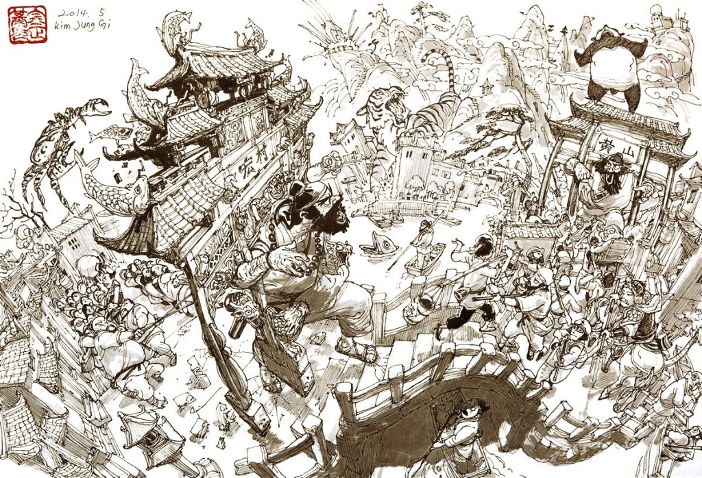
Another phase of things had opened up with an enlightening quote from the genius artist, Kim Jung Gi that said:
“Don’t draw what you see. Draw what you HAVE seen.”
I liked his emphasis on practicing reproducing reference images, only from different angles and perspectives so you can learn their forms in three dimensional space. Over time, your visual library carries enough shape and texture language to work directly without reference. Very nice. You see, I have a complicated relationship with the use of reference images in creating art. The dream has always been to sit down with a piece of paper or a blank screen and summon fantasy and science fiction imagery from nothing – not to robotically reproduce an image in front of me. Over and over, every artist I was seeing on Youtube or reading in interviews, they were all using reference images. I had this inner voice saying “if I wanted to reproduce an image, I’d take a picture of it”. Kim Jung Gi’s advice offered a different relationship with reference imagery.
So it’s been over a year now. Keeping up the practice frequency to at least a half-hour each night if at all possible. Even when I’m bone tired after work and would rather stare at history documentaries or old spy movies (or train movies -those are awesome).
Anyway, somewhere along the way, this happened:
Don’t ask, my friend. I just thought I’d try watercolor painting and this guy showed up. I call him Barney. My first attempt. I hadn’t planned on getting obsessed with watercolors – it was Peter Han‘s fault. Was watching Peter draw something amazing, and he pulled out a little travel palette set. The smooth and striking combination of ink and colored wash fascinated me. Strangely, as I submerged into the very deep and mesmerizing well of watercolor painting in magazines, books, interviews, and tutorials, a new, possibly ultimate and final step has started to take shape.
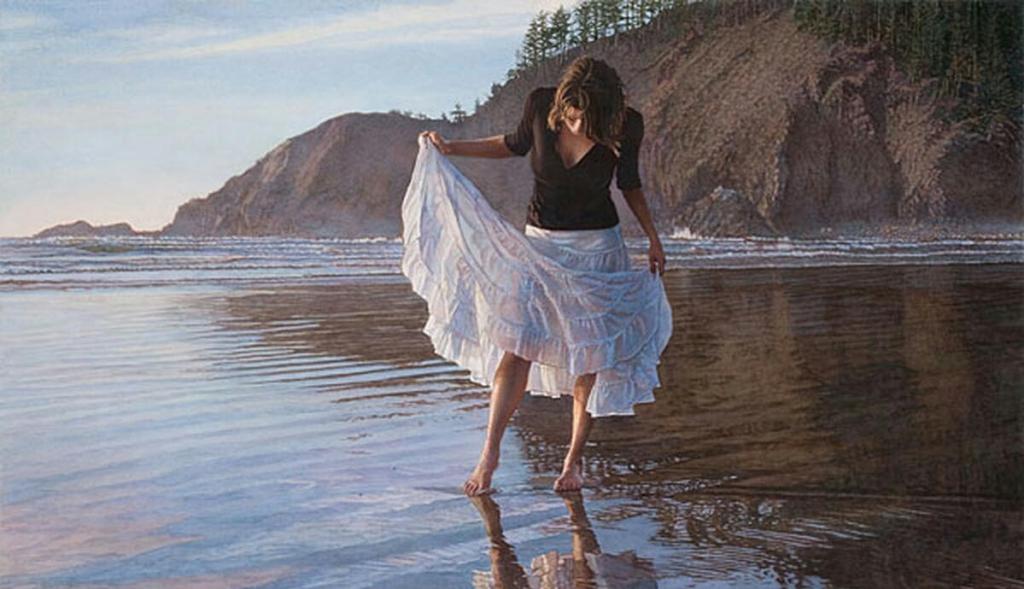
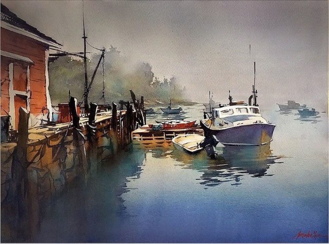
Watercolor pigment does what it feels like doing on the paper. It moves around. Crashes. Blossoms. Ignores your feeble mortal attempts to control it. But it makes incredible gradients and blooms and textures like nothing else. And its mightiest trick, almost its entire reason for being, is to capture light. I’m talking about the translucency of a green leaf in summer with sunlight bleeding through, the broken sunbeam dancing on a marble floor, the ghostly and serene reflections of clouds and seafoam on the beach once the wave goes out. Google “Steve Hanks” and Thomas Schaller to see what I mean.
Reflecting on Indian Beach (Steve Hanks)Foggy Morning – Maine (Thomas Schaller)
The more this got in my head, the more I began to realize there even WAS a third step to this process. I’m not there yet, but I think I can see it taking shape. If I hadn’t started paying so much closer attention to light filtering through trees or bathing morning fog in an orange glow because of all this focus on watercolors, I’d have missed it, I think. This final quote that crystalizes what I’m seeing has popped up a number of times now, so I’m not sure who started it all. It’s a boneshaker though, that I’m still trying to coax into being my buddy:
“Don’t draw what you see, draw what you feel.”
Now that’s an entirely different way to interact with reference imagery, isn’t it! Snapping a picture in the moment during a hike or on the train freezes one of those haiku moments for you, sure. Cobbling together some stock images and a DAZ3d render or a photobash of some AI-generated elements can put together a good and unique composition, of course. And in that first step, you can practice your technique, reproducing it as faithfully as you can.
At some point though, Gi’s second step suggests you vary the angle, maybe reproduce it from above or from a different side…maybe with an armored zebra beside it, or a screaming werewolf. Mess around and don’t stress about perfection, right? It’s a sketchbook; what do you care if every other one turns out trash? Forms start repeating for you: the fact that eyes aren’t really ovals, that lips and noses and hair cast shadows, and that people almost never stand vertically straight on both feet. That sort of thing.
But then, when you’ve maybe gotten to a point where you can somewhat faithfully reproduce an image with variations and additions, with subractions, and perhaps even can summon something to the page entirely from memory and imagination, another step opens up for you.
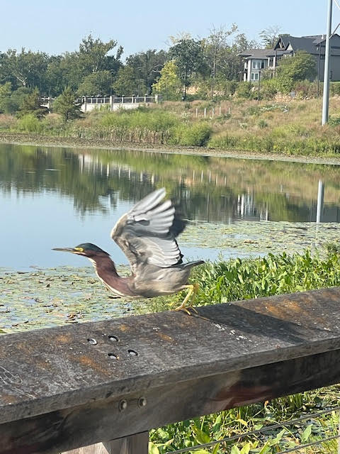
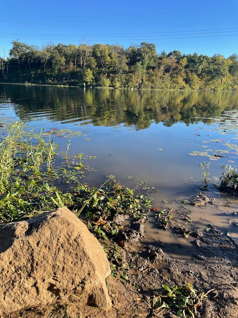
Those are pictures I’ve taken in various spots this summer in Kansas City, Cades Cove in Tennessee, and at Destin, FL. You’ve probably got ones like it on your own phone, those images that caught your eye and made you feel something. A foggy morning, a quiet library with the sunlight streaming off a high window, a busy subway station or airport with interesting faces, or maybe a funny face your dog made. It made you feel something, so you snatched it to stick in your pocket.
That’s the third and ultimate step in art journeys, I think: to capture what you feel on the page. The reference becomes almost beside the point. I’m still working this out for myself. Maybe these musings prod something for you if visual arts are at all of interest to you.
Since some folks appreciated the first uploaded sketchbook, here is an update (paper sketches 1-3, watercolors from 4-13, Procreate digital art from 14-17):
Crazy busy year. I hope yours has gone well. For my part, I’m glad Christmas is on its way. That particular crazy freight train is more than welcome this year.
(Update Mar 2025)
And, in the spirit of accountability to improve, here’s an updated sketchbook of what I’ve been up to since this post went up (watercolors on pages 1-8, Procreate sketches pages 9-18, and physical sketchbook pages 19-24):
I lost over thirty years in my art journey because I (stupidly) took a wrong turn based on what should have been great advice. Let me tell you about that, how exactly I went off the rails, and what a ridiculously talented Korean artist said that got me back on the journey.
If you care about the process of visual creation, whether it’s you doing the creating or just a spectator’s interest in how all that works, then this one’s for you.
Why does this matter?
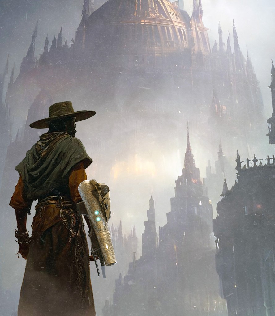
Crap, man, I’d like to be thirty years better in drawing and painting! I hate that I stepped away for that long. I’m the chief illustrator for Grailrunner, and its lead writer, and its game designer. I need to get a lot done myself to control costs, but somehow keep a high standard on quality of art to convey the unique (we think) property we’re trying to build with the Salt Mystic line.
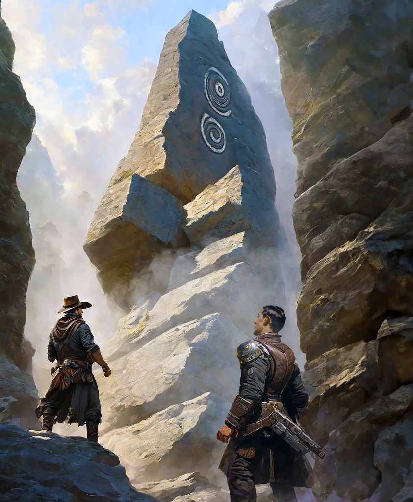
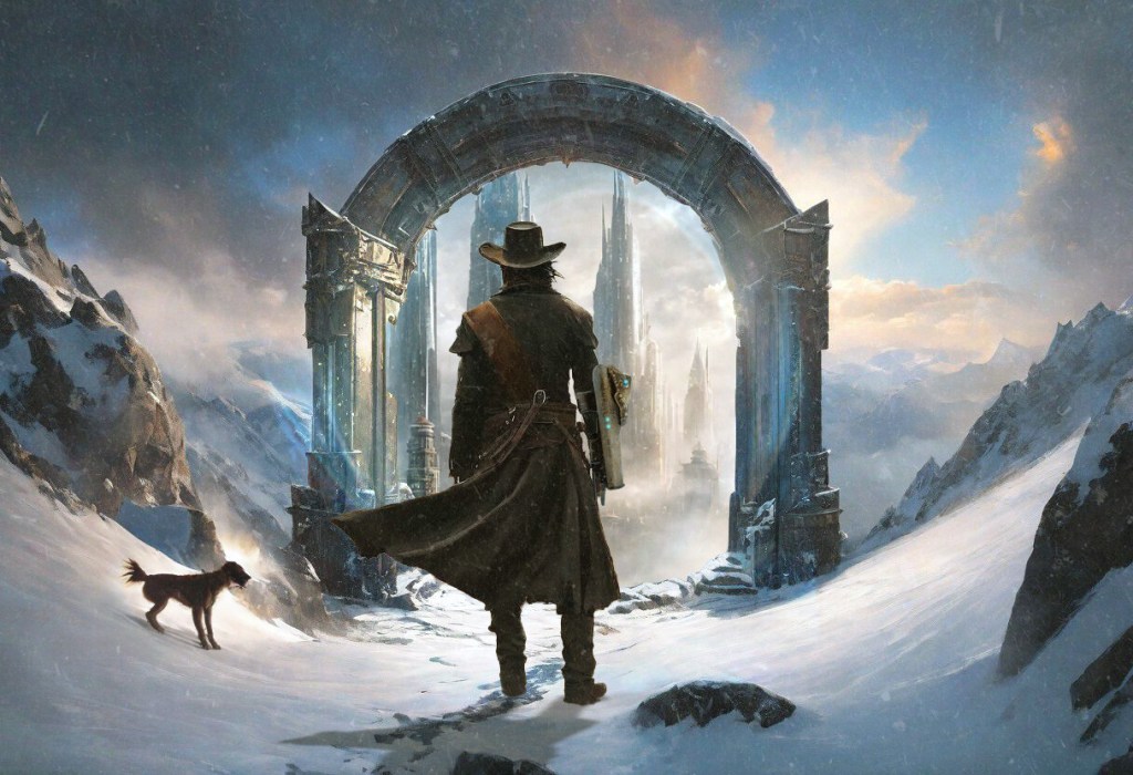
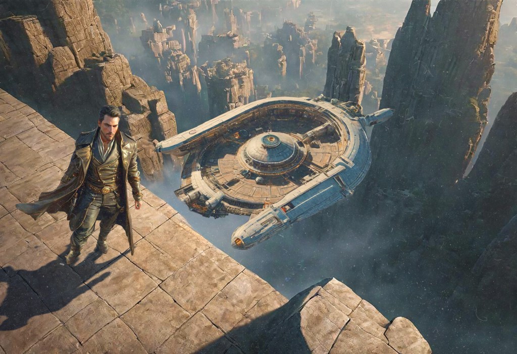
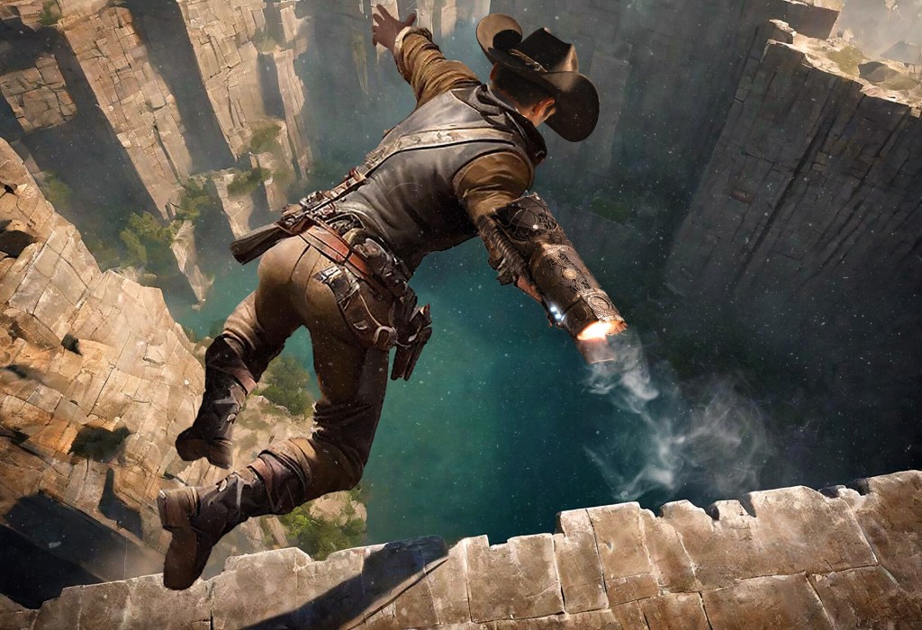
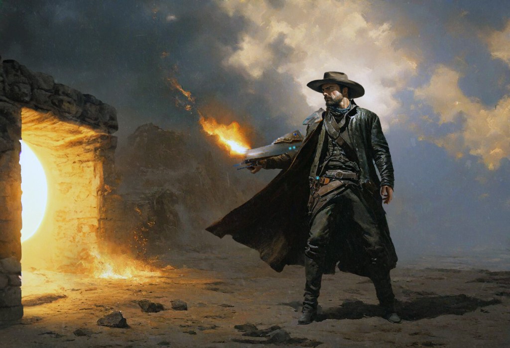
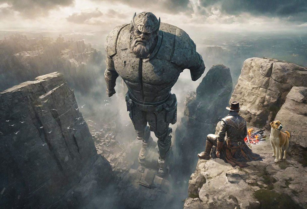
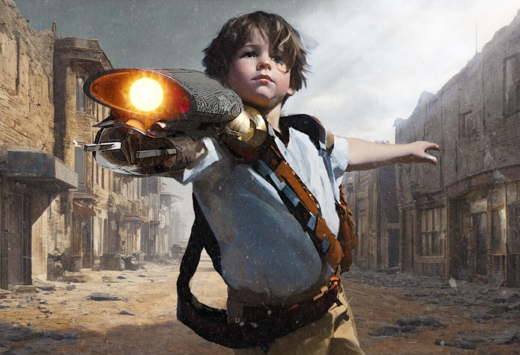
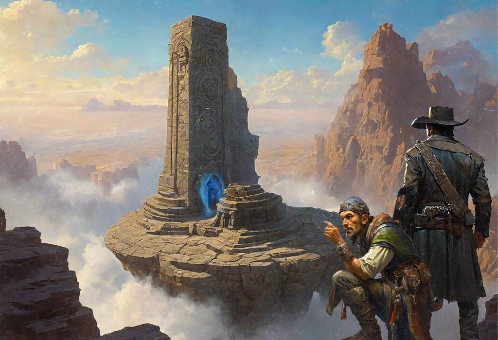
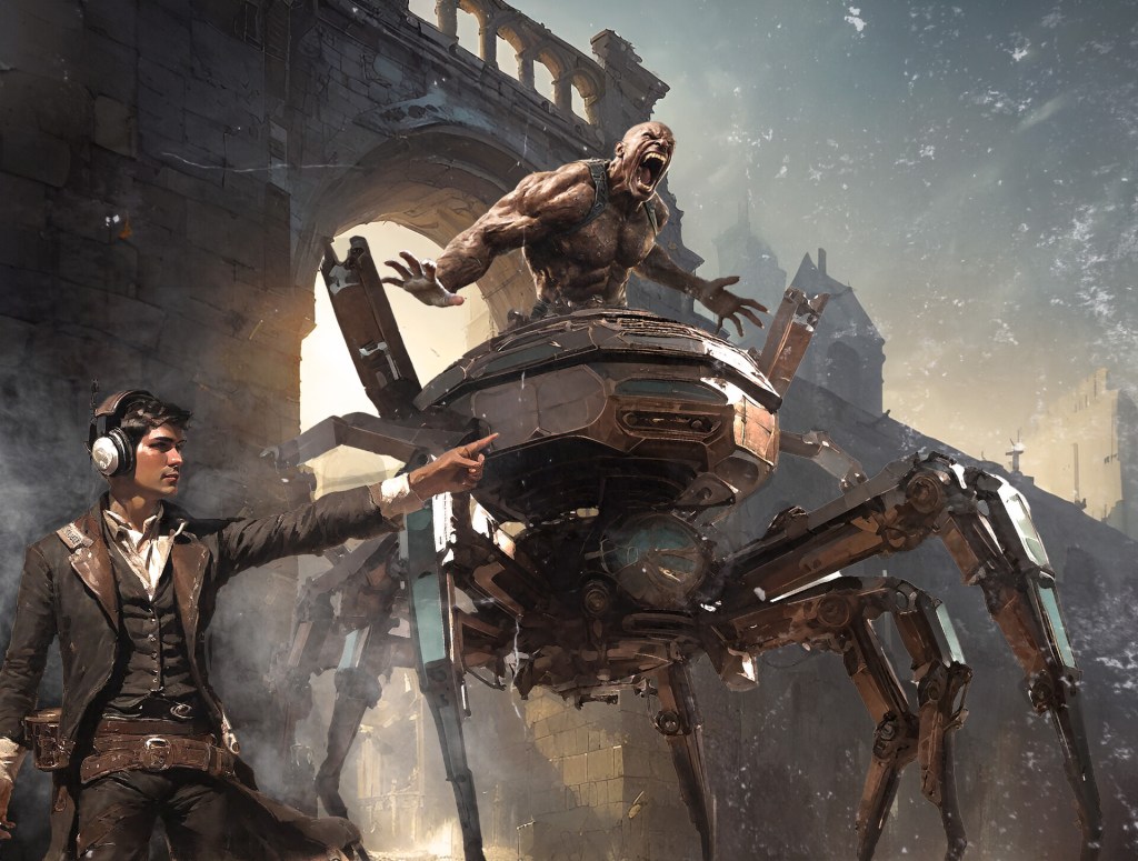
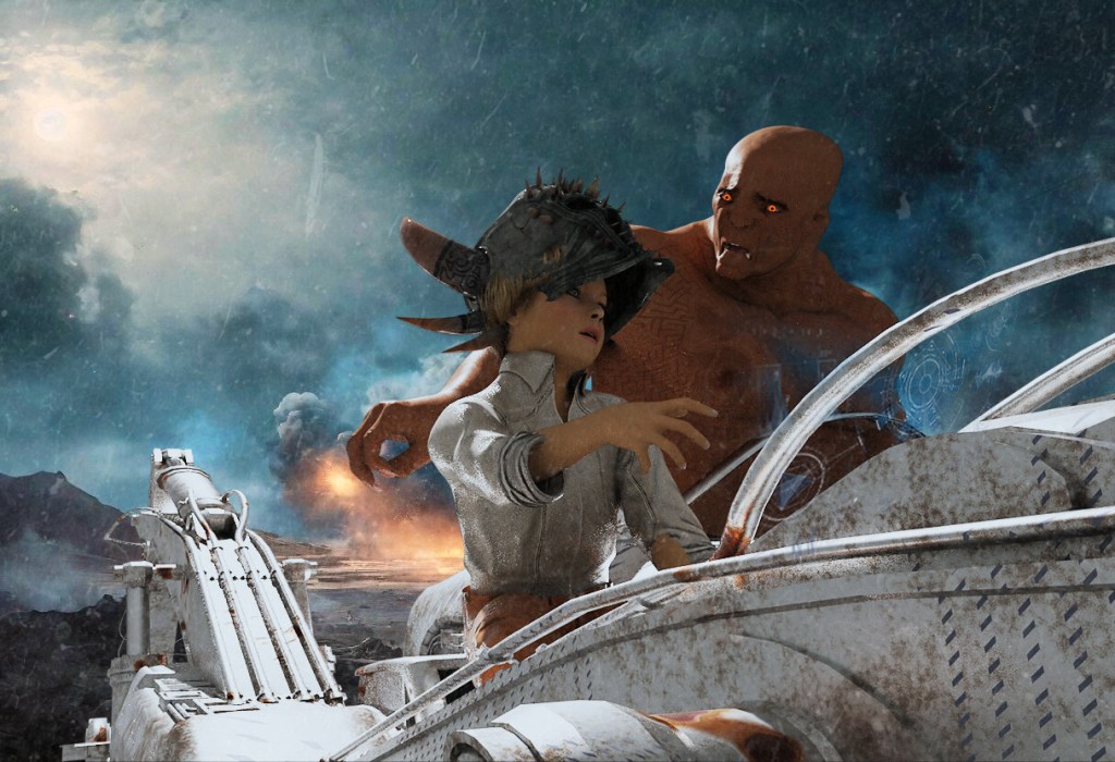
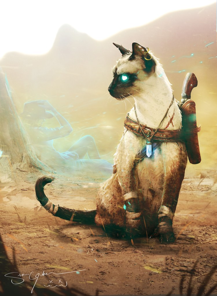
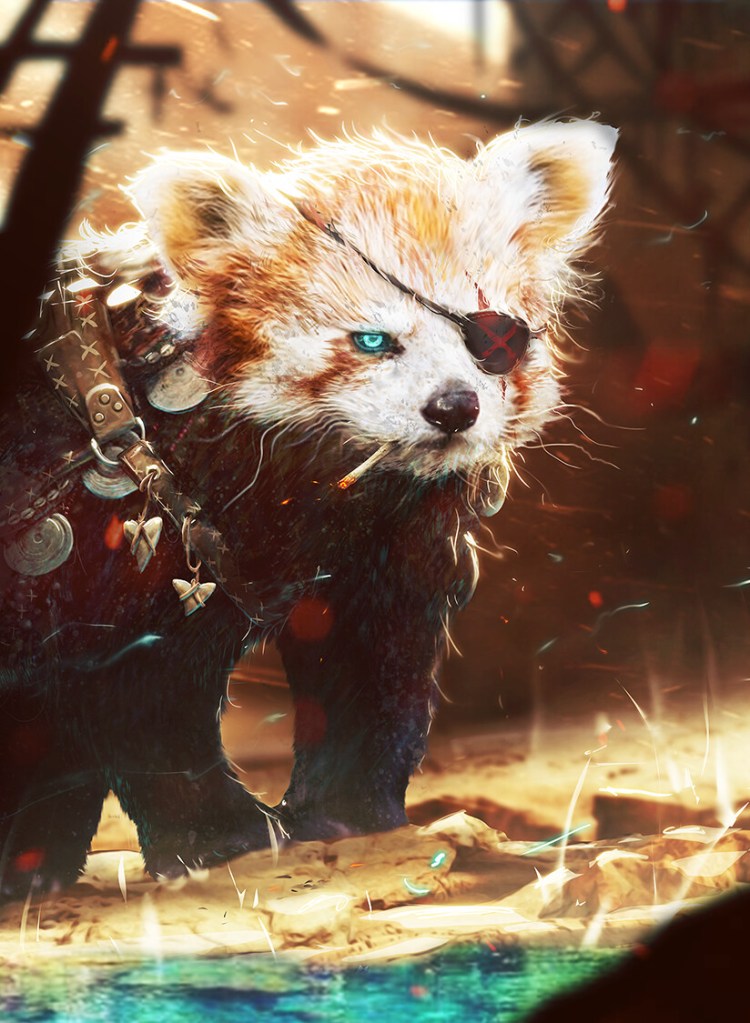
The images below represent the style of work I’m building these days, relying heavily on photobashing and concept art techniques (with folks like Imad Awan as my virtual gurus). The Grailrunner house design standard is semi-realistic digital painting with grungy overlay, western themed adventurers almost always carrying the signature weapon (a gauntlet-based plasma weapon that doubles as a shield in duels), exploring statue-riddled, software-haunted ruins with shimmering dimensional portals. We aim for vibrant or earthy colors, lots of smoke and grit, with implied stories (often illustrating flash fiction on Salt Mystic lore cards).
See the lot of them (and trace my hopefully improving style) at the Artstation account. Yes, I use AI-generated bits to composite exactly like I do with stock images but generally composite everything into something new and paint over them such that the transformation is meaningful and my own.
It gets the job done, at least I think. Still, I wish they were grittier. I wish they broke more new ground than they do. I envy the striking shapes and designs of a lot of concept art out there for cinema and gaming – the kind of images that stick with you even if you don’t know the context. Artstation is great for inspiration, but it can also crush your dreams if you compare yourself to anybody.
What’s prompted this reminiscence about bad art advice?
Well, I came across this book called Sketching From The Imagination: Sci Fi by 3DTotal Publishing. I wrote about it here. That was October, which seems like an eternity ago. I posed for myself the challenge of returning to traditional pencil and ink drawing in a sketchbook to push my imagination harder than ever before. The dream is to explore a blank page with loose shapes and vague ideas to summon phantoms into form and create groundbreaking designs and concepts. Then these wild new beasties and tech and colorful characters would then find homes in the fiction or game settings.
How’s that going?
Meh. I was so much rustier than I thought I was. I’ll share some pages here to embarrass myself and stay accountable to you for improving. We’ll get to that. But let’s talk about that advice.
When I was a kid, I filled scores of sketchbooks and countless backs of trashed dot-matrix printer paper my dad had brought home from work. Drawings of super heroes and sci fi vehicles and cities were my jam. Comic books were my main source of imagery, so everything I was drawing had bold outlines and underwhelming composition. The stories weren’t being told by the images in a self-explanatory way – I didn’t think about that sort of thing. I was alone a lot, so I didn’t share these with anybody, nor did I get any feedback.
Flash forward to one day in art class, Middle School I guess, the teacher strolled by to see whatever I was working on and stopped to say something about my approach that resonated with me. He pointed at the paper and said something profound:
“Real world things don’t have outlines. Draw what you see.”
It shook me. Hadn’t thought about that. Good point. So I gave it everything I had to incorporate his advice into how I drew. Back home, hovering the pencil over the paper, for the life of me I couldn’t figure out where or how to make a mark to start the drawing if you couldn’t outline it.
For this post, I looked through some old crates to find a particular drawing that would be humiliating to show but really staked the ground for when I began to turn away from drawing entirely. The picture in my head was a Dungeons & Dragons-style adventure party with a lady wizard, a swordsman, and an elf planning their next move on a morning beach with foamy, ripply water lapping at their feet. Maybe a dying campfire in the foreground with smoke rising in front of them. I couldn’t find it, unfortunately.
Anyway, it was horrid. Everything on the page was so light, you couldn’t even make it out. I was petrified to start drawing outlines again, and I couldn’t see how to force shadows and contrast to draw out the shapes. It threw my perspective. It threw my focus on their faces. It ruined everything. It was the last sketchbook I really did anything with until decades later, at least in any serious way.
Sounds bad. What’s different now then?
I get it now. Youtube changes everything, doesn’t it? Contrasting light and dark, the subtle use of textures, faking details, focusing and directing the viewer’s eyes across the image, and strategic use of busy and rest areas…I never went to art school. That all may be common sense to you, but it’s a glorious rainmaker for me to see all that in action artist after artist, listening to these marvelous and generous people draw magnificent things and explain their thought process as they go. Great time to be alive, isn’t it?
I travel a lot, so I keep an art pack and sketchbook. Pigma FB, MB, and BB brush pens, Staedtler pigment liners, a mechanical pencil, and some Graphix watercolor felt pens. Since October, I’ve put the practice time in almost every night at least for a half hour. It wasn’t a pleasant return.
The dream is to draw from imagination though: new things. What I’ve learned from artist after artist in their podcasts, Youtube or ImagineFX interviews is that drawing from reference is far more common. A lot of the guys you see on video drawing or painting have their reference images off screen.
Reference images! That wasn’t why I got into this gig. If I wanted a copy of an image, I’d take a picture. It was disheartening to me to hear professionals talk about light table tracing for their outlines…to see fantasy illustrators mash up references to form fantasy beasts – all of it copying what they saw. That was my problem back in the first place, right?
Then I came across this genius: Kim Jung Gi. Rest in peace.
Please google him if this flame of wonder is unfamilar to you. He drew from his imagination like a magical fountain spews sparkly fairies. He just walked up to paper and went nuts, drawing fish-eyed perspective, highly intricate intertwined figures, scores of objects and novel, distinct, and interesting characters at a high rate of speed and without slowing. How’d he do that?
That guy didn’t have any reference images. That’s what I wanted. I had to go deep to understand what he did right that I was doing wrong that could unlock this magic. Exploration on the blank page…finding ideas haphazardly that were uniquely my own…I wanted to bottle this magic for myself. How in the world did he get to the point he could do it so wonderfully. Then I heard him say it (through a translator):
“Don’t draw what you see. Draw what you HAVE seen.”
His point was you have to do the reference images and understand forms and shapes in three dimensional space before you can do what he did. He explained the lifetime of sitting in public places filling thousands of pages drawing what he saw and forcing himself to draw it from another angle. That was the key – he drew what he saw with a lifetime of practice, but still practiced summoning those images from his memory to try them from different angles.
He drew what he HAD seen. It was a big realization for me, this idea of examining the reference image – not just to get better at copying it, but to run your mind’s eye all over it in three dimensions to understand it better and to file that away to fuel your imagination.
Now THAT’s what artists actually do. They don’t copy. They understand.
I wish that guy was still alive. He was amazing.
Agreed. Now how about sharing your progress?
Ugh. Here you go. Don’t be judgey. Wish me luck that things improve. Go ahead. Click the book.
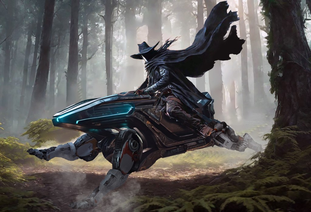
Ouch. I hope you don’t lose all trust in me, should you have had any. Photobashing is an entirely different beast than battling blank pages with a mechanical pencil. I’ll keep at it. The beast-shaped robotic vehicle in the header image was a minor victory in this experiment: called a “sporecutter”, it’s the first concept that’s come from the new approach that might actually make it to the fiction. Page 15 in the sketchbook file here is the front runner for the design of an important vehicle in the Mazewater: Master of Airships novel I’m working on. That’s another possible win.
That’s what I wanted to talk to you about today. I hope it was enlightening or helpful, should this be a journey you find compelling for yourself. Otherwise, I hope I still brightened your day a bit and made you think.
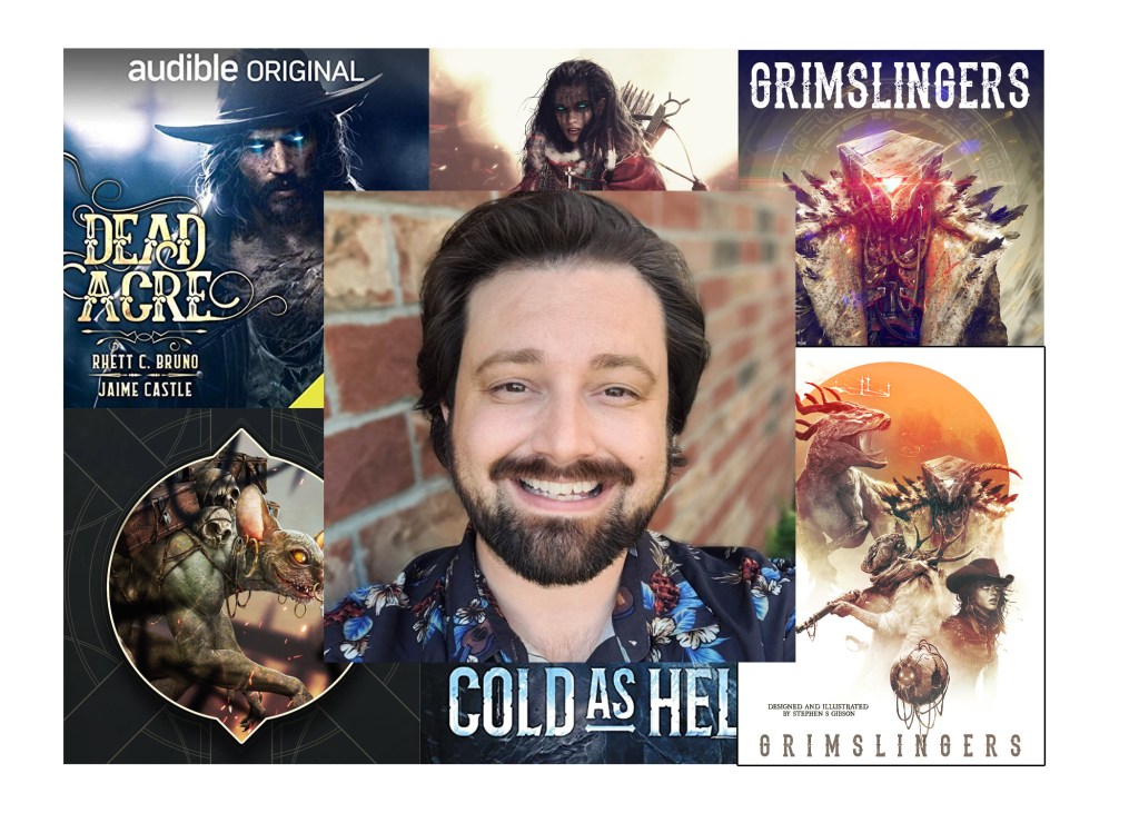
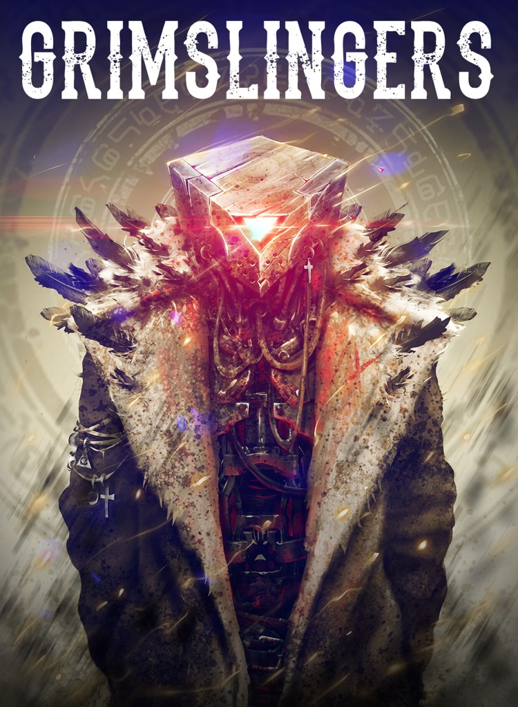
We’re continuing our Inspirational Creator Series of interviews this week, checking in with Stephen Gibson – artist, writer, game designer, and creator of the Grimslingers line of tabletop games. He’s had some exciting personal developments since we last spoke in 2020, and remains one of the most popular interviews we’ve hosted here on Grailrunner. Click here to read that original interview.
He had been Art Director at Arcane Wonders at the time, designing a supporting app for Grimslingers and trying to find time to catch some sleep. His art has popped up recently on book covers, and he’s even been featured in the art magazine, ImagineFX. In 2022, he made a big switch to Sumo Digital in Newcastle in England and added another member to his growing family!
Fascinating dude, great guy, and incredibly talented. What else could a Grailrunner ask for in finding inspiration?!
Stephen, apart from the occasional “wassup”, we last chatted in October of 2020, before zombie movies came to life with a global pandemic. You were one of the first interviews in a series we did on inspirational creators, and yours in particular remains the most popular of all that we did. Apparently, Henrietta the magic hen is quite the ambassador for you!
It has been a lifetime! I’m flattered at the reception and find it hilarious (but not all that surprising) that Henrietta has stolen the hearts of your readers. She’s also one of the illustrations I spent the least amount of time on. I’m sure there’s a lesson in there somewhere…
At the time, you were deep in playtesting on Grimslingers 2, and had featured a detailed map and some app screenshots in various places on social media. Then I suspect life happened and you needed to focus on your work as Art Director at Arcane Wonders among other things. Were you or your family impacted seriously by COVID? I hope everyone is well.
Life indeed happened, as it does to us all. I had my third child, among other big life changes and yeah, COVID!!! I spent most of Covid gaining weight and wishing I had the energy to work on Grimslingers 2.
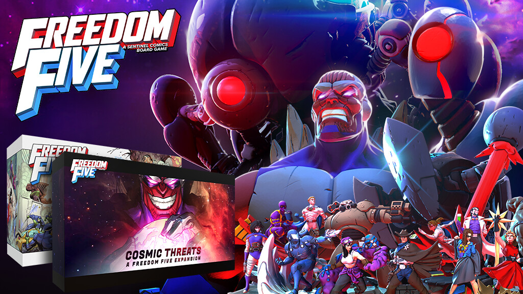
To prepare for this chat, I dug back through your (sparse) posts, and you seemed super passionate about an Arcane Wonders release called Freedom Five. It sounded like a tremendous amount of work – how was that experience?
Art wise, Freedom Five was a lot of fun because I was able to work with some extraordinarily talented artists. I’m particularly proud of the comic book panel style card art we had for ability cards. Each ability card really sold the story of the ability on it. The campaign was a whirlwind that seemed doomed a little ways in but we were able to turn it around and I’m immensely proud of my hand in that (which meant a few sleepless nights re-working the entire campaign page).
It was a tremendous amount of work (and still is, it still hasn’t shipped to backers). We were very ambitious, but the project also got hit hard by the pandemic. We funded right before poop hit the fan and the world plummeted into chaos, and that meant all of our numbers, estimates and expectations for producing this game got thrown out the window.
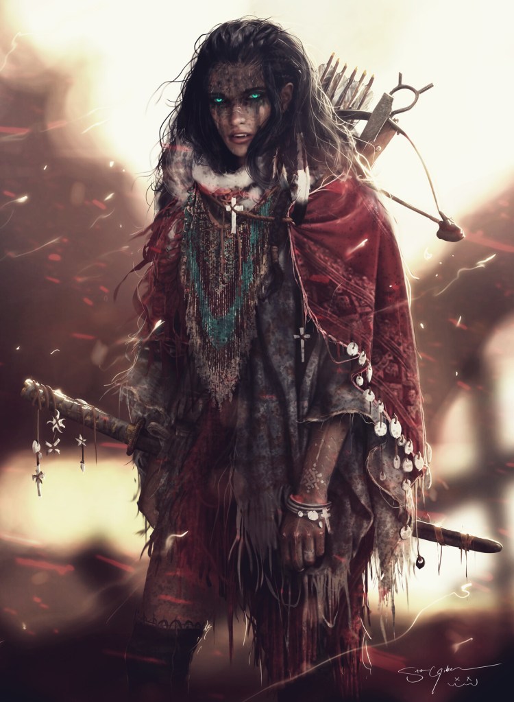
I was incredibly jealous of the cover image you did for Cold As Hell, the book by Rhett Bruno and Jaime Castle. I saw your mysterious post about it around May of 2021, then stumbled randomly across it on the Barnes & Noble shelf this past summer. Looks amazing. (Offer stands for you to do a piece for Grailrunner’s Salt Mystic setting any time you like.)
“Shot dead in a gunfight many years ago, now he’s stuck in purgatory, serving the whims of the White Throne to avoid falling to Hell. Not quite undead, though not alive either, the best he can hope for is to work off his penance and fade away.” – that’s from the Amazon description. I see why you were attracted to the project.
The author approached me to see if he could use some of my Grimslinger art for his cover (Pocket Watch Will to be exact). That was a first for me, haha. Instead we worked out producing a new piece of art and I think that was for the best! I’m quite fond of that cover, it certainly evokes a mood!
You’ve described your workflow as being heavy on photobashing and digital painting in Photoshop. Describe your desk setup – an old post showed a Wacom tablet among other things. How do you set up for work?
My “Grimslingers” style is photobashing, but I’m just as comfortable doing cartoons or comic-esque stuff. Right now I actually don’t have a desk or even a computer, I sold it on to move to the UK and start a new job! HOWEVER, I used to have a Wacom Cintiq 24HD Pro, an ultra-wide primary monitor and a beefy PC to boot. I also use a Logi Ergo M575 trackball mouse. It allows me to use the mouse without needing a ton of space to move it around, that way I can switch between pen, keyboard and mouse without too much movement (why do much movement when little movement good?).
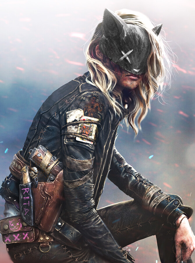
Barceline: Vampire EaterLuella And The Gaia MindIcarus: The Iron Witch
You mentioned on Artstation you’d used Unreal Engine 5 for the first time in kitbashing some Victorian environmental pieces for TacticStudios. What did you think?
I think every artist should had some 3D software in their repertoire. Unreal is fantastic for kitbashing and I wish I had more time to spend with it! It’s one of my main goals as an artist, to develop my 3D bashing and sculpting skills more. For me, that’s the next step in my evolution.
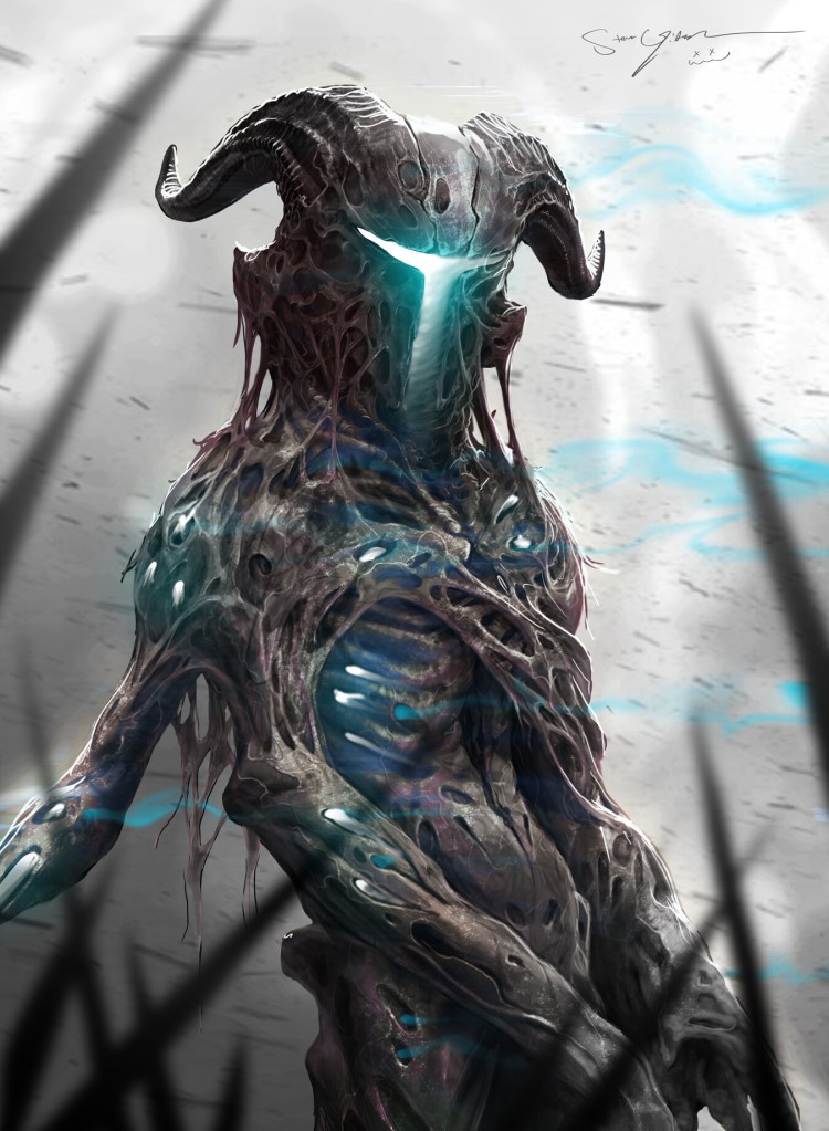
Daemonic Soul HunterValenciaAl’Miago The Wizard
Congratulations on being featured in the December 2022 issue of ImagineFX. Best quote ever, regarding your approach to art: “…splicing in new images to fill out the character until I can’t stand to look at it anymore.”
You also said something near and dear to the mission of Grailrunner Publishing: “The world needs more passion projects and less corporate-controlled products.” Tell me what you mean by that and why it’s important.
Getting featured along other incredibly talented artists in ImagineFX was a big moment for me as an artist! Certainly a highlight of my journey thus far! My quote partly had to do with my frustration with truly unique and visionary ideas being disregarded because their considered more of a gamble – which they are! I totally get why business entities take the approach that they do in train to “paint by numbers” games and play things safe. But playing it safe doesn’t move our industry forward. It’s the risk takers that got us where we are now, and it’s the risk takers that will push us forward.
In my opinion, a game like Grimslingers wouldn’t have ever happened if I had to pitch it to publishers, it’s just far too wild and to weird a mix of genres and styles. There are some visionary and forward thinking publishers out there (more in the board game world compared to the video game world) and I truly do appreciate them. Cheers to the risk-takers! It’s a difficult and dangerous task, but the soul of our industry lives with them
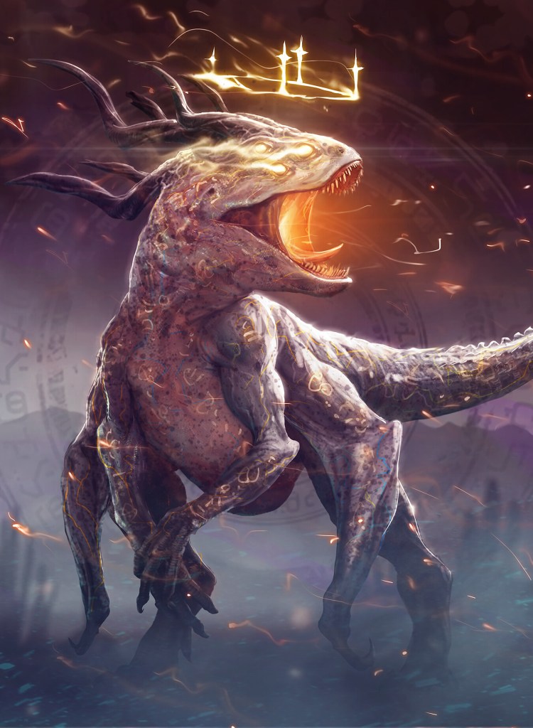
KipperThe Witch KingNyunyo And Alma
One more question before we get to Grimslingers – you’ve settled in now at Sumo Digital in Newcastle. Tell us why this move, what’s exciting about it, and what sorts of things you’ll be working on.
Covid shook my confidence in the board game industry, and life rocked my personal finances (to the extent that I wasn’t able to keep up with my bills). As a father of three, I’m not at a point in my life anymore where I’m willing to ride out risky situations for too long. After college I had signed up for a job alert service to which I never unsubscribed. One day, I got a job alert for a position at Digital Extremes (a studio in my town that happens to make the ultra-successful looter shooter, Warframe!) The job description fit me perfectly and was the push I needed to help me feel like I could exist in the video game industry. I updated my resume, my portfolio, I started learning new software (like UE5). I interviewed with several studios (and yes, I did get the interview with Digital Extremes!).
I lacked experience in the video games industry so I knew (or I thought I knew) that I’d never find a job as an Art Director, so I was applying to concept artist positions. I interviewed with Ubisoft for the Splinter Cell remake, TacticStudios for an unannounced project, Digital Extremes for Warframe and Atomhawk for Character Concept Artist. They were all very promising and I had a few interviews with each, but Atomhawk seemed the most exciting to me, and they seemed the most excited about me. Unfortunately the job fell through because of some changes to their projects. What I didn’t know at the time was that Atomhawk is part of a larger group, Sumo Digital, and one of their recruiters reached out to me, apologized the opportunity fell through but if I was interested in relocating to the UK, there might be something for me. I thought it was a joke but turns out it wasn’t! Not only that, it was for an Art Director role – a job listing I had seen but didn’t apply to because it was asking for far more experience than I had (let that be a lesson to you all!).
There’s more to the story but the heart of it is this: Changing your life is difficult and scary, but it can be done. Work hard, play nice with others, put yourself out there, it’ll work out. Good things are waiting for those who put in the effort to achieve them.
Speaking of Grimslingers, what can you tell us about what’s coming up (and generally when we can expect to see it)?
Unfortunately, I don’t have any Grimslingers news at this time…but one day, echoing through the winds, you’ll begin to hear the faint whispers of news from far away lands, tickling your ear tubes with the promise of more Grimslingers!
What is it about the stories of the Forgotten West, magic-toting grimslingers, Icarus and his mysterious missions, that inspires you? Why so much passion into this setting?
The answer is simple I think: it’s me. It’s all just an expression and wild re-interpretation of my personality and life experiences. A collection of things I love and adore and a world in which I make no compromises and have no limits.
And if you could launch some grimslingers out into the world on your own missions, what would you have them do exactly?
Definitely go get me some pizza, this covid weight isn’t going to maintain itself!!!
Stephen, anything else you’d care to let us know or places you’d like folks to keep an eye on for your doings?
In a few years’ time, games I’ll have art directed at Sumo Digital hitting the market. I hope you all love what you see and will be able to spot my unique flare to approaching art!
Special request – if there’s an illustration of Red, the salty panda pirate out there, I think we need to see that.
Thanks very much, Stephen. And best of luck in the new company and new continent!