Franklin Booth: Engraver of Light

I have some marvelous freebies for you today, so stick with me.

I’ve been burrowing into a particular rabbit hole these recent weeks, studying and practicing traditional pen & ink drawing. It started with this:

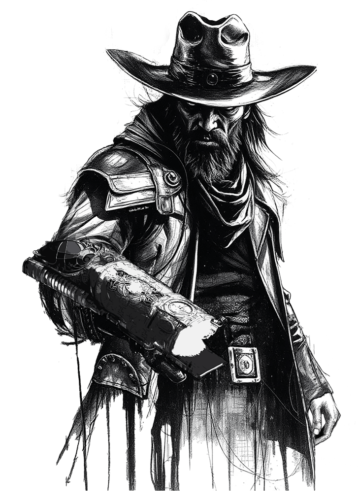
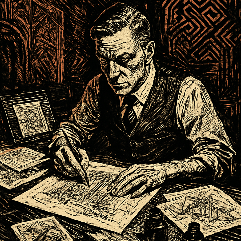
That’s interior art for SALT MYSTIC: BOOK OF LOTS. I did it, but I cheated. The base gunslinger was a couple of AI-generated pieces, drained of color and mashed together, cleaned up a bit, and mashed into an original 3D render of the plasma weapon on his forearm. I composited all that into the one image for a splash page as you first open the book.

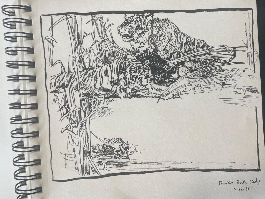
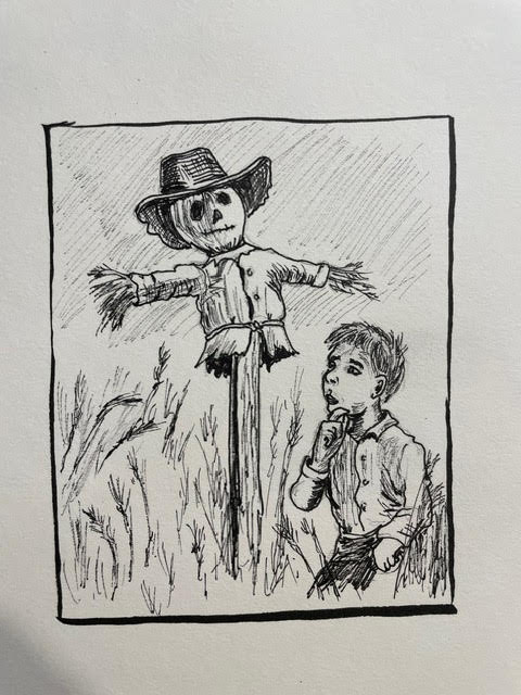
But it got me thinking that this idea of grungey ink drawings as interior art looks really great and could be a nice distinguishing factor in future Grailrunner books. So I started practicing and studying the great ink masters (which you can read about here) to hone my craft and work directly Pigma Micron and Pentel Brush Pen on paper. No blending modes, no AI bases, no 3d paintovers or stock image composites. No digital tricks at all. Just pen and ink and paper and the satisfying swoosh sound that makes.

It’s a life changer, honestly. But anyway, it led me to Bernie Wrightson and Sergio Toppi and the guy I want to talk about today: Franklin Booth.

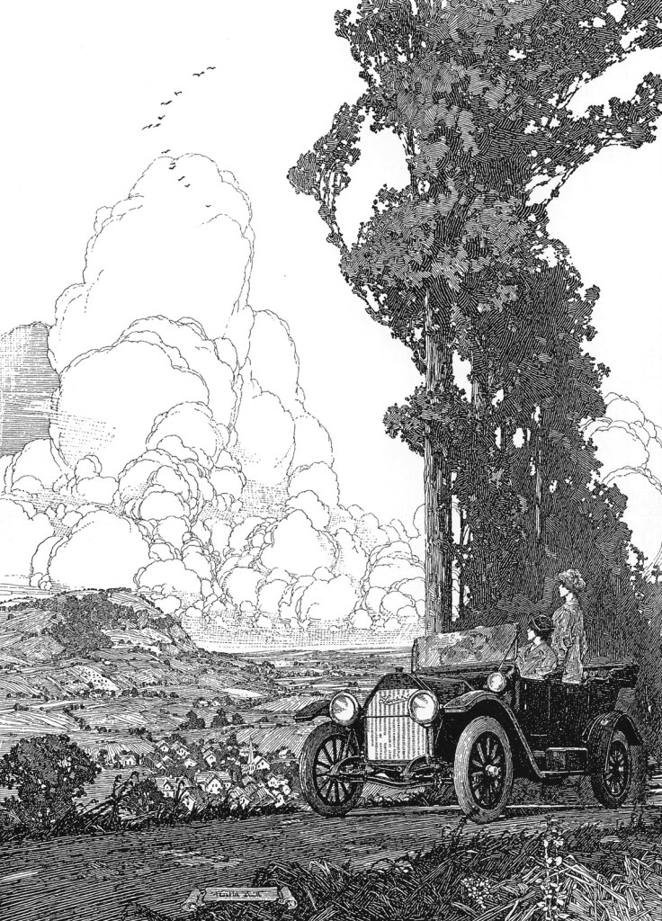
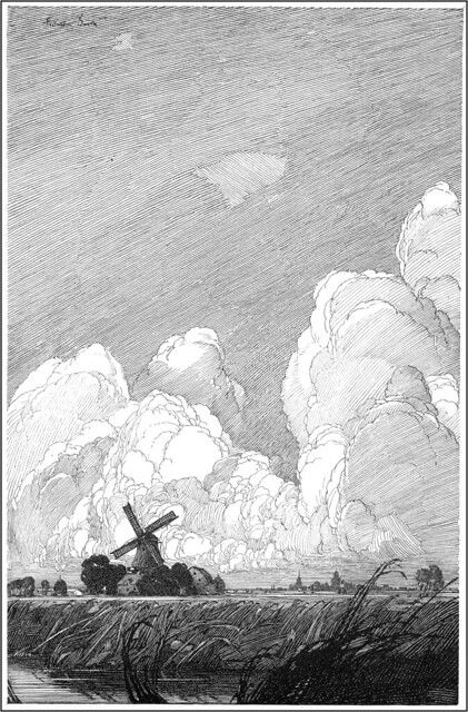
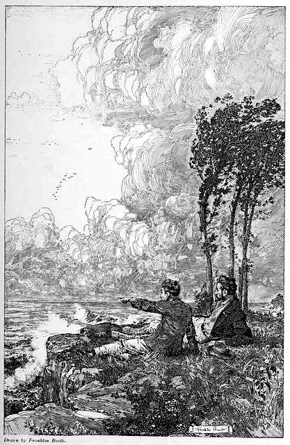
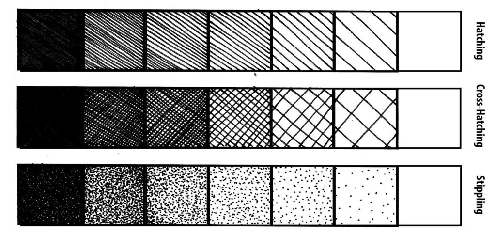
I’d ask you to keep in mind that the pen & ink artist has exactly one way to generate values and shadows, and that’s with black marks. Usually, lines. If they want shades of gray, they draw lines.
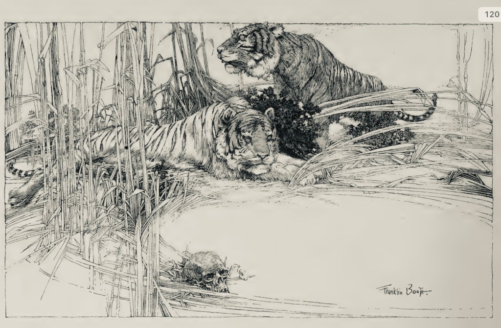
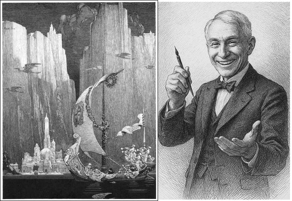
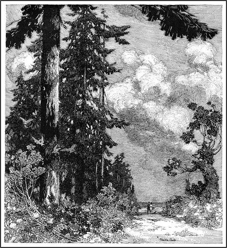
Like this:

I mean, just take a look at some of those drawings by Booth! The patience and craftmanship is insane! Honestly, I wanted to learn more about the guy and found that it’s kind of difficult to do that. He didn’t make much of a splash with his personality or how he lived his life – just with his work. Here’s a great, though short, overview of him and his work on Youtube.

We’re also several posts in to a new ongoing series here on Grailrunner called CONVERSATIONS FROM THE ABYSS where we’re applying AI tools in some innovative ways as a sort of experimental lab. That got me thinking I’d like to read a decent, illustrated biography of Booth and get to know him a little better, mainly to understand his influences and how he learned to do what he did. So I had ChatGPT write me one and it was terrible. I asked for a 50k word detailed biography and got slop. Seriously, at one point I even asked it why the final product was so bad when it suggested we work section by section in much shorter passages with me approving things along the way.

Yes, I could just buy Silent Symphony from Flesk Publications, but that’s beside the point!

I tried iterating section by section, making my own suggestions as we went till it started to take a kind of shape that might be worth reading. Then I scavenged the internet and the Internet Archive specifically to grab public domain images that were either referenced in the sections or appropriate to the time period being described, all done by Booth himself. We’re not selling you anything here – the final product will be the last download button on this post. I included them as well throughout the text.

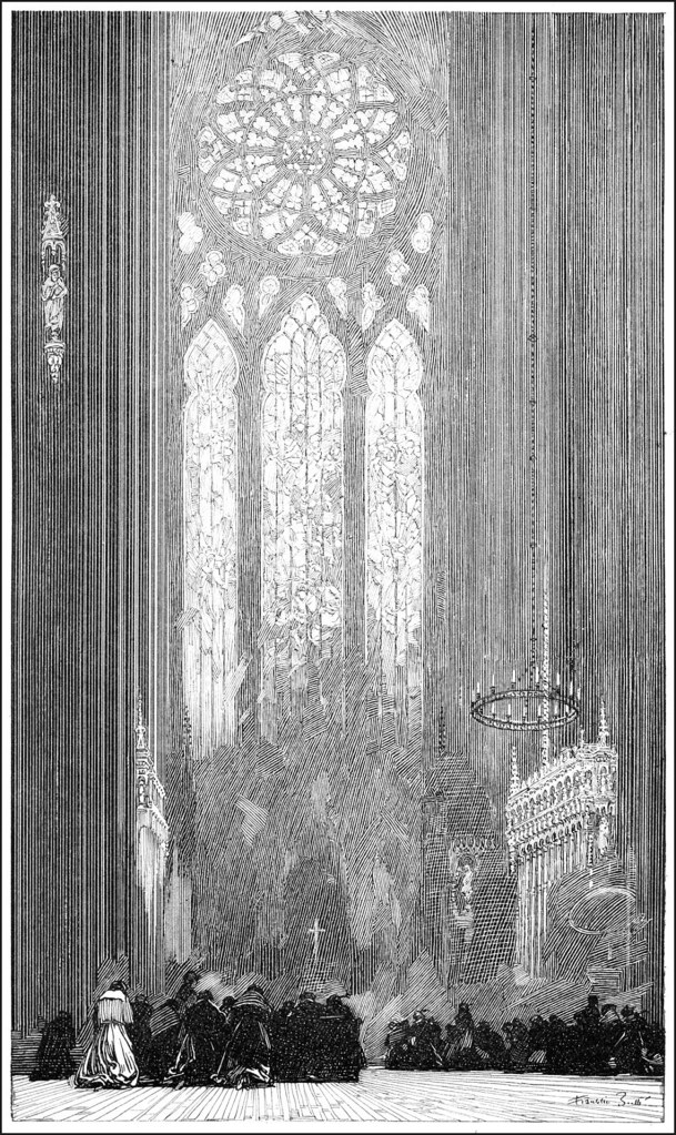
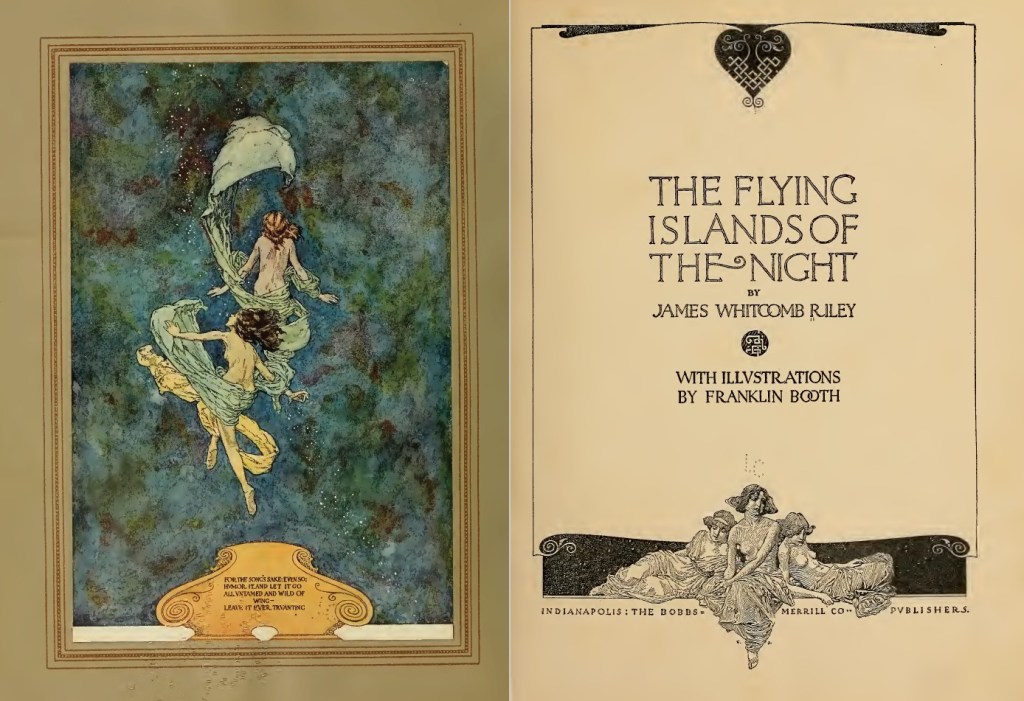
In all that, I learned about the fantasy play he illustrated titled Flying Islands of the Night by James Whitcomb Riley, which you can peruse below by smashing the splash page below. It’s vintage beauty at its finest.

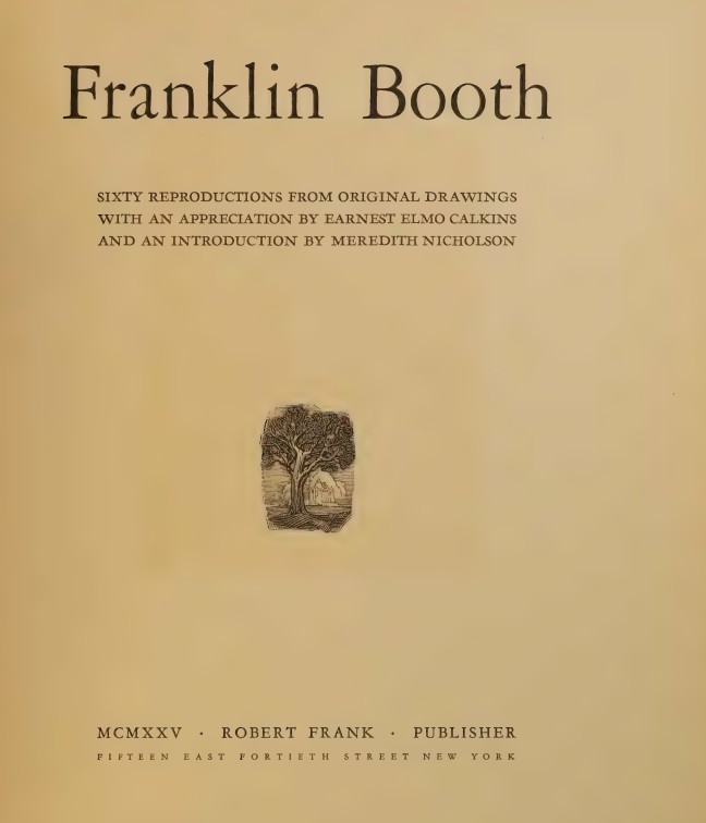
I found a scan of a 1925 book containing 60 reproductions of Booth’s drawings with sourcing and titles, details which are almost impossible to find on the internet (as everyone just posts the pictures out of context). That’s available by smashing the title page here:

And here’s a real gemstone that I found which took on an entirely different function than its author intended: a 1916 travelogue written by Theodore Dreiser where he went on a road trip with Booth himself! It’s called A Hoosier Holiday, available by smashing the title page button below:

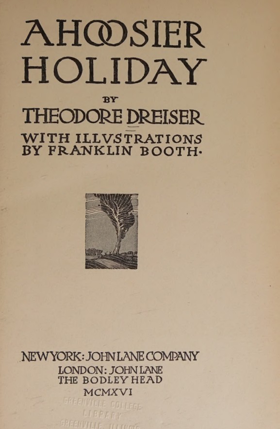
Where Dreiser thought he’d describe the trip and his musings along the way, I found an intimate and first-hand means of hearing Booth’s exact words, descriptions of his facial expressions and the fact that he ate all the popcorn he could get his hands on, things and sites he found interesting, and even charcoal sketches he made along the way. I found Dreiser to be an arrogant nuisance, but Booth seemed genuinely like a guy I’d road trip with. I liked him even more after reading it.

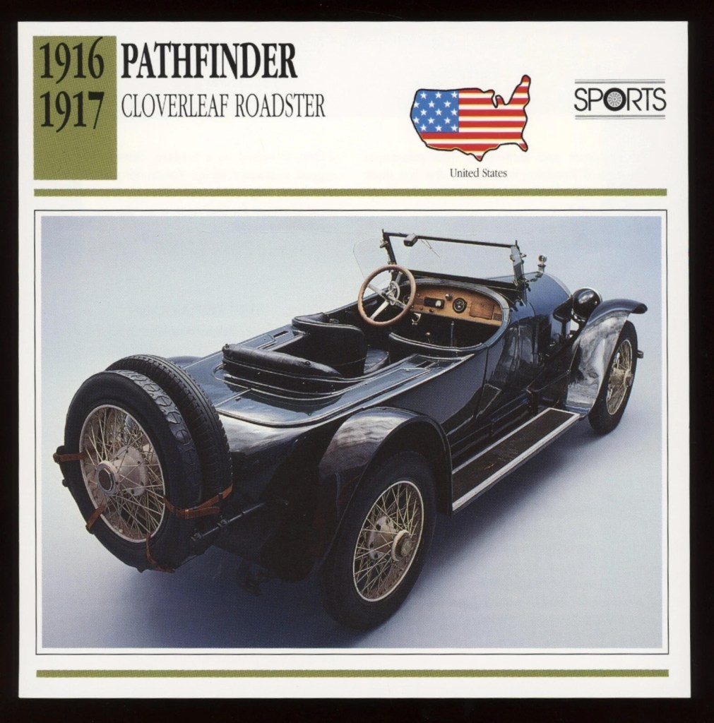
It was Booth’s 1916 Pathfinder, by the way, which he paid $3k for ($100k in today’s money), and they had a chauffeur as well. Booth was doing pretty well for himself, it seemed.

Quick and painful anecdote – ChatGPT was including factual errors. Some were easy to find, like a bold statement that Booth never married when that was demonstrably untrue. It provided several explicit quotes, which I asked it to source. Each time I called out something like that, it bailed and said it made those up. I think that’s my fault, as I’d named some historians I like as the basis for the voice and tone the software should take to write the text, and it took that to mean it should hallucinate.

Anyway, I wanted to find and include Booth’s very first published illustration. Turned out, the first amateur publication was in a newspaper, which I found in a publicly available scan and screenshotted to included in the book. That was a great find. But ChatGPT was telling me his first professional published work was in a trade magazine called The Inland Printer. I eyeballed 6 years worth of that stupid magazine and found zippo from Booth, eventually going back to call ChatGPT out on that as well. Sheepishly, it admitted that internet claims suggest he appeared in that magazine but since I’d looked and couldn’t find it, it supposed that was incorrect.

But the book I wanted to read was taking shape and becoming something worth spending time reading. The illustrations were helpful and interesting. I liked what I was getting, but it needed one final flourish.

I asked Booth to comment on his own biography.

By instructing ChatGPT to analyze everything we knew about Booth’s personality and values, I asked it at last to speak in his voice and comment on the book we’d produced about his life. That’s the final section of the book.

Here is the final product, titled FRANKLIN BOOTH: ENGRAVER OF LIGHT.

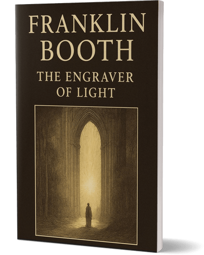
What a great journey that was! I really enjoyed the immersion and learning about this fascinating guy. Take a look and let me know what you think.

[UPDATE July 8, 2025]

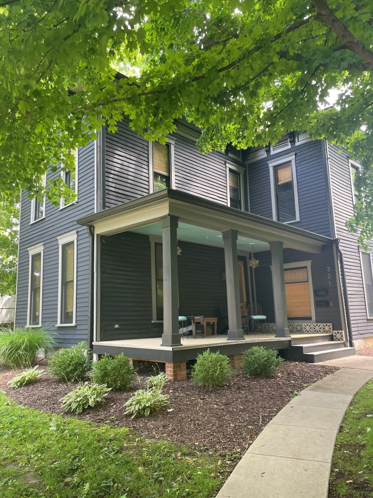
I found myself in Indianapolis for business and with a half-day free, so I drove to Carmel, Indiana to the boyhood home of Franklin Booth, which is listed as a historical site though also is still a private home (in surprisingly good shape). It’s super close to a beautiful downtown, in fact walking distance…a quiet and cozy neighborhood with no sign whatsoever that a famous artist lived and worked there. Not even a plaque.

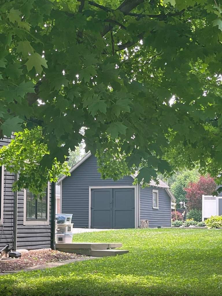
And I understand the backyard shed was where he maintained the workshop which he visited every summer and completed so many of those famous works I’ve highlighted here.
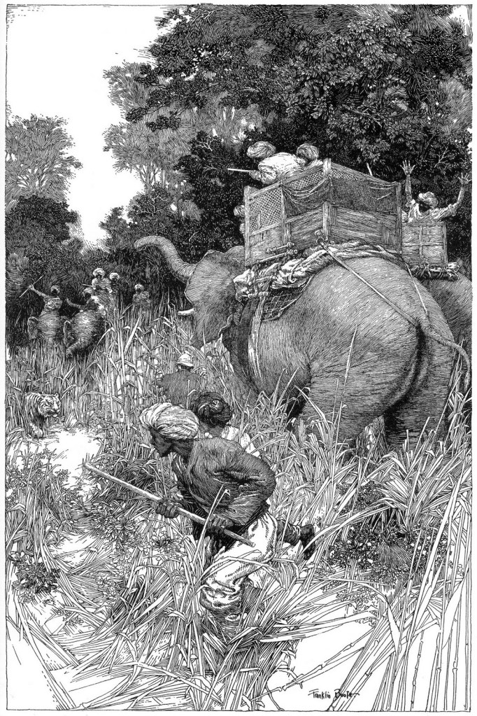
This one:

Pretty cool. Anyway, till next time,

Art critiques from a resurrected master of pen & ink

A year ago, I wrote here about the worst art advice I’d ever gotten, and I posted pages from my sketchbook at the time to stay accountable in some way for improving. It turned out kind of popular, maybe out of the general public’s desire to see car wrecks in motion. Those pages were fairly early in getting back to traditional art versus digital and were mostly pencil work with some light-table ink drawings. And by light-table, I mean tracing things and so…cheating.

I updated you guys in November with some more pages and then again a couple of months ago (bottom of the same post). Those include watercolors, some digital stuff in Procreate, and also ink drawings. Somewhere in all of that, traditional pen & ink drawing kind of caught fire with me.

It’s kind of all I can think about these past couple of weeks. Those delicious hatching lines and stipples, deep, gorgeous washes of black, and intricate patterns of black and white condensing beautifully into a striking, eye catching work of art! It’s all very satisfying, if I’m honest. And the feel of a Pentel pocket brush pen swishing on toothed paper feels a little like watching somebody make a chocolate cake, almost mesmerizing.

I found this amazing resource free on the Internet Archive (smash the cover image to take a look for yourself):

Written by Arthur Guptill, this is a classic instructional book on pen and ink drawing, widely regarded as one of the most comprehensive and authoritative resources on the subject. His writing style was patient, articulate, and he was clearly a master of clean, simple line work and exhibited craftsmanship in how he approached both drawing itself but also how he framed his instruction materials. The guy was a natural teacher.

I was approaching my learning by a combination of master studies and daily practice, at first using a Copic alcohol marker for shading and eventually moving to just the brush pen and Pigma liners to focus on learning hatching and cross-hatching.

Here’s an example, a dazzling piece called “The Cobbler”, by John R. Neill:

I learned quite about overlapping structures for depth, clean linework, effective use of contrast, and detailed volumes just by copying this thing.

Here’s another study, by Franklin Booth – a real beauty he titled “Hunting The Tigers”:

Loads of things to absorb by this one regarding overlapping structures, use of negative space, balance of value, simulating water in black and white, and fur textures with ink. Honestly, I’m not happy at all with my copy, but I was being ambitious.

Anyway, we’re four articles in to a new series titled “Conversations from the abyss” where we use advanced AI tools like ChatGPT and also Suno music generation to bring back creators from the past for interesting debates, dialogues, or other entertaining diversions. Nothing for sale – all available free here on the site. It struck me this past week that it would be amazing if I could receive art critiques directly from Arthur Guptill as I’m practicing various bits and bobs I’m learning from the master studies and other practice drawings.

I’ve got a soft spot for Frank Baum’s OZ books and thought an image of a young Baum coming across a scarecrow in a field and pondering it with his wild imagination might be an interesting image for ink practice. I gave it a shot, then uploaded it to ChatGPT and tested this prompt: “Acting as Arthur Guptil, critique this image and provide guidance on how to improve it.”

Here’s what happened, and it honestly blew my mind:

“You have achieved a fine effort in line drawing, and there is evident care in your composition and subject choice. The nostalgic theme—a young boy in thoughtful contemplation before a scarecrow—is charming and well-suited to ink. Now, let us refine your rendering through a few key observations and recommendations:

1. Line Quality and Variation

Your line work shows promise, but greater variety in line weight will enhance dimensionality and focus. At present, the lines are largely uniform, which causes elements to flatten together.

  • Suggestion: Use thicker lines for foreground elements (such as the boy’s arm or the hat’s brim) and finer, lighter lines for background elements like grass or sky hatching.
  • Vary the stroke pressure as a tool of emphasis and mood. For instance, a light cross-hatching for distant tones vs. a bolder hatching for areas of core shadow (beneath the scarecrow’s hat or the boy’s jaw).

2. Compositional Framing

The rectangular frame is sound, but the internal balance feels slightly off-kilter. The scarecrow dominates the space while the boy feels pinched in the lower right.

  • Suggestion: Consider either enlarging the figure of the boy or repositioning him slightly more centrally. Alternatively, allow the scarecrow’s arm to lead the eye toward the boy in a more deliberate diagonal.

3. Rendering Form and Volume

The scarecrow reads clearly as a simple form, but the boy’s anatomy, particularly the arm and face, could benefit from more structural understanding.

  • Suggestion: Study the planes of the face and arm. The boy’s head could use slightly more cross-contour shading to indicate roundness. The hand, though expressive, lacks clear articulation—gesture drawing practice would help here.

4. Textures and Detail

Your use of short, broken strokes to indicate vegetation is appropriate, but the grass and shirt material begin to blend. The shirt on both the boy and scarecrow could use more definitive folds to suggest fabric tension and weight.

  • Suggestion: Use parallel or directional hatching that follows the form of the fabric. Avoid over-randomized strokes, and let texture be a deliberate compositional voice.

5. Background and Spatial Depth

The background is composed primarily of evenly spaced hatching. While this is functional, it does little to suggest depth or atmosphere.

  • Suggestion: Introduce a subtle gradient to the background by controlling your stroke density—more hatching at the top or corners to create a vignette or atmospheric recession.

Final Encouragement:
The spirit of your work is admirable and speaks to a narrative sensibility. With improved control of line, deeper understanding of structure, and refined use of contrast, this drawing could serve as an excellent illustrative plate.Keep your pen in motion and your eyes ever studying!”

*

I mean. A dead guy just gave me really precise feedback on my drawing, recognizably in his voice and noticing very specific things in the drawing! I got compliments that were specific and not vague exhortations. I got clear, explicit guidance on what exactly I could improve. Not generalities. It was, and I mean this, very helpful.

Now, you might be thinking – “Dude, you’re a chicken letting the wolf teach you how to protect the hen house. AI is going to replace artists entirely; why use it for art instruction if you’re encouraging people to use it at all, they’ll just generate the images directly. Why even learn to draw?”

All of that is, of course, nonsense though, isn’t it?

If we get fat and lazy and stop creating, then the images that AI tools use will become instead of crisp white and deep blacks, just an increasingly bland mush of grays…monotonous and uninspired. AI outputs will become AI training datasets, leading to a downward death spiral of junk art. I don’t want to add to that. I want to make new things, man. New things! I see critiques from long-dead art instructors as yet another powerful tool for me to do just that.

I asked for a new chapter to Guptill’s book for digital inking, by the way, which is available free below (and entirely and recognizably in Guptill’s voice):

And yeah, okay, it’s time for an accountability upload of the latest sketchbook entries here (be kind!):

That’s what I wanted to share with you today. Pages 19, 20, and 21 especially benefited from pseudo-Guptill’s instruction, and I gave it all I had to incorporate to the developing pieces what it was telling me.

All this has me wondering – just who else can I get to critique some of this and help me learn quicker? Maybe Leonardo Da Vinci is up next!

Till next time,