The journey to pen & ink mastery: 15 lessons learned

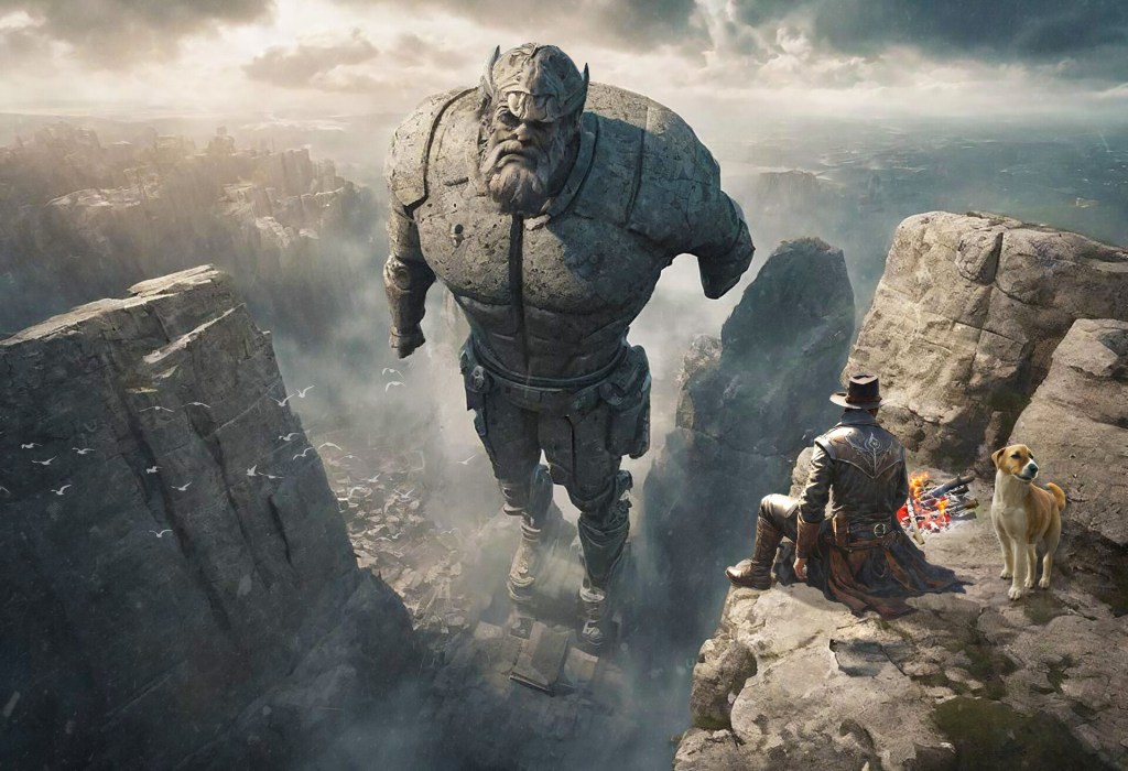
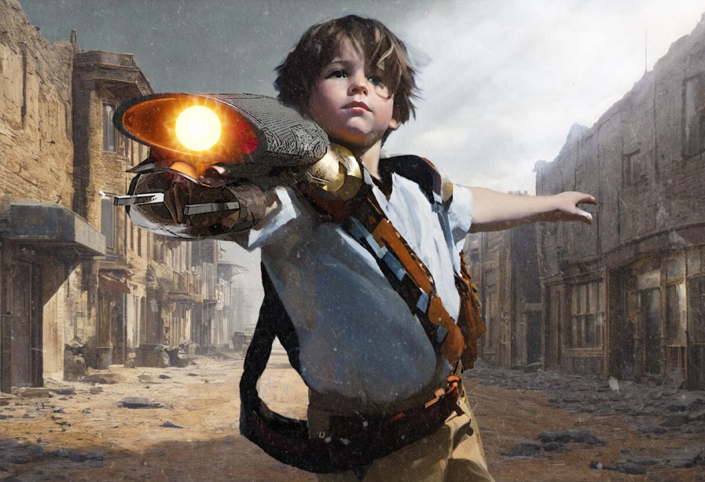
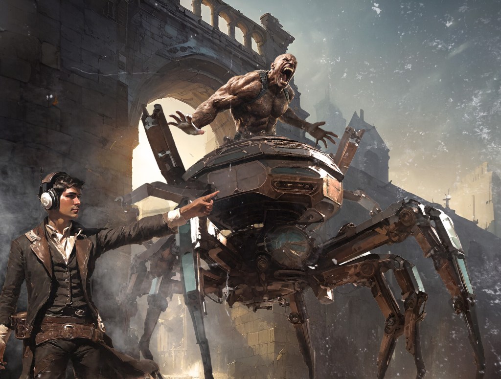
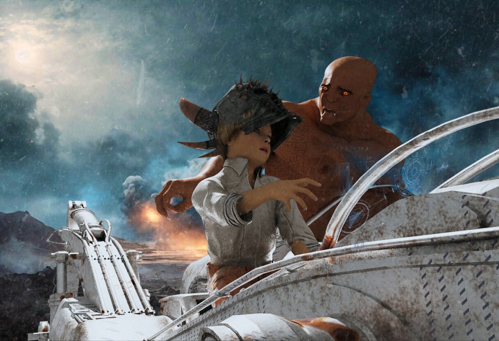
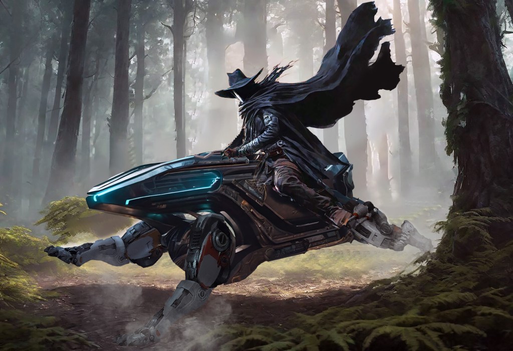
It started in October 2023. I used to fill sketchbooks with superheroes and sci-fi vehicles when I was a kid, but I hadn’t really touched it seriously in decades. Then I came across one of the marvelous Sketching From The Imagination books from 3DTotal, and it blew my mind! The idea of drafting my own concept art to summon up interesting ideas for the novels and games of Salt Mystic intrigued me.

But I sucked. And I’m hoping to keep that in the past tense, but we’re not there yet.

I wrote here before about some art advice I’ve picked up along the way, one of which crippled my drawing for a very long time. That post contains a couple of sketchbook updates to keep me honest and working to improve. It’s not super fun to share a journey because I would prefer anybody stopping by Grailrunner to check us out think that I’m a powerhouse of creativity and master craftsman of the imagination.

Still, maybe I’ll get better if I’m periodically embarrassing myself!

Then I took a road trip with my wife this past summer to the Mississippi Blues Trail and came across a hardbound compilation of 1890’s era Harper’s Magazines. I wrote that up in I Found a Pen & Ink Masterclass in an Old Antique Mall. Suddenly, traditional pen & ink became an obsession as I saw what Charles Dana Gibson and Franklin Booth and guys like that could do! My Booth research culminated in Franklin Booth: Engraver of Light and a trip out to see the Indiana house where he grew up and kept a studio. I also got the chance to interview a modern-day ink wonder-worker with Mateusz Lenart.

So what’s your process to learn and practice?

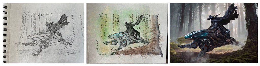
Two sketchbooks now. One is for drawing from imagination or freehand with cobbled-together references. That’s to work on my ability to reproduce things I’m looking at with tweaks and from different angles, and to experiment and be messier. For the other sketchbook, I generate a clean reference digitally with stock images, AI elements, or a combination of these, then trace the outline with a light table and work from the reference for rendering.

Any particular destination in mind here?

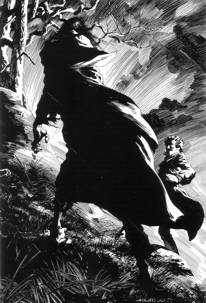
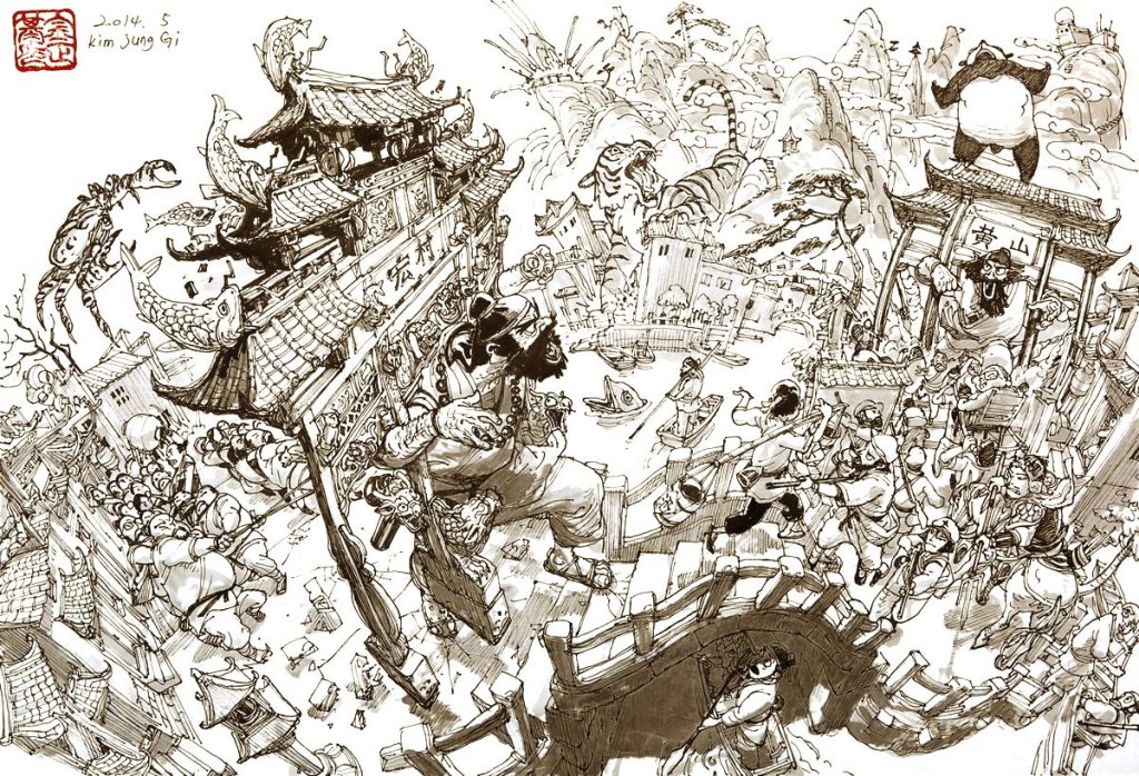
I’d like to combine the visual storytelling of Norman Rockwell, the ink style of Bernie Wrightson, and the sci-fi visual innovation of Juan Gimenez. That isn’t too much to ask, is it? Specific artists I’m looking at for their ink work are Charles Dana Gibson, Franklin Booth, Sergio Toppi, Bernie Wrightson, and Joseph Clement Coll.

Wrightson. I mean…do yourself a favor and take a look at these!

So what have you learned?

Let’s do the countdown, shall we? Fifteen things I’ve learned in practicing traditional pen & ink and analyzing the masters:

#15 Using references is not cheating

I’ve got a love/hate relationship with using references because copying things wasn’t why I originally got onto this train, you know? Still, images in my head fade too quickly for me to look inward and draw what I see there. You do what you’ve gotta do, right? It’s been enlightening for me to see just how many professional artists use photographs and composite stock images for their references.

#14 Professionals work in layers

The masters lay down their structure, they build deep shadows, they add texture, and their pictures often look terrible in progress as it seems they’re destroying their own work. Then it somehow, magically, takes shape in the final product. The picture doesn’t have to spontaneously drop onto the page fully formed. It builds in layers. To be honest, I’m still struggling with this one, but I know there’s truth here.

#13 Strategic overlaps simulate depth

I couldn’t figure out why my grass, weeds, and trees in practice landscapes looked so awful and flat. It was driving me crazy. Then I took a photo of some plants growing by a lake near my house and made a strong effort to make the thick blades translucent and allow some shadow of a leaf behind it to be implied. That was a watercolor painting, but it got me thinking. Then a Stephen Travers tutorial on Youtube spelled it out for me that I was rushing my plants and tree limbs with flicks of the pen when a few strategically placed blades or limbs up front with detail, contrasted with flicks behind them and shadows below them would imply exactly enough to look FAR better.

#12 Texture matters more than hatching

I know this is true, but I can’t make my hands do it. Driving me nuts, honestly! But I’m abusing hatching and slapping lines everywhere to add shadows and it’s looking like washed-out, hairy messes at times. I see a guy like Alphonso Dunn teaching texture and realize what I’m doing wrong. You’ll see a couple of leaf studies in the accountability sketchbook below where I bottomed out on this. It’s something I’m keeping in mind as I work to improve, not something I’ve mastered.

#11 Simplify the reference and find the story

Photos capture everything. Reproducing them is compelling. It feels like practice. Then when I’m done, somehow the photo looks fine with all that detail and my drawing looks like a bowl of spaghetti fell on the paper. I’ve come to realize that “focal points” and “guiding lines” in a drawing really work, and that the viewers’ eyes really can be steered. Practically every professional artist seems to be saying the same thing on this – start with what story you want to tell, then draw only that. Just hint at everything else, and try not to even do that.

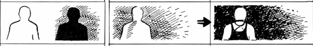
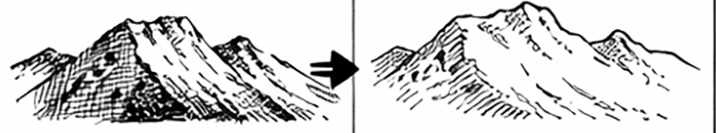
#10 Contrast is what pulls forward on the page, not line weight

I had been getting the impression from on-line inker tutorials and an Arthur Guptill book that dark shadows and heavy line weights look like they’re closer and lighter lines look farther away. In the sketchbook at the bottom of this post, you’ll see a drawing of a girl and a horse with a spilled water bucket where this came home for me. I needed the girl and horse to look closer, but there were dark shadows behind them in the stall, which crippled me. I mean, if I darken the shadows, the figures will be lighter and will look farther away when that’s the opposite of what I wanted! I realized with that one that contrast is what draws the eye, not darkness, so uniform shadow behind them is A-OK.

#9 Leave rest areas

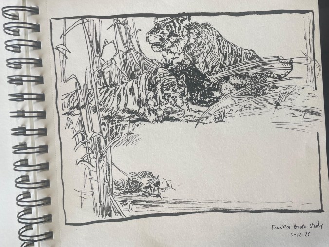
This is a study I did of a Franklin Booth masterpiece. I usually feel a strange compulsion to fill the entire image with stuff. Can’t help it. Seems like the job. Then you see a composition like this where he leaves that wide open space for water, and you really get the importance of leaving something without details to keep things from getting busy.

#8 Shadows should be bold, should connect, and should be interesting

I first learned this from a watercolor artist named Matthew White. He kept going on about “connecting your shadows”, and “make them interesting”, and for a long while, I had no idea what he getting at. In my head, if the reference has deep shadows, then add them. If it doesn’t, then don’t. Then you realize at some point that you’re not trying to copy the reference and there are emotions at play here with values, shapes, and configurations. Just like a bass guitar anchors music and things sound thin and weaker without it, the deep shadows are an anchor for the image.

#7 Outlines are okay, but be smart about them

“Things in the real world don’t have outlines.” That was the art advice that threw me for decades. I couldn’t see how to draw something without putting a pencil or pen to paper at the edges. With pencil, it was easier to smudge and add gray areas, so not quite as bad. But when you switch to pen & ink, every time the tip touches the paper, it’s crisp black. Walter Crane in Line & Form stated something in words that I was noticing with the ink masters – you can avoid outlines entirely by effective use of contrast.

However, outlines can also be fine with a smaller tip (like 0.005 liners) or if you break them up in the highlighted areas where the light is hitting.

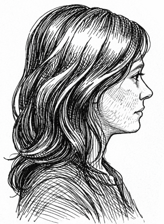
#6 Think in clumps and masses for hair

Trying to draw hundreds of lines to simulate hair is crazy. It turns out that hair, much like foliage and grass, can be clustered into value patterns – basically grouped highlights and grouped shadow shapes. In the highlighted area of hair, a few well-placed strokes hints enough for the viewer’s brain to fill in the rest.

#5 Work in larger formats if you can

I think in 5 x 8 and 7 x 10 formats because sketchbooks often come like that, and it’s where I’m always putting my drawings. I have found, however, that many of the impossibly detailed drawings that catch my eye weren’t made in a pocket sketchbook. They were on much larger Bristol board or something like it. They were built large with room to breathe, and became sharp and complex when shrunk down in reproduction on the page or on a website. This comes to mind when I’m squinting at a drawing and switching to my finest liner to try and make something visually impressive at a small scale.

#4 Line hierarchy

As a kid or in school, I drew with just the one ballpoint pen and never considered needing different thicknesses. It wouldn’t have dawned on me to do so. Those early 20th century ink masters were using dip fountain pens which flexed to allow for varying thickness – but good luck keeping yourself in reasonably priced fountain pens and ink these days. Ahhh- but brush pens! Like the Pentel Sign Brush Pen that has that cool, stiff and tiny brush you can push on. And liner sets like Pigma and Uni, with multiple options to choose from. I have found that varying line thickness is visually appealing, and strategic use of bold lines for emphasis and lighter lines for highlights can help lead the viewer’s eyes.

#3 A good drawing can save bad rendering, but a bad drawing is hopeless

A weak composition or poor drawing absolutely cannot be saved by even superb hatching and shadows. It just looks like mud, and mistakes on faces or eyes or with the perspective are obvious no matter how awesome your rendering. I’ve seen that pencil drawings restrain me too much and make the drawings too clean, which I need to fix. But I’ve also seen how wobbly and searching my lines are when I don’t do a pencil drawing. I’m wondering if a very light, minimal pencil drawing that I use like a jazz score might be the compromise I need.

#2 Restraint looks better than over-working – the viewer needs less than you think

I over-work my drawings. Definitely. It happened even today, with me thinking this very thought. Every pass of hatching on the most recent drawing in the sketchbook, I thought to myself – easy…that’s probably enough. Then I kept hatching. I don’t know why. It’s crazy. Anyway, professional artists render much less than feels like they should. They hint where I draw. I’m especially bad with eyeballs; some of the professional works I’ve analyzed barely stroke the pen to suggest eyes where I’m drawing little ovals and working like crazy to make it look good. Nah…restraint is better than spelling everything out. Stop early.

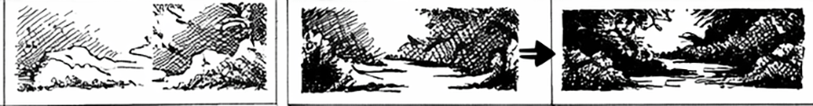
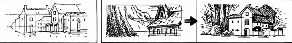
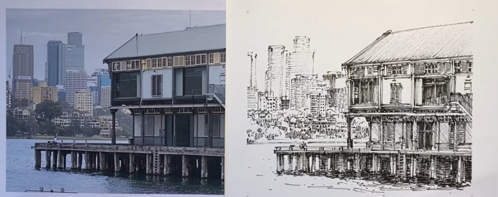
#1 You can still fade distant objects with pen & ink

This one’s funny. I’ve tried a few landscapes where, like a dummy ignoring the lessons even in this post, I’ve meticulously tried to simulate everything in the distance and modified the hatching to experiment with every kind of value you can imagine. Then, I was watching Stephen Travers (below) draw a building on the shore with a city in the distance. I thought to myself as he got started – oh, man, is that detail going to look like a big, messy pizza when you’re done! But he used much thinner lines and wider spacing with fewer marks in the distance to avoid rendering everything equally and it looked amazing. The focus was right where he wanted it – on the building up close.

Okay, that’s a pretty good list. Let’s see that sketchbook then!

Let’s do it. Be kind.

*

And that’s what I wanted to bring you today. I hope it’s okay to share these lessons learned as I go, even though I’ve got so much room to improve.

Till next time,

Art Advice: An Epiphany In Three Steps

Back in May, I posted some musings on this site about what I called bad art advice that I’d gotten when I was in Middle School.

“The real world doesn’t have outlines – draw what you see.”

Weird, I know, but I struggled so much with that I gave up drawing altogether. I get that it should be straightforward advice that every burgeoning artist SHOULD in fact receive and, indeed, follow. I get that it’s true and obvious and OUGHT to have been helpful. Just wasn’t how I reacted, unfortunately.

I’ve come to realize that is just a first step.

I recounted how back in October 2023, I’d come across a lifechanging book series called Sketching From The Imagination and an art magazine called ImagineFX that had me rejuvenated to start it all over again, on fire with cool pictures in my head and a spirit to truly give it a go this time. I shared my sketchbook at the time (shudder!) a little over a half-year in, to be accountable to folks here for improving.

Another phase of things had opened up with an enlightening quote from the genius artist, Kim Jung Gi that said:

“Don’t draw what you see. Draw what you HAVE seen.”

I liked his emphasis on practicing reproducing reference images, only from different angles and perspectives so you can learn their forms in three dimensional space. Over time, your visual library carries enough shape and texture language to work directly without reference. Very nice. You see, I have a complicated relationship with the use of reference images in creating art. The dream has always been to sit down with a piece of paper or a blank screen and summon fantasy and science fiction imagery from nothing – not to robotically reproduce an image in front of me. Over and over, every artist I was seeing on Youtube or reading in interviews, they were all using reference images. I had this inner voice saying “if I wanted to reproduce an image, I’d take a picture of it”. Kim Jung Gi’s advice offered a different relationship with reference imagery.

So it’s been over a year now. Keeping up the practice frequency to at least a half-hour each night if at all possible. Even when I’m bone tired after work and would rather stare at history documentaries or old spy movies (or train movies -those are awesome).

Anyway, somewhere along the way, this happened:

Don’t ask, my friend. I just thought I’d try watercolor painting and this guy showed up. I call him Barney. My first attempt. I hadn’t planned on getting obsessed with watercolors – it was Peter Han‘s fault. Was watching Peter draw something amazing, and he pulled out a little travel palette set. The smooth and striking combination of ink and colored wash fascinated me. Strangely, as I submerged into the very deep and mesmerizing well of watercolor painting in magazines, books, interviews, and tutorials, a new, possibly ultimate and final step has started to take shape.

Watercolor pigment does what it feels like doing on the paper. It moves around. Crashes. Blossoms. Ignores your feeble mortal attempts to control it. But it makes incredible gradients and blooms and textures like nothing else. And its mightiest trick, almost its entire reason for being, is to capture light. I’m talking about the translucency of a green leaf in summer with sunlight bleeding through, the broken sunbeam dancing on a marble floor, the ghostly and serene reflections of clouds and seafoam on the beach once the wave goes out. Google “Steve Hanks” and Thomas Schaller to see what I mean.

The more this got in my head, the more I began to realize there even WAS a third step to this process. I’m not there yet, but I think I can see it taking shape. If I hadn’t started paying so much closer attention to light filtering through trees or bathing morning fog in an orange glow because of all this focus on watercolors, I’d have missed it, I think. This final quote that crystalizes what I’m seeing has popped up a number of times now, so I’m not sure who started it all. It’s a boneshaker though, that I’m still trying to coax into being my buddy:

“Don’t draw what you see, draw what you feel.”

Now that’s an entirely different way to interact with reference imagery, isn’t it! Snapping a picture in the moment during a hike or on the train freezes one of those haiku moments for you, sure. Cobbling together some stock images and a DAZ3d render or a photobash of some AI-generated elements can put together a good and unique composition, of course. And in that first step, you can practice your technique, reproducing it as faithfully as you can.

At some point though, Gi’s second step suggests you vary the angle, maybe reproduce it from above or from a different side…maybe with an armored zebra beside it, or a screaming werewolf. Mess around and don’t stress about perfection, right? It’s a sketchbook; what do you care if every other one turns out trash? Forms start repeating for you: the fact that eyes aren’t really ovals, that lips and noses and hair cast shadows, and that people almost never stand vertically straight on both feet. That sort of thing.

But then, when you’ve maybe gotten to a point where you can somewhat faithfully reproduce an image with variations and additions, with subractions, and perhaps even can summon something to the page entirely from memory and imagination, another step opens up for you.

Those are pictures I’ve taken in various spots this summer in Kansas City, Cades Cove in Tennessee, and at Destin, FL. You’ve probably got ones like it on your own phone, those images that caught your eye and made you feel something. A foggy morning, a quiet library with the sunlight streaming off a high window, a busy subway station or airport with interesting faces, or maybe a funny face your dog made. It made you feel something, so you snatched it to stick in your pocket.

That’s the third and ultimate step in art journeys, I think: to capture what you feel on the page. The reference becomes almost beside the point. I’m still working this out for myself. Maybe these musings prod something for you if visual arts are at all of interest to you.

Since some folks appreciated the first uploaded sketchbook, here is an update (paper sketches 1-3, watercolors from 4-13, Procreate digital art from 14-17):

Crazy busy year. I hope yours has gone well. For my part, I’m glad Christmas is on its way. That particular crazy freight train is more than welcome this year.

(Update Mar 2025)

And, in the spirit of accountability to improve, here’s an updated sketchbook of what I’ve been up to since this post went up (watercolors on pages 1-8, Procreate sketches pages 9-18, and physical sketchbook pages 19-24):

Till next time,

The Worst Art Advice I Ever Got

I lost over thirty years in my art journey because I (stupidly) took a wrong turn based on what should have been great advice. Let me tell you about that, how exactly I went off the rails, and what a ridiculously talented Korean artist said that got me back on the journey.

If you care about the process of visual creation, whether it’s you doing the creating or just a spectator’s interest in how all that works, then this one’s for you.

Why does this matter?

Crap, man, I’d like to be thirty years better in drawing and painting! I hate that I stepped away for that long. I’m the chief illustrator for Grailrunner, and its lead writer, and its game designer. I need to get a lot done myself to control costs, but somehow keep a high standard on quality of art to convey the unique (we think) property we’re trying to build with the Salt Mystic line.

The images below represent the style of work I’m building these days, relying heavily on photobashing and concept art techniques (with folks like Imad Awan as my virtual gurus). The Grailrunner house design standard is semi-realistic digital painting with grungy overlay, western themed adventurers almost always carrying the signature weapon (a gauntlet-based plasma weapon that doubles as a shield in duels), exploring statue-riddled, software-haunted ruins with shimmering dimensional portals. We aim for vibrant or earthy colors, lots of smoke and grit, with implied stories (often illustrating flash fiction on Salt Mystic lore cards).

See the lot of them (and trace my hopefully improving style) at the Artstation account. Yes, I use AI-generated bits to composite exactly like I do with stock images but generally composite everything into something new and paint over them such that the transformation is meaningful and my own.

It gets the job done, at least I think. Still, I wish they were grittier. I wish they broke more new ground than they do. I envy the striking shapes and designs of a lot of concept art out there for cinema and gaming – the kind of images that stick with you even if you don’t know the context. Artstation is great for inspiration, but it can also crush your dreams if you compare yourself to anybody.

Mitchell Stuart, for example. Or Ricardo Lima. Or Raphael LaCoste. Or Greg Rutkowski. Or Ash Thorp. People like this are just on another level.

What’s prompted this reminiscence about bad art advice?

Well, I came across this book called Sketching From The Imagination: Sci Fi by 3DTotal Publishing. I wrote about it here. That was October, which seems like an eternity ago. I posed for myself the challenge of returning to traditional pencil and ink drawing in a sketchbook to push my imagination harder than ever before. The dream is to explore a blank page with loose shapes and vague ideas to summon phantoms into form and create groundbreaking designs and concepts. Then these wild new beasties and tech and colorful characters would then find homes in the fiction or game settings.

How’s that going?

Meh. I was so much rustier than I thought I was. I’ll share some pages here to embarrass myself and stay accountable to you for improving. We’ll get to that. But let’s talk about that advice.

When I was a kid, I filled scores of sketchbooks and countless backs of trashed dot-matrix printer paper my dad had brought home from work. Drawings of super heroes and sci fi vehicles and cities were my jam. Comic books were my main source of imagery, so everything I was drawing had bold outlines and underwhelming composition. The stories weren’t being told by the images in a self-explanatory way – I didn’t think about that sort of thing. I was alone a lot, so I didn’t share these with anybody, nor did I get any feedback.

Flash forward to one day in art class, Middle School I guess, the teacher strolled by to see whatever I was working on and stopped to say something about my approach that resonated with me. He pointed at the paper and said something profound:

“Real world things don’t have outlines. Draw what you see.”

It shook me. Hadn’t thought about that. Good point. So I gave it everything I had to incorporate his advice into how I drew. Back home, hovering the pencil over the paper, for the life of me I couldn’t figure out where or how to make a mark to start the drawing if you couldn’t outline it.

For this post, I looked through some old crates to find a particular drawing that would be humiliating to show but really staked the ground for when I began to turn away from drawing entirely. The picture in my head was a Dungeons & Dragons-style adventure party with a lady wizard, a swordsman, and an elf planning their next move on a morning beach with foamy, ripply water lapping at their feet. Maybe a dying campfire in the foreground with smoke rising in front of them. I couldn’t find it, unfortunately.

Anyway, it was horrid. Everything on the page was so light, you couldn’t even make it out. I was petrified to start drawing outlines again, and I couldn’t see how to force shadows and contrast to draw out the shapes. It threw my perspective. It threw my focus on their faces. It ruined everything. It was the last sketchbook I really did anything with until decades later, at least in any serious way.

Sounds bad. What’s different now then?

I get it now. Youtube changes everything, doesn’t it? Contrasting light and dark, the subtle use of textures, faking details, focusing and directing the viewer’s eyes across the image, and strategic use of busy and rest areas…I never went to art school. That all may be common sense to you, but it’s a glorious rainmaker for me to see all that in action artist after artist, listening to these marvelous and generous people draw magnificent things and explain their thought process as they go. Great time to be alive, isn’t it?

I travel a lot, so I keep an art pack and sketchbook. Pigma FB, MB, and BB brush pens, Staedtler pigment liners, a mechanical pencil, and some Graphix watercolor felt pens. Since October, I’ve put the practice time in almost every night at least for a half hour. It wasn’t a pleasant return.

The dream is to draw from imagination though: new things. What I’ve learned from artist after artist in their podcasts, Youtube or ImagineFX interviews is that drawing from reference is far more common. A lot of the guys you see on video drawing or painting have their reference images off screen.

Reference images! That wasn’t why I got into this gig. If I wanted a copy of an image, I’d take a picture. It was disheartening to me to hear professionals talk about light table tracing for their outlines…to see fantasy illustrators mash up references to form fantasy beasts – all of it copying what they saw. That was my problem back in the first place, right?

Then I came across this genius: Kim Jung Gi. Rest in peace.

Please google him if this flame of wonder is unfamilar to you. He drew from his imagination like a magical fountain spews sparkly fairies. He just walked up to paper and went nuts, drawing fish-eyed perspective, highly intricate intertwined figures, scores of objects and novel, distinct, and interesting characters at a high rate of speed and without slowing. How’d he do that?

That guy didn’t have any reference images. That’s what I wanted. I had to go deep to understand what he did right that I was doing wrong that could unlock this magic. Exploration on the blank page…finding ideas haphazardly that were uniquely my own…I wanted to bottle this magic for myself. How in the world did he get to the point he could do it so wonderfully. Then I heard him say it (through a translator):

“Don’t draw what you see. Draw what you HAVE seen.”

His point was you have to do the reference images and understand forms and shapes in three dimensional space before you can do what he did. He explained the lifetime of sitting in public places filling thousands of pages drawing what he saw and forcing himself to draw it from another angle. That was the key – he drew what he saw with a lifetime of practice, but still practiced summoning those images from his memory to try them from different angles.

He drew what he HAD seen. It was a big realization for me, this idea of examining the reference image – not just to get better at copying it, but to run your mind’s eye all over it in three dimensions to understand it better and to file that away to fuel your imagination.

Now THAT’s what artists actually do. They don’t copy. They understand.

I wish that guy was still alive. He was amazing.

Agreed. Now how about sharing your progress?

Ugh. Here you go. Don’t be judgey. Wish me luck that things improve. Go ahead. Click the book.

Ouch. I hope you don’t lose all trust in me, should you have had any. Photobashing is an entirely different beast than battling blank pages with a mechanical pencil. I’ll keep at it. The beast-shaped robotic vehicle in the header image was a minor victory in this experiment: called a “sporecutter”, it’s the first concept that’s come from the new approach that might actually make it to the fiction. Page 15 in the sketchbook file here is the front runner for the design of an important vehicle in the Mazewater: Master of Airships novel I’m working on. That’s another possible win.

That’s what I wanted to talk to you about today. I hope it was enlightening or helpful, should this be a journey you find compelling for yourself. Otherwise, I hope I still brightened your day a bit and made you think.

Till next time,