Ugh. Bad news. The artist I was trying to snag for the packaging for the upcoming Salt Mystic tabletop game is swamped. If you’re not up to date on what I’m talking about – catch up here. Everybody’s got a day job, and his is art director at a game publisher. I only found out he was taking occasional freelance work in the last few weeks and tried to pounce, with no dice. I’m a little bummed about that because he’s amazing, and his style would be perfect for the tuck boxes the game’s card decks will come in.
We agreed another time maybe. If things work out well, we can possibly bring him in for some premium cards in volume two or something. Stay tuned, I guess?
But now I need packaging designs for two card deck boxes that sizzle and pop, that highlight what the game is about and communicate its unique lore or technology and how it differs from Star Wars or Warhammer 40k or whatever. Needs to be clear about being science fiction, but feel kind of like a cowboy image…striking and adventurous, but at a glance clear what sort of game we’re talking about.
No pressure at all.
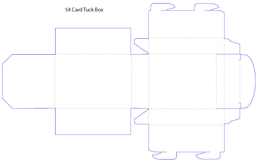
And the image needs to fit in this template:
If you download the Basic Rules and take a peek at pages four and five, those two dudes are the point of these decks: War Marshals. Tough guys, to be sure…devious and fast with their ball lightning carbines….but also tactical and strategic geniuses at commanding their factions. The two tuck boxes need to highlight their respective War Marshal very prominently. Then I’ll need space on one side for introductory game wording, some exciting blurb about the lore, and a little copyright and legal stuff.
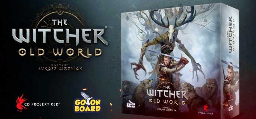
Saw this packaging for an upcoming game based on The Witcher that really impressed me:
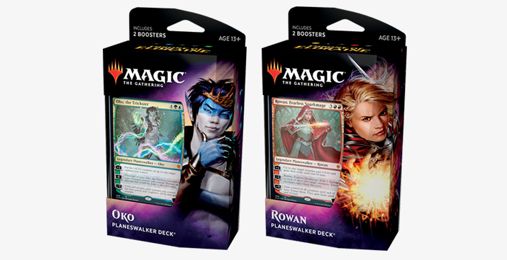
I suppose the thing that struck me most about it was I have had box designs for Magic: The Gathering decks in mind – with shades of blue and green and glowing eyes, hovering magical glyphs and whatnot. But none of that makes sense here, not from the aesthetics or elements of the Salt Mystic worldbuilding, not from the standpoint of looking different on the shelf, and also just to distance from other card games.
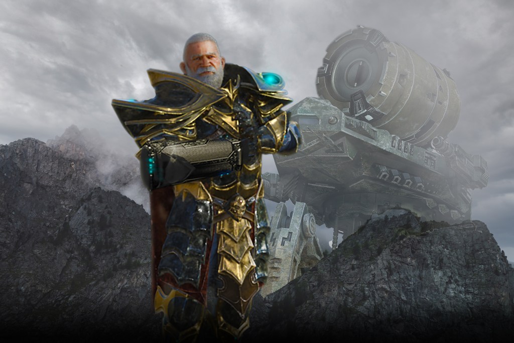
But these Witcher: Old World graphics pop big time for me. I like the coloring, the dramatic lighting and smoke, the sense of danger and action. It’s eye-catching and intriguing. So I took a stab at something like I thought my ideal artist might have come up with (the guy who’s too busy), and with this box in mind. That’s the image at the top of this article. Now I’m just kind of staring at it, letting it soak in to see whether I like it. I’d need to fade the edges and fade to black more at the bottom of the box, as well as include a dramatically dark field for the back of the box for the wording and logos.
So I would I rather be writing? Because that’s what started all this?
Yes, I would rather be writing. But none of this world will exist without the visuals and an exciting way to engage with the stories happening in it. Gotta do it, man. Gotta do it.
Looking for thoughts on packaging here – what do you think?
But until next time…
Dreams are engines. Be fuel.
