Huge Grailrunner freebie – an interactive concept art masterclass for free!

Friends and neighbors, this one’s different.

For years we’ve been talking here at Grailrunner about how imagination works — why certain images crack open your brain, why odd bits of history or art or game design suddenly ignite a whole setting, and why creators keep coming back to the well even when the world’s noisy. We’re always on the lookout for new ways to break into exciting and innovative designs, imagery, and above everything ruling it all…to tell new stories.

OK, so what’s the freebie?

Hold on – a little context first. It was a life-changing experience for me personally to write and design our most recent publication, SALT MYSTIC: BOOK OF LOTS, a western-themed science fantasy roleplaying game book built around the fortune-telling mechanic of bibliomancy. I’ll tell you why. To build out the world of our signature IP at Grailrunner, I needed a ridiculously huge amount of outlandish concepts, crazy ideas, and just cool, new stuff! I kind of went down the deep well of concept art techniques like mind-mapping, thumbnail sketches and iteration, shape carving, scribble ideation, and mood boards. That stuff is like adrenalin for an imagination, honestly!

It was so impactful, in fact, that I wanted to go deeper. Yet it struck me that art school and super expensive concept art classes with some of the working masters in this field aren’t going to make sense for me. I imagine they don’t make sense either economically or logistically for a lot of folks like me. So it got me thinking I’d like a simpler, streamlined, but focused way of drilling deeper into JUST the parts of concept art that would help me – the techniques that help break your imagination’s walls to explore new ideas.

Sounds great. What did you do?

We don’t charge for AI-generated stuff at Grailrunner, and we always point out its use. In fact, we’ve built out some pretty amazing stuff that we give away just to experiment with possibilities and hopefully inspire anybody that hangs out here with us. If you keep coming back here, maybe you’ll buy a book or a game or drop a LIKE on our Facebook page. That’s the idea.

My absolute favorite giveaway so far has been an entire board game mockup set in the seas of Tolkien’s Middle Earth. Awesome. I just got a Silhouette Cameo 5 for my birthday, so I’m planning to break that puppy in with the printable tokens and cards there.

And specifically now for concept art techniques?

I curated a portfolio of concept art masters, provided an outline of content for my ideal coursework for a class, and instructed ChatGPT to act as the composite concept artist (meaning all those people) and write the chapters one by one for my outline as well as a preface and afterword. Then I went chapter by chapter and had it generate impactful exercises unique to each section which a student could conduct on their own with an internet connection and pencil and paper.

I mocked up illustrations of concept art techniques and examples to ensure the book is illustrated well and clear in what it’s saying. Then I bundled all of that into a professional textbook template and converted it into a pdf.

Inside you’ll find:

  • A step-by-step ideation → thumbnail → refinement pipeline
  • Practical exercises after every major section
  • Guidance on using digital tools without letting them boss your imagination around
  • A tone that assumes you’re already creative — we’re just lighting the boosters

That sounds nice. Your header says it’s “interactive” though. What’s that about?

I told you here that I’ve used AI tools to resurrect old masters and have them critique my own art to provide detailed feedback on what I could improve. That works surprisingly well, so I added instructions in the Preface on how to upload this very pdf to a student’s own instance of ChatGPT then have the AI act as the composite author critique their own uploaded exercises.

I mean. That’s totally possible and crazy to think we can do that kind of thing for free now. Anyone upset about AI being used like this needs to…and I say this with love…recognize this kind of workflow is an unstoppable industrial revolution. Your competitors are doing it.

Give me a download link, man! You’re killing me.

Grab the masterclass, run through the first exercise tonight, and then show us what you made. We’re still building this creative network in public — the more people who are sketching, painting, kitbashing, and worldbuilding alongside us, the weirder and better things get.

Enjoy, and make sure to let us know what you think.

Till next time,

Let’s talk to Mateusz Lenart: award-winning game director and modern-day pen & ink master

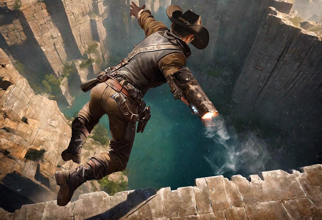
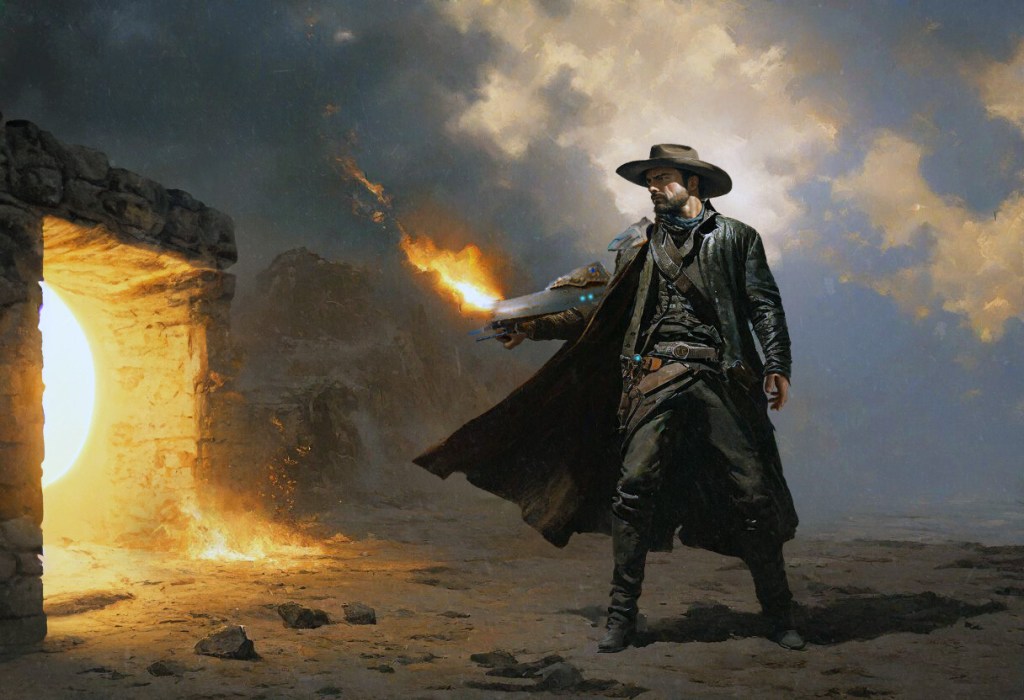
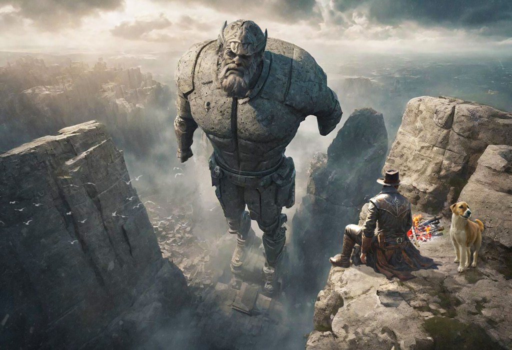
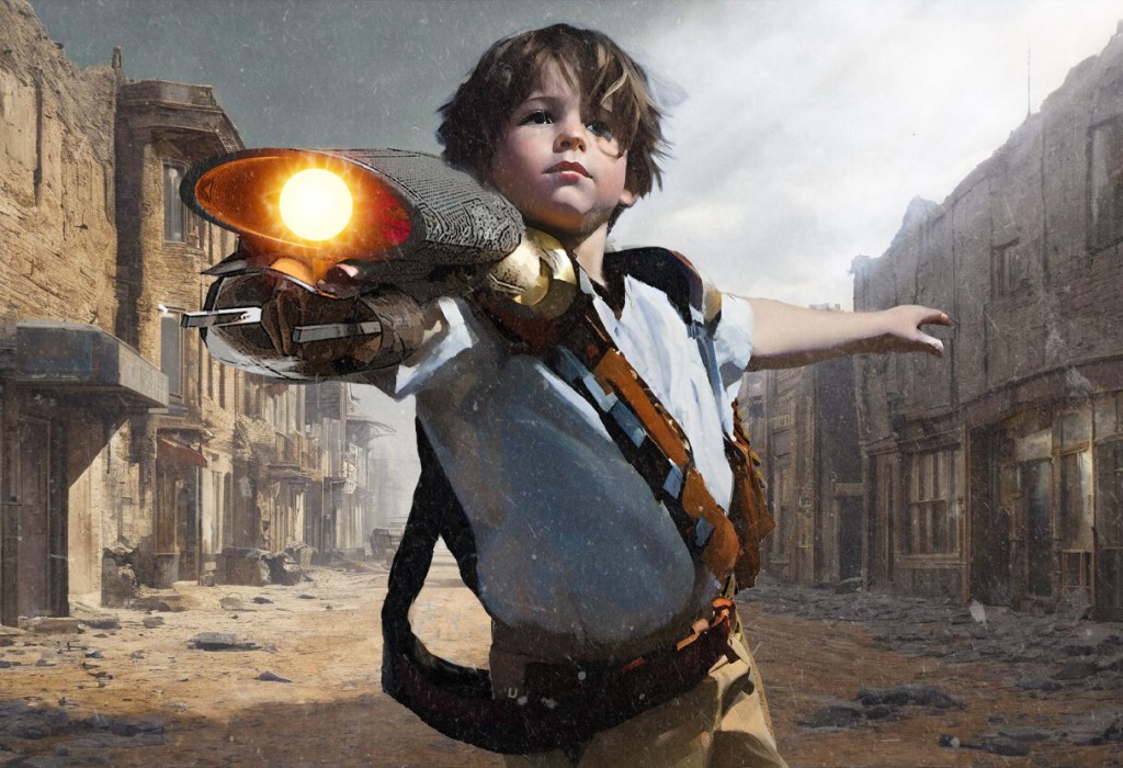
At Grailrunner we thrive on conversations that sit at the crossroads of imagination and craftmanship. Mateusz Lenart doesn’t just know the place – he’s set up shop there and is drawing crowds! From his role as Creative Director at Bloober Team (Layers of Fear, Observer, Blair Witch, The Medium, and the Silent Hill 2 remake) to his own powerhouse artwork – especially in traditional pen & ink, Lenart brings an artist’s eye, a comic reader’s energy, and a storyteller’s genius into the ever-shifting worlds of modern games and illustration.

Welcome to Grailrunner, Mateusz! And welcome to our ongoing series titled:

1. When we spoke to game designer, Jake Norwood (The Riddle of Steel), he mentioned a fascinating Polish RPG called Dzikie Pola. Polish fantasy author Krzysztof Piskorski (Tainted Grail) is a long-time target of ours for an interview to cover his incredible fantasy worlds. And if we’re talking Tainted Grail, we’re talking illustrator, Piotr Foksowicz – also Polish. And here you are, scaring the crap out of us with groundbreaking psychological horror in video games! Is there something awesome in the water over there?

Well, I can’t reveal too much just yet, but what I can say is that at Bloober Team we’re very much committed to pushing the boundaries of psychological horror. We’ve recently announced another remake in the Silent Hill franchise – this time going back to the very beginning with the first game – and not long ago we released Cronos: The New Dawn, another horror experience from our studio. Our portfolio has always been about exploring the darker corners of the human mind, and we intend to keep building on that tradition with future titles.

2. You mentioned in a previous interview that American comics from the 90’s were a big inspiration for you to get into art. Can you elaborate on which comics or graphic novels stood out for you, and especially tell us why that was?

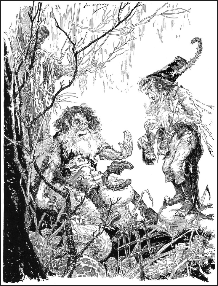
A lot of what inspired me came from whatever I could find in the newsstands in Poland — Kioski Ruchu and the like. As most of the kids I devoured the Spider-man and Batman series in particular, even though it wasn’t always easy — my parents weren’t thrilled about me reading them! Those American comics were flashy and visceral, with dynamic art, dramatic panels, and strong emotions. Todd McFarlane’s Spider-man work was unforgettable — the exaggerated lines, the energy of the webs, the theatrical villains.


Beyond the American stuff, European comics played a big role in shaping me, too. I was deeply influenced by Thorgal by Grzegorz Rosiński, and also by the Yans series from the same author — their storytelling, the textures, the atmosphere — all of that showed me other ways comics could work. And then there were lighter, fun reads like Asterix, which taught me humour, caricature, and the power of visual pacing.

3. If I’d peeked over your shoulder as a kid, what would I have seen on the page—spaceships, monsters, superheroes, or something stranger? Why?

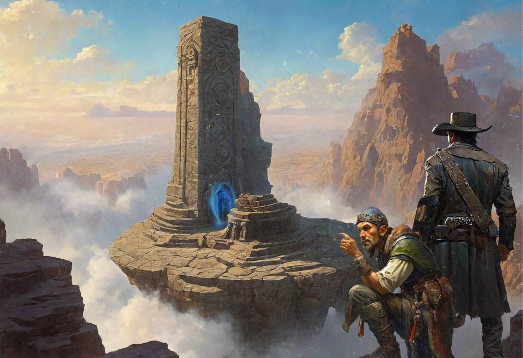
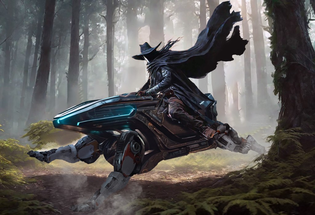
Honestly, a bit of everything. I was a pretty meticulous and disciplined kid — I somehow knew early on that learning anatomy would help me in the future, so you’d probably see a lot of sketches of hands, muscles, poses, often copied from anatomy books. At the same time, for fun I was constantly drawing fantasy characters — monsters, elves, knights — usually with little RPG-style stats written next to them for strength, dexterity, and so on.

You’d also find plenty of comic book pages. I loved inventing huge worlds and epic storylines, though most of them lasted maybe two or three pages before I’d abandon the project and jump to the next idea.

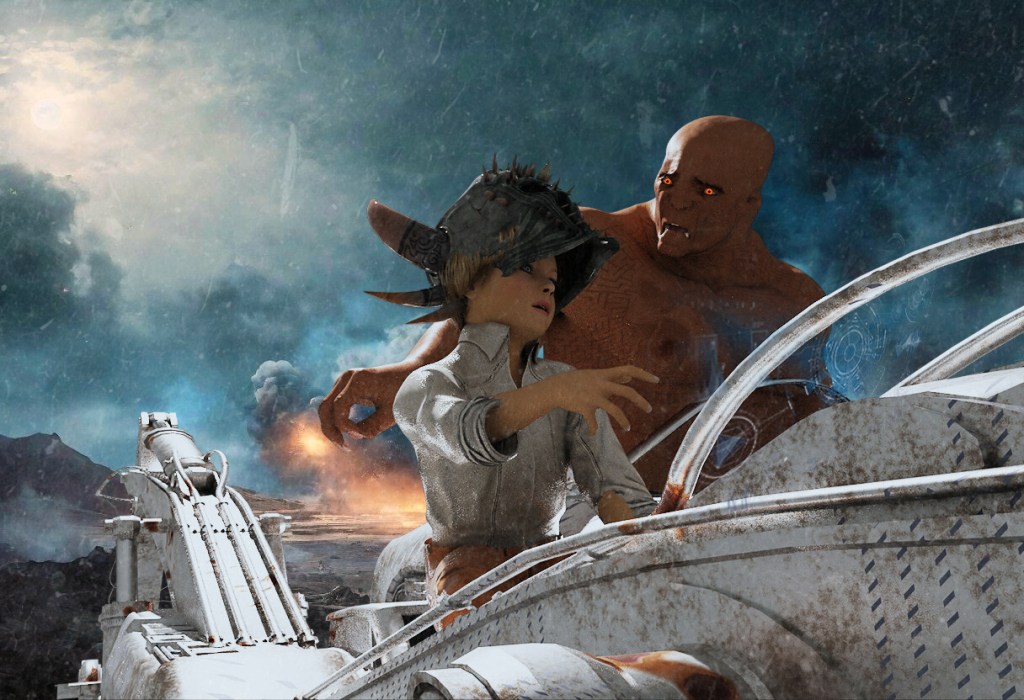
And, of course, there was always a darker tone in what I created. I don’t really know why — maybe because the darker stuff always felt more alive to me: more dynamic, more energetic, more full of contrast. That fascination with atmosphere and intensity stuck with me and never really left

4. Polish art, architecture, and history thread through your work. Can you share a specific real-world reference or point of inspiration, maybe even folklore, from your country that shows up in your illustration or concept art?

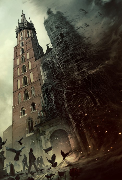
To be honest, there weren’t that many Polish references in my earlier work. Occasionally they appeared — for example, in The Medium I illustrated the towers of St. Mary’s Basilica in Kraków — but Polish architecture or folklore was never my main source of inspiration. At that time I was probably more fascinated by the topography of Middle-earth than by Poland itself.

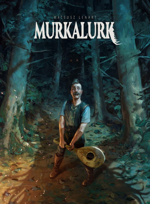
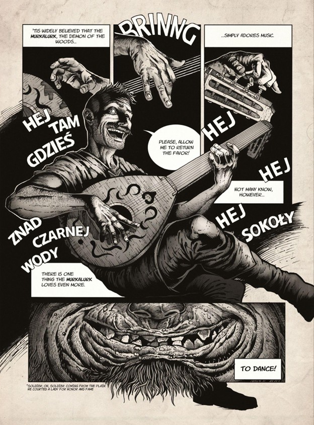
That has changed a bit in recent years. I’ve become much more interested in Slavic mythology, and it’s starting to influence the way I build my own stories. One small experiment was a short comic I created called MURKALURK, which tells the story of an unlucky bard who crosses paths with Slavic demons. Right now, I’m also working on a bigger project — a fantasy world that draws heavily from Slavic myth and culture. So you’ll definitely see more of that in my future work.

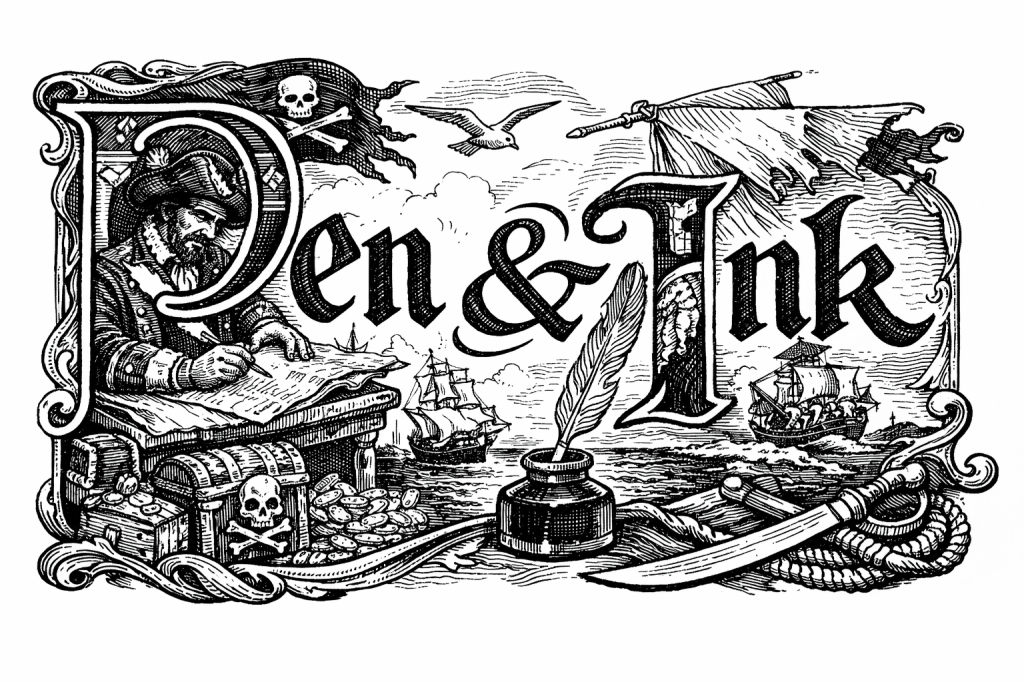
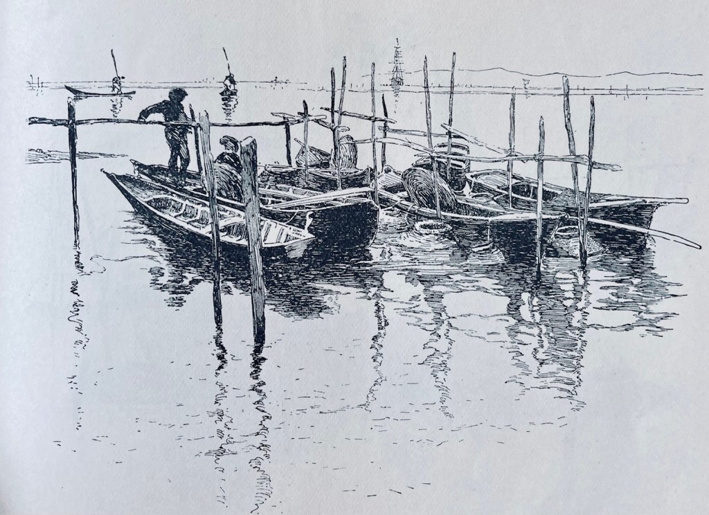
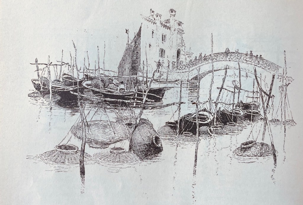
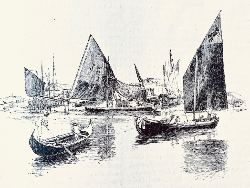
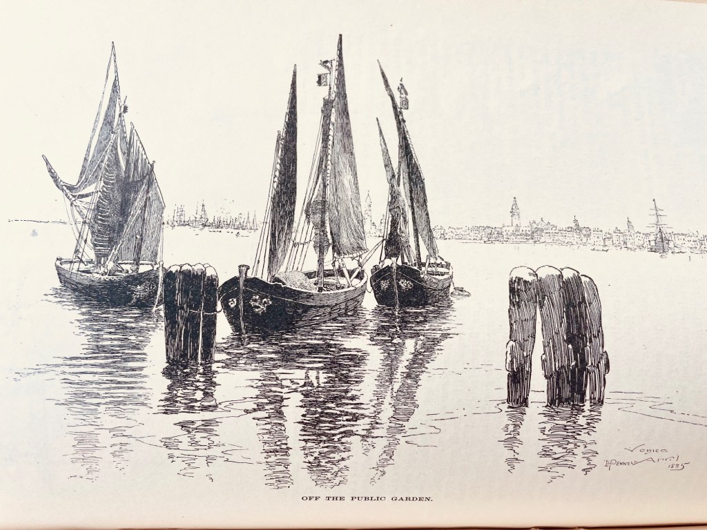
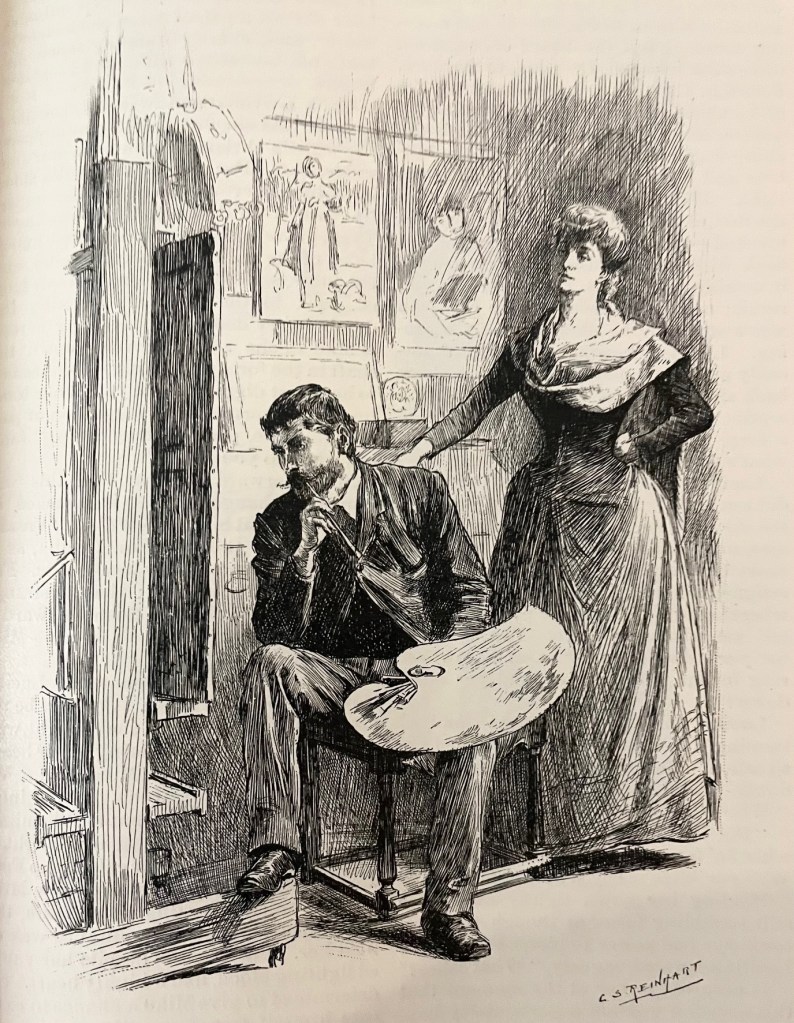
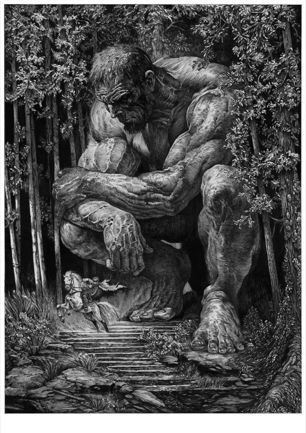
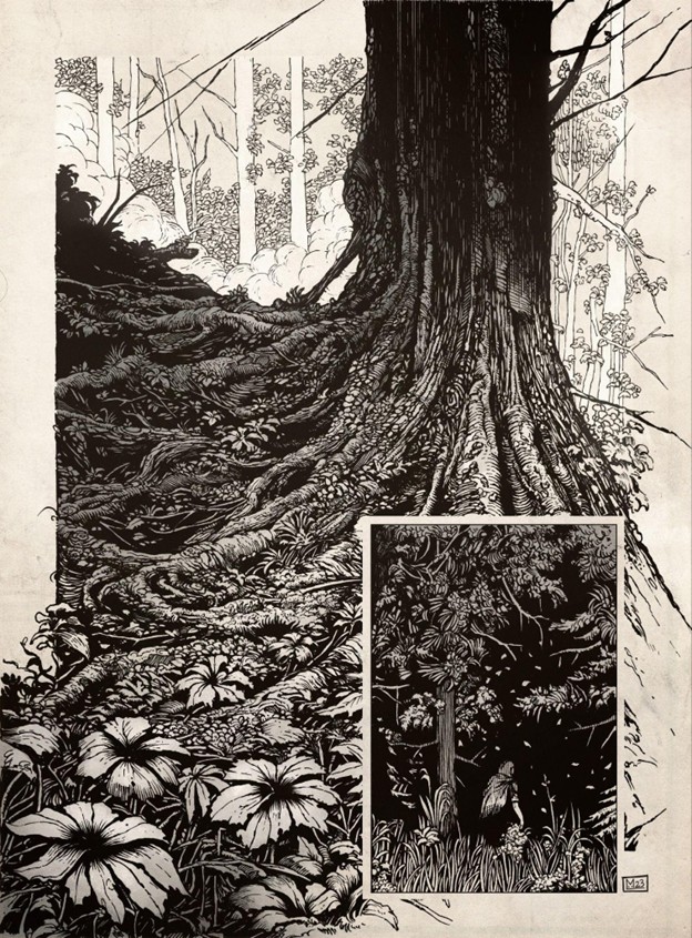
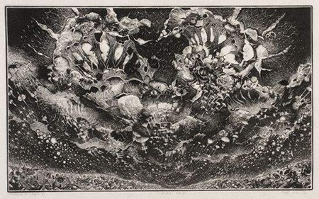
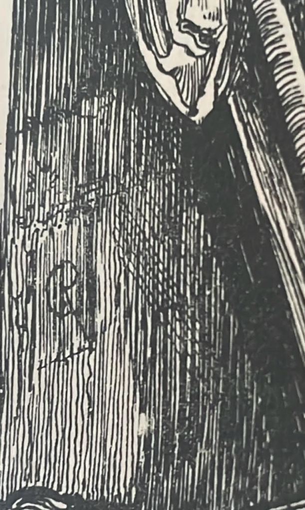
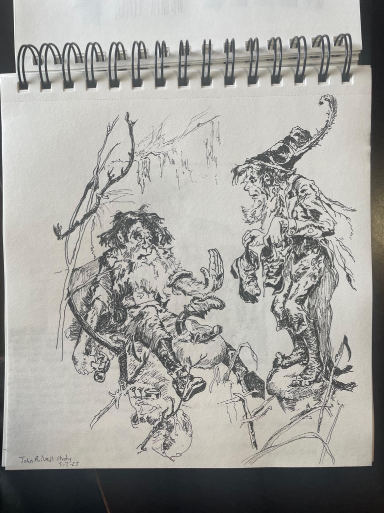
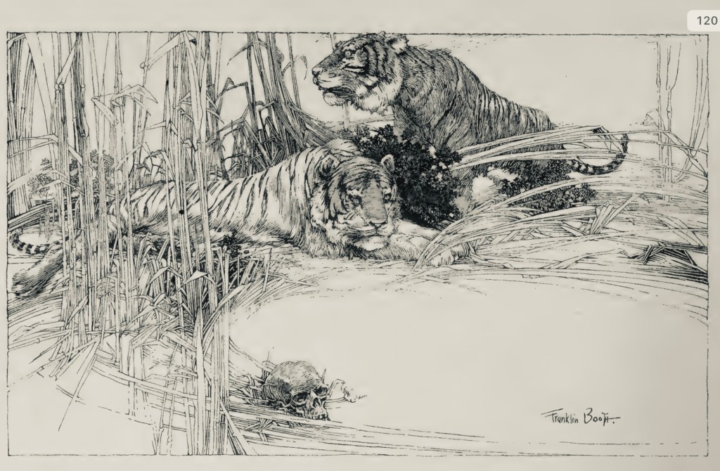
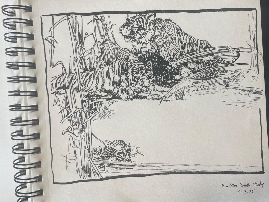
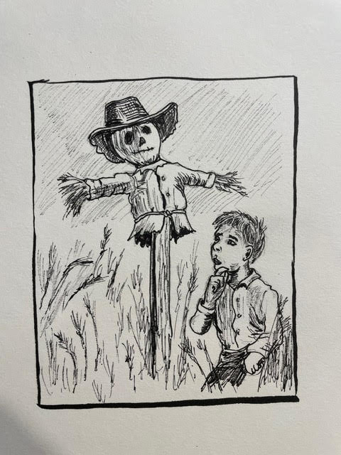
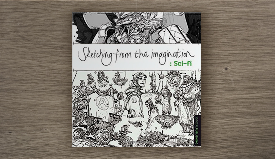
5. Awesome. Simply awesome. Why traditional pen & ink? I’ve got to say, when you mentioned 19th century master, Franklin Booth in a previous interview, I got incredibly excited. The guy was on a different level of genius! You also cited Gustave Dore, Bernie Wrightson, and Joseph Clement Coll. What is it about that kind of art that attracts you?

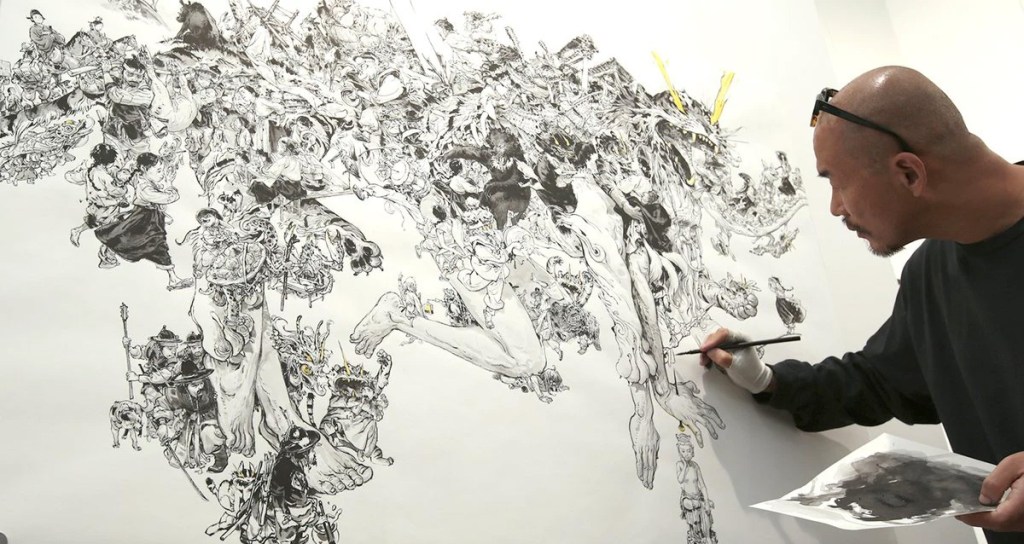
There’s something incredibly powerful about telling a story only with line and value — no color, just light and shadow, rhythm and texture. For me, pen and ink has always felt like the purest way of drawing, where every stroke is deliberate, every line carries weight.

I’ve also always been better in black and white than in color. When I discovered artists like Franklin Booth or Joseph Clement Coll, it opened my eyes to how far you could go with nothing but ink — whole worlds built out of contrast, atmosphere, and detail. There’s a timelessness to that style that I find endlessly inspiring.

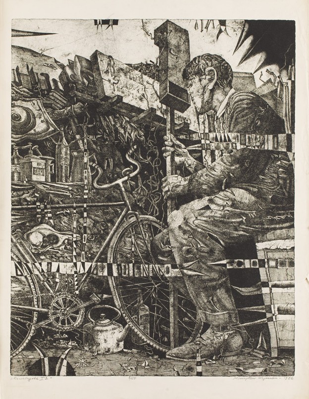
At the same time, I was very drawn to traditional printmaking techniques such as aquatint and linocut. I remember being deeply impressed by the works of Józef Gielniak, especially his Variations for Grażynka, and by Mieczysław Wejman’s aquatints like The Cyclist. When I was a student, I actually imagined myself working with those techniques professionally. But life took a different turn, and I didn’t continue down that path. In a way, pen and ink became a perfect substitute — it gives me a similar sense of precision, rhythm, and texture, without the technical limitations of printmaking.

6. Re-cycle

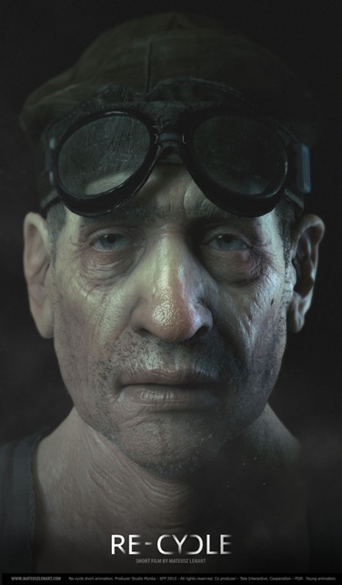
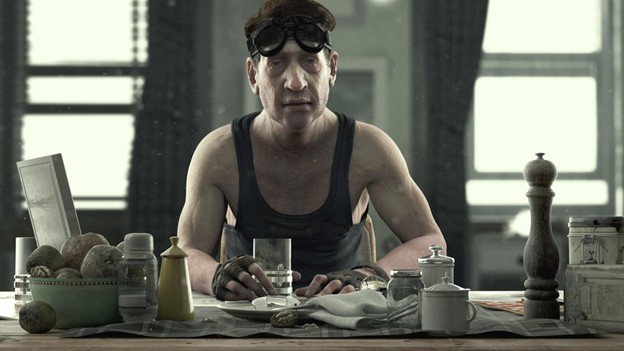
Your animated short Re-cycle is a striking, personal work. What first inspired the idea, and what challenges did you face in bringing it to life? Looking back, how did it shape or grow you as an artist?

I’ve always been someone who can’t focus on just one thing at a time — which is both a blessing and a curse. I started out as a concept artist, but quickly became fascinated with 3D, animation, design, lighting, and filmmaking. It was also a period when Polish short animation was experiencing a renaissance, with creators like Tomasz Bagiński, Damian Nenow, and Grzegorz Jonkajtys making work I deeply admired and wanted to create myself.

I honestly don’t remember exactly where the idea for Re-cycle came from, but, like many of my projects, it carries rather somber tones rather than cheerful ones. It was an interesting project — had I finished it in two years, it might have completely changed the path of my career.

In reality, it took seven years to complete because I kept being pulled into other work. By the time I finished, I was very tired of it, and the technology I had used was already outdated. Looking back, it taught me a lot about perseverance, about balancing multiple interests, and about how long-term projects shape your patience and vision. I do want to return to animation, but to do it properly I’ll need a lot of dedicated time to fully immerse myself in the craft again.

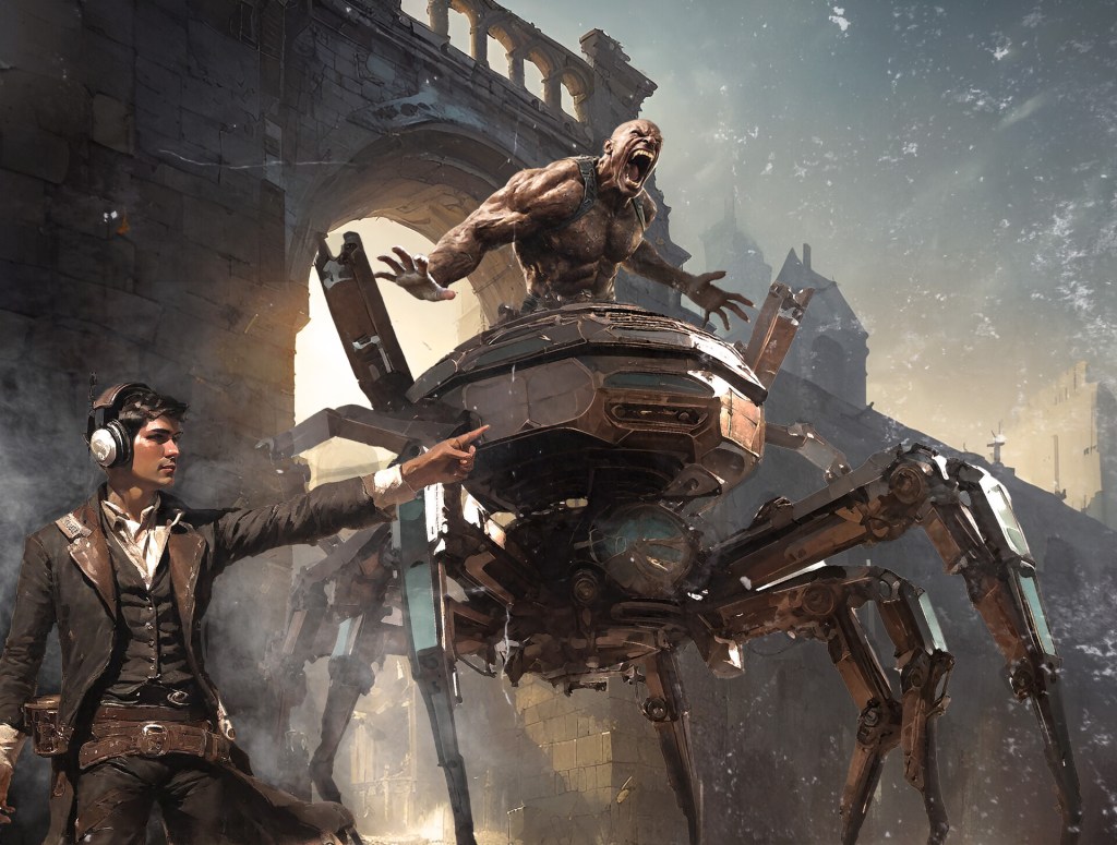
7. Our readers will kill me if I don’t ask about The Medium and Silent Hill, for which you served crucial creative and director roles. What can you tell us about those experiences bringing true psychological horror into the world that made you better as a creator? Did anything from your ink drawing practice or comic-book eye make its way into these massive productions?

Working on The Medium and Silent Hill was incredibly satisfying, but also very different experiences. On The Medium I served more as an art director — helping to shape the Other World — and getting to build an environment inspired by Zdzisław Beksiński’s work was a deeply powerful experience. Trying to translate that kind of surreal, decayed atmosphere into something the player could actually move through taught me a great deal about tone, detail and restraint.

Silent Hill was a step up in both scale and responsibility: the stakes were higher and my role covered design, art and direction. Revisiting one of the most iconic names in horror history is never easy, but it was hugely rewarding. The biggest challenge there was balancing respect for the original material with the need to bring something new and playable to a modern audience — and doing that across a large, multidisciplinary team forces you to be both precise and flexible.

My ink-drawing practice and comic-book eye absolutely found their way into those productions. The lessons of black-and-white work — composition, the economy of line, the power of contrast and negative space — translated directly into how we thought about lighting, silhouettes and level composition. Likewise, the way comics use panel rhythm to control pacing informed how we staged encounters and revealed information to the player: timing, framing and the gaps you leave for the audience’s imagination are universal storytelling tools.

Finally, these projects made me a better creator because they pushed me to scale my instincts. Working on a single illustration is a private act; working on a game means sharing to others your visual language, iterating under constraints, and learning when to cut or simplify for the sake of atmosphere. Film, comics and games aren’t as far apart as they seem — they share the same fundamentals: composition, emotion and the building of tension — and those cross-medium influences keep feeding my work.

8. When you need to design something truly frightening, what rituals or shifts of perspective get you into that mental space—and do you step back out of it deliberately, or carry it until the work is done?

It really depends on the situation. Very often, the things that frighten me most are those that aren’t meant to be frightening at all — finding that uncanny element in an otherwise ordinary scene creates the strongest tension. When you work on horror for a long time, though, you almost become numb to it. Stepping away and then returning to the work helps a little, but you can never truly see it with fresh eyes again. That’s why outside feedback is so essential — we rely on it constantly.

As for rituals, I don’t think I have any special ones. Creating horror, for me, is like any other kind of work: it’s a mix of knowledge, experience, and ideas. To paraphrase Stephen King, most of the time I feel more like a craftsman than a visionary — applying what I know to get the job done. Of course, there are moments of revelation, flashes of inspiration, and when they come you have to grab them and use them. But most of the process is simply the hard, patient work of solving problems over the course of a long production.

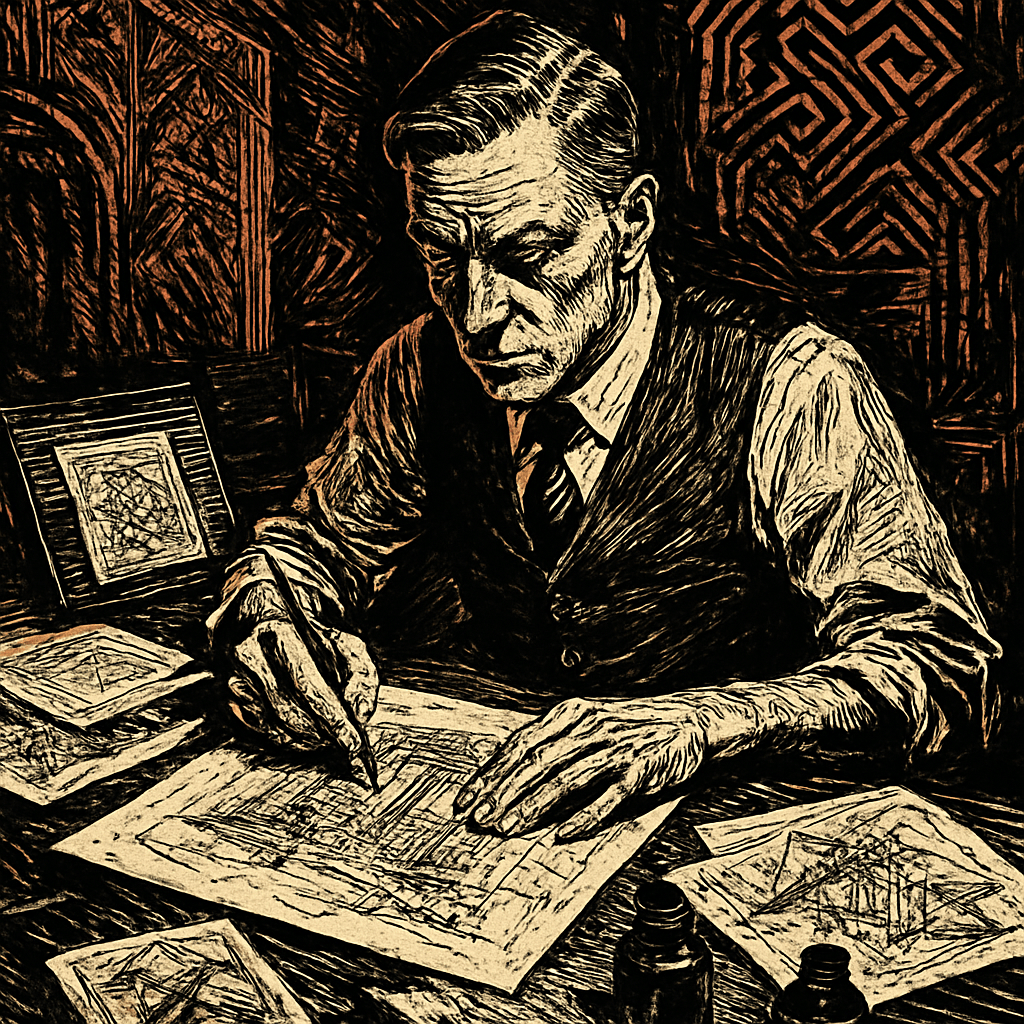
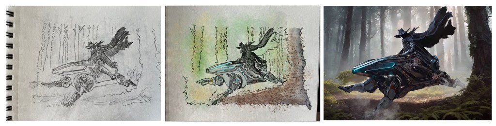
9. When you start concept art for a new character or environment, what’s your first step—gesture, thumbnail, written note—and how do you know when that early sketch has ‘spark’ worth pursuing?

It’s a difficult question, because the process can vary a lot. Technically, I almost always start with silhouette, shape, and energy on the page. There are countless tutorials that talk about the power of form, proportion, and so on, and those things are important — but for me the idea itself is what really pushes you forward.

Sometimes a written description of a monster or a character is already enough to spark something interesting. Other times, you have to brute-force your way toward a good idea through dozens of iterations, hoping that at some point something will ‘click.’ References also play a huge role in this stage. Collecting and studying them often triggers unexpected solutions — they can turn a generic design into something unique.

Recognizing the moment when a sketch has enough spark to move forward is always tricky. In my role as creative director, I often have to make that call, and it’s easier when you’re not personally involved in the painting itself. In my personal work, I usually just follow what excites me most, even if I can’t fully explain why. Sometimes it’s purely instinct — you sense there’s something worth pursuing, and you trust yourself to chase it. I’m also aware that, in doing so, I may be overlooking ideas that others would consider stronger.

10. Anything else you’d like to tell us about, including how we can see more of your work?

I try to stay as active as I can creatively. As I mentioned earlier, my biggest problem is that I always want to do everything at once. I’m still working at Bloober Team on our next title — it’s a long process, and one I’ll only be able to share more about in the future.

On the personal side, I recently released a comic/illustrated album called Murkalurk, which was received warmly and motivated me to start working on a larger comic project, loosely inspired by Slavic mythology. Right now, I’m deep in the stage of building characters and writing the story, which is why I haven’t shared much new work online lately.

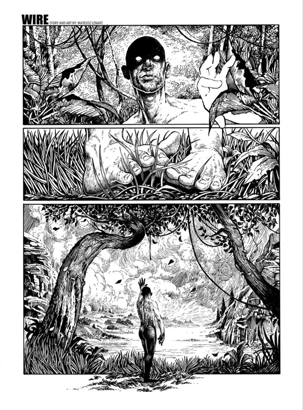
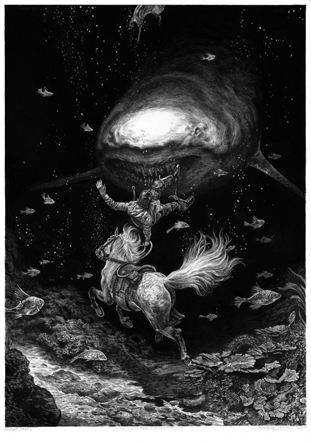
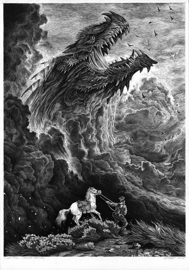
There’s also my ongoing series The Knight’s Tale, created in traditional pen and ink. I hope to find the time to add new chapters to the story of that lost knight. As always, there’s never enough time and far too many ideas.

Hopefully, you’ll be able to see some of these new projects soon on my social channels — mainly on Instagram.

Thank you for the talk.

Thanks for your time and the wonderful art you’ve sent along for us to appreciate! Hopefully we can connect again in the future to see what you’ll have been up to!

*

Mateusz Lenart is an impressive bridge strung between ink and pixel, between the quiet scratch of a pen and the thunder of a horror score. His work reminds us that the best creators aren’t defined by tools but by vision: a sketchbook line that can grow into a world, a half-remembered comic that becomes a camera angle, a personal short film that seeds a new way of seeing. At Grailrunner, we often say “Dreams are engines. Be fuel.” In Mateusz’s hands, those engines are ink-black, smoke-stained, and unstoppable. And we can’t wait to see where they carry him next.

Till next time,

I found a pen & ink masterclass in an old antique mall!

Last week, I took a road trip down the Mississippi Blues Trail out of Memphis. It was incredible, and I might write that one up as well. Seriously, we ate at the Hollywood beside the piano where Mark Cohn was inspired to write “Walking In Memphis”, saw BB King’s famous Lucille guitar, and walked Dockery Farms where the Delta Blues were born. Amazing trip.

The only reason I mention it now though is we were headed back on a route through Little Rock and back to Kansas City when we stopped at an old antique mall. If you’ve hung around here at Grailrunner before, you well know how much we’re into old bookstores and the forgotten but mind-expanding wonders you can find on dusty old shelves. And man, have I got one for you today!

This guy here. Smash the image below for a short video showing what I mean.

It’s a hardback compilation of Harper’s Magazines from 1891 through 1892. Harper’s is a monthly magazine covering culture, finance, literature and the arts that was launched in 1850 and is still continuously published today. I didn’t have any particular fondness or interest in that magazine so much as just seeing what people read about in the 1890’s. I’m also a little obsessed with the 1893 Chicago World’s Fair, also known as the Columbian Exposition, and I was hoping there would be a mention or two in here, and there was.

That’s why I first picked it up.

As I flipped through the pages, I was stunned by the quality and craftmanship of the pen & ink and engraved illustrations inside. I use the word carefully…stunned! Some of the artists were familiar to me, but for many of the pieces inside, I couldn’t even tell who the artist was. Credits weren’t always given, and signatures were too stylized to read.

I used ChatGPT to analyze some of the more interesting works to research the artist when it wasn’t obvious, and it was surprisingly useful for that. Often wrong, but with some caution and follow-up research, you can usually zero in on a likely name.

Thought I’d share some of these beauties with you today, and maybe introduce you to some wonder-workers of the past who could summon sparkling magic with a simple fountain pen. I’m offering 20 vintage illustrations here for admiration and craftmanship study.

Care to join me?

By Felician Myrbach

Myrbach was an Austrian-born artist and leading illustrator of the 19th century. Also acting as director of the Vienna Academy of the Fine Arts, he was known for detailed illustrations of military scenes and historical costumes. This image struck me with its sense of depth, balance of light and shadow, and elegant washes. Looks like it’s coming out of the page.

By John Reinhard Weguelin

I loved the subject here, and the haunting feel of it. The artist was J.R. Weguelin, who was primarily known for his dreamy watercolors and oil paintings, though he supplemented his income by slumming to draw masterpieces like this one for magazines.

When I came across a simple article about Native Americans, I couldn’t believe I was seeing an original Frederic Remington illustration there just as a picture for a magazine. Then another. And another. These seven images are all by Remington, and they’re all beautiful. He was known for paintings and drawings mainly depicting the American west.

These three were all by Charles Stanley Reinhart, an American painter and illustrator who was also responsible for artwork on certain silver certificates commissioned by the U.S. Bureau of Engraving and Printing said by many to be the most beautiful monetary designs ever produced by the United States. That last image, of the two guys sitting and smoking is an absolute master class in pen & ink linework. I struggle in my own drawings to avoid outlines, to use contrasting light and dark for the silhouettes, and to choose the right directions for hatching that don’t distract from the shapes and mood. Reinhart entirely nailed it with that one.

These two were by Edwin Austin Abbey, an American muralist, painter and illustrator known most for Victorian and Shakespearean subjects. Perhaps most dear to our hearts at Grailrunner, Abbey was the artist behind the famous “Quest and achievement of the Holy Grail” murals at the Boston Central Library.

I really loved these two, as they independently stuck out for me on their own merits before I realized they were by the same artist and in fact, an artist whose work I thought I knew. Charles Dana Gibson was an American artist typically cited as being the creator of the “Gibson girl”, the iconic representation of the independent American woman at the turn of the 20th century. I think that puts the poor guy in a box that is unfair, as his composition, linework and hatching are among the finest of his age. He did a little more than ads with girls in them. Seriously, these two images are firecrackers!

These two architectural pieces just made me stare in awe. I can’t draw buildings, no matter how careful I am. They always turn into heavily lined, overly simplified, often leaning, caricatures of buildings. Not my thing, unfortunately. But these two by John Tavenor-Perry (at least I think so) are masterworks. ChatGPT couldn’t do anything with that weird signature (looking like a stylized rune but supposedly initials). After some heavy back-and-forth, I think we landed on a likely artist though I’m open to correction.

By Albert Sterner, this piece is a treasure-trove of hatching. I love it. Somehow, he’s managed to keep all these disparate elements in the composition cleanly segregated: the ladies and the cushion, his legs and vest, the flowers, the chair, shadows…all of it clearly silhouetted and easily read despite being a jumble of things. No way could I have figured out how to get all that detail into a drawing without feeling I needed to strip it way down so you could tell what it was.

And now finally, the mystery piece.

This one.

I was mesmerized. It accompanies a poem by James Russell Lowell titled “His Ship”, appearing in the December 1891 issue of Harper’s Magazine. No credit given anywhere, including the “Editor’s Drawer” where many other attributions for illustrations are provided.

The signature is maddeningly concealed in the drawing. I think. Hard to say if that’s a signature or not. Here’s what I mean:

Anyway, I contacted Harper’s in case somebody’s maintaining an archive of some kind to help identify the genius who did this. It’s gorgeous. If I get any kind of response or make headway on the identification, I’ll come back and update you.

*

But that’s what I wanted to bring you today. Masters of their craft in the golden age of illustration, doing what they did and generating timeless works of art. For whatever reason, and not just as an aspiring artist myself, these drawings are unearthly and hypnotizing to me.

What do you think?

Art critiques from a resurrected master of pen & ink

A year ago, I wrote here about the worst art advice I’d ever gotten, and I posted pages from my sketchbook at the time to stay accountable in some way for improving. It turned out kind of popular, maybe out of the general public’s desire to see car wrecks in motion. Those pages were fairly early in getting back to traditional art versus digital and were mostly pencil work with some light-table ink drawings. And by light-table, I mean tracing things and so…cheating.

I updated you guys in November with some more pages and then again a couple of months ago (bottom of the same post). Those include watercolors, some digital stuff in Procreate, and also ink drawings. Somewhere in all of that, traditional pen & ink drawing kind of caught fire with me.

It’s kind of all I can think about these past couple of weeks. Those delicious hatching lines and stipples, deep, gorgeous washes of black, and intricate patterns of black and white condensing beautifully into a striking, eye catching work of art! It’s all very satisfying, if I’m honest. And the feel of a Pentel pocket brush pen swishing on toothed paper feels a little like watching somebody make a chocolate cake, almost mesmerizing.

I found this amazing resource free on the Internet Archive (smash the cover image to take a look for yourself):

Written by Arthur Guptill, this is a classic instructional book on pen and ink drawing, widely regarded as one of the most comprehensive and authoritative resources on the subject. His writing style was patient, articulate, and he was clearly a master of clean, simple line work and exhibited craftsmanship in how he approached both drawing itself but also how he framed his instruction materials. The guy was a natural teacher.

I was approaching my learning by a combination of master studies and daily practice, at first using a Copic alcohol marker for shading and eventually moving to just the brush pen and Pigma liners to focus on learning hatching and cross-hatching.

Here’s an example, a dazzling piece called “The Cobbler”, by John R. Neill:

I learned quite about overlapping structures for depth, clean linework, effective use of contrast, and detailed volumes just by copying this thing.

Here’s another study, by Franklin Booth – a real beauty he titled “Hunting The Tigers”:

Loads of things to absorb by this one regarding overlapping structures, use of negative space, balance of value, simulating water in black and white, and fur textures with ink. Honestly, I’m not happy at all with my copy, but I was being ambitious.

Anyway, we’re four articles in to a new series titled “Conversations from the abyss” where we use advanced AI tools like ChatGPT and also Suno music generation to bring back creators from the past for interesting debates, dialogues, or other entertaining diversions. Nothing for sale – all available free here on the site. It struck me this past week that it would be amazing if I could receive art critiques directly from Arthur Guptill as I’m practicing various bits and bobs I’m learning from the master studies and other practice drawings.

I’ve got a soft spot for Frank Baum’s OZ books and thought an image of a young Baum coming across a scarecrow in a field and pondering it with his wild imagination might be an interesting image for ink practice. I gave it a shot, then uploaded it to ChatGPT and tested this prompt: “Acting as Arthur Guptil, critique this image and provide guidance on how to improve it.”

Here’s what happened, and it honestly blew my mind:

“You have achieved a fine effort in line drawing, and there is evident care in your composition and subject choice. The nostalgic theme—a young boy in thoughtful contemplation before a scarecrow—is charming and well-suited to ink. Now, let us refine your rendering through a few key observations and recommendations:

1. Line Quality and Variation

Your line work shows promise, but greater variety in line weight will enhance dimensionality and focus. At present, the lines are largely uniform, which causes elements to flatten together.

  • Suggestion: Use thicker lines for foreground elements (such as the boy’s arm or the hat’s brim) and finer, lighter lines for background elements like grass or sky hatching.
  • Vary the stroke pressure as a tool of emphasis and mood. For instance, a light cross-hatching for distant tones vs. a bolder hatching for areas of core shadow (beneath the scarecrow’s hat or the boy’s jaw).

2. Compositional Framing

The rectangular frame is sound, but the internal balance feels slightly off-kilter. The scarecrow dominates the space while the boy feels pinched in the lower right.

  • Suggestion: Consider either enlarging the figure of the boy or repositioning him slightly more centrally. Alternatively, allow the scarecrow’s arm to lead the eye toward the boy in a more deliberate diagonal.

3. Rendering Form and Volume

The scarecrow reads clearly as a simple form, but the boy’s anatomy, particularly the arm and face, could benefit from more structural understanding.

  • Suggestion: Study the planes of the face and arm. The boy’s head could use slightly more cross-contour shading to indicate roundness. The hand, though expressive, lacks clear articulation—gesture drawing practice would help here.

4. Textures and Detail

Your use of short, broken strokes to indicate vegetation is appropriate, but the grass and shirt material begin to blend. The shirt on both the boy and scarecrow could use more definitive folds to suggest fabric tension and weight.

  • Suggestion: Use parallel or directional hatching that follows the form of the fabric. Avoid over-randomized strokes, and let texture be a deliberate compositional voice.

5. Background and Spatial Depth

The background is composed primarily of evenly spaced hatching. While this is functional, it does little to suggest depth or atmosphere.

  • Suggestion: Introduce a subtle gradient to the background by controlling your stroke density—more hatching at the top or corners to create a vignette or atmospheric recession.

Final Encouragement:
The spirit of your work is admirable and speaks to a narrative sensibility. With improved control of line, deeper understanding of structure, and refined use of contrast, this drawing could serve as an excellent illustrative plate.Keep your pen in motion and your eyes ever studying!”

*

I mean. A dead guy just gave me really precise feedback on my drawing, recognizably in his voice and noticing very specific things in the drawing! I got compliments that were specific and not vague exhortations. I got clear, explicit guidance on what exactly I could improve. Not generalities. It was, and I mean this, very helpful.

Now, you might be thinking – “Dude, you’re a chicken letting the wolf teach you how to protect the hen house. AI is going to replace artists entirely; why use it for art instruction if you’re encouraging people to use it at all, they’ll just generate the images directly. Why even learn to draw?”

All of that is, of course, nonsense though, isn’t it?

If we get fat and lazy and stop creating, then the images that AI tools use will become instead of crisp white and deep blacks, just an increasingly bland mush of grays…monotonous and uninspired. AI outputs will become AI training datasets, leading to a downward death spiral of junk art. I don’t want to add to that. I want to make new things, man. New things! I see critiques from long-dead art instructors as yet another powerful tool for me to do just that.

I asked for a new chapter to Guptill’s book for digital inking, by the way, which is available free below (and entirely and recognizably in Guptill’s voice):

And yeah, okay, it’s time for an accountability upload of the latest sketchbook entries here (be kind!):

That’s what I wanted to share with you today. Pages 19, 20, and 21 especially benefited from pseudo-Guptill’s instruction, and I gave it all I had to incorporate to the developing pieces what it was telling me.

All this has me wondering – just who else can I get to critique some of this and help me learn quicker? Maybe Leonardo Da Vinci is up next!

Till next time,

Art Advice: An Epiphany In Three Steps

Back in May, I posted some musings on this site about what I called bad art advice that I’d gotten when I was in Middle School.

“The real world doesn’t have outlines – draw what you see.”

Weird, I know, but I struggled so much with that I gave up drawing altogether. I get that it should be straightforward advice that every burgeoning artist SHOULD in fact receive and, indeed, follow. I get that it’s true and obvious and OUGHT to have been helpful. Just wasn’t how I reacted, unfortunately.

I’ve come to realize that is just a first step.

I recounted how back in October 2023, I’d come across a lifechanging book series called Sketching From The Imagination and an art magazine called ImagineFX that had me rejuvenated to start it all over again, on fire with cool pictures in my head and a spirit to truly give it a go this time. I shared my sketchbook at the time (shudder!) a little over a half-year in, to be accountable to folks here for improving.

Another phase of things had opened up with an enlightening quote from the genius artist, Kim Jung Gi that said:

“Don’t draw what you see. Draw what you HAVE seen.”

I liked his emphasis on practicing reproducing reference images, only from different angles and perspectives so you can learn their forms in three dimensional space. Over time, your visual library carries enough shape and texture language to work directly without reference. Very nice. You see, I have a complicated relationship with the use of reference images in creating art. The dream has always been to sit down with a piece of paper or a blank screen and summon fantasy and science fiction imagery from nothing – not to robotically reproduce an image in front of me. Over and over, every artist I was seeing on Youtube or reading in interviews, they were all using reference images. I had this inner voice saying “if I wanted to reproduce an image, I’d take a picture of it”. Kim Jung Gi’s advice offered a different relationship with reference imagery.

So it’s been over a year now. Keeping up the practice frequency to at least a half-hour each night if at all possible. Even when I’m bone tired after work and would rather stare at history documentaries or old spy movies (or train movies -those are awesome).

Anyway, somewhere along the way, this happened:

Don’t ask, my friend. I just thought I’d try watercolor painting and this guy showed up. I call him Barney. My first attempt. I hadn’t planned on getting obsessed with watercolors – it was Peter Han‘s fault. Was watching Peter draw something amazing, and he pulled out a little travel palette set. The smooth and striking combination of ink and colored wash fascinated me. Strangely, as I submerged into the very deep and mesmerizing well of watercolor painting in magazines, books, interviews, and tutorials, a new, possibly ultimate and final step has started to take shape.

Watercolor pigment does what it feels like doing on the paper. It moves around. Crashes. Blossoms. Ignores your feeble mortal attempts to control it. But it makes incredible gradients and blooms and textures like nothing else. And its mightiest trick, almost its entire reason for being, is to capture light. I’m talking about the translucency of a green leaf in summer with sunlight bleeding through, the broken sunbeam dancing on a marble floor, the ghostly and serene reflections of clouds and seafoam on the beach once the wave goes out. Google “Steve Hanks” and Thomas Schaller to see what I mean.

The more this got in my head, the more I began to realize there even WAS a third step to this process. I’m not there yet, but I think I can see it taking shape. If I hadn’t started paying so much closer attention to light filtering through trees or bathing morning fog in an orange glow because of all this focus on watercolors, I’d have missed it, I think. This final quote that crystalizes what I’m seeing has popped up a number of times now, so I’m not sure who started it all. It’s a boneshaker though, that I’m still trying to coax into being my buddy:

“Don’t draw what you see, draw what you feel.”

Now that’s an entirely different way to interact with reference imagery, isn’t it! Snapping a picture in the moment during a hike or on the train freezes one of those haiku moments for you, sure. Cobbling together some stock images and a DAZ3d render or a photobash of some AI-generated elements can put together a good and unique composition, of course. And in that first step, you can practice your technique, reproducing it as faithfully as you can.

At some point though, Gi’s second step suggests you vary the angle, maybe reproduce it from above or from a different side…maybe with an armored zebra beside it, or a screaming werewolf. Mess around and don’t stress about perfection, right? It’s a sketchbook; what do you care if every other one turns out trash? Forms start repeating for you: the fact that eyes aren’t really ovals, that lips and noses and hair cast shadows, and that people almost never stand vertically straight on both feet. That sort of thing.

But then, when you’ve maybe gotten to a point where you can somewhat faithfully reproduce an image with variations and additions, with subractions, and perhaps even can summon something to the page entirely from memory and imagination, another step opens up for you.

Those are pictures I’ve taken in various spots this summer in Kansas City, Cades Cove in Tennessee, and at Destin, FL. You’ve probably got ones like it on your own phone, those images that caught your eye and made you feel something. A foggy morning, a quiet library with the sunlight streaming off a high window, a busy subway station or airport with interesting faces, or maybe a funny face your dog made. It made you feel something, so you snatched it to stick in your pocket.

That’s the third and ultimate step in art journeys, I think: to capture what you feel on the page. The reference becomes almost beside the point. I’m still working this out for myself. Maybe these musings prod something for you if visual arts are at all of interest to you.

Since some folks appreciated the first uploaded sketchbook, here is an update (paper sketches 1-3, watercolors from 4-13, Procreate digital art from 14-17):

Crazy busy year. I hope yours has gone well. For my part, I’m glad Christmas is on its way. That particular crazy freight train is more than welcome this year.

(Update Mar 2025)

And, in the spirit of accountability to improve, here’s an updated sketchbook of what I’ve been up to since this post went up (watercolors on pages 1-8, Procreate sketches pages 9-18, and physical sketchbook pages 19-24):

Till next time,

The Worst Art Advice I Ever Got

I lost over thirty years in my art journey because I (stupidly) took a wrong turn based on what should have been great advice. Let me tell you about that, how exactly I went off the rails, and what a ridiculously talented Korean artist said that got me back on the journey.

If you care about the process of visual creation, whether it’s you doing the creating or just a spectator’s interest in how all that works, then this one’s for you.

Why does this matter?

Crap, man, I’d like to be thirty years better in drawing and painting! I hate that I stepped away for that long. I’m the chief illustrator for Grailrunner, and its lead writer, and its game designer. I need to get a lot done myself to control costs, but somehow keep a high standard on quality of art to convey the unique (we think) property we’re trying to build with the Salt Mystic line.

The images below represent the style of work I’m building these days, relying heavily on photobashing and concept art techniques (with folks like Imad Awan as my virtual gurus). The Grailrunner house design standard is semi-realistic digital painting with grungy overlay, western themed adventurers almost always carrying the signature weapon (a gauntlet-based plasma weapon that doubles as a shield in duels), exploring statue-riddled, software-haunted ruins with shimmering dimensional portals. We aim for vibrant or earthy colors, lots of smoke and grit, with implied stories (often illustrating flash fiction on Salt Mystic lore cards).

See the lot of them (and trace my hopefully improving style) at the Artstation account. Yes, I use AI-generated bits to composite exactly like I do with stock images but generally composite everything into something new and paint over them such that the transformation is meaningful and my own.

It gets the job done, at least I think. Still, I wish they were grittier. I wish they broke more new ground than they do. I envy the striking shapes and designs of a lot of concept art out there for cinema and gaming – the kind of images that stick with you even if you don’t know the context. Artstation is great for inspiration, but it can also crush your dreams if you compare yourself to anybody.

Mitchell Stuart, for example. Or Ricardo Lima. Or Raphael LaCoste. Or Greg Rutkowski. Or Ash Thorp. People like this are just on another level.

What’s prompted this reminiscence about bad art advice?

Well, I came across this book called Sketching From The Imagination: Sci Fi by 3DTotal Publishing. I wrote about it here. That was October, which seems like an eternity ago. I posed for myself the challenge of returning to traditional pencil and ink drawing in a sketchbook to push my imagination harder than ever before. The dream is to explore a blank page with loose shapes and vague ideas to summon phantoms into form and create groundbreaking designs and concepts. Then these wild new beasties and tech and colorful characters would then find homes in the fiction or game settings.

How’s that going?

Meh. I was so much rustier than I thought I was. I’ll share some pages here to embarrass myself and stay accountable to you for improving. We’ll get to that. But let’s talk about that advice.

When I was a kid, I filled scores of sketchbooks and countless backs of trashed dot-matrix printer paper my dad had brought home from work. Drawings of super heroes and sci fi vehicles and cities were my jam. Comic books were my main source of imagery, so everything I was drawing had bold outlines and underwhelming composition. The stories weren’t being told by the images in a self-explanatory way – I didn’t think about that sort of thing. I was alone a lot, so I didn’t share these with anybody, nor did I get any feedback.

Flash forward to one day in art class, Middle School I guess, the teacher strolled by to see whatever I was working on and stopped to say something about my approach that resonated with me. He pointed at the paper and said something profound:

“Real world things don’t have outlines. Draw what you see.”

It shook me. Hadn’t thought about that. Good point. So I gave it everything I had to incorporate his advice into how I drew. Back home, hovering the pencil over the paper, for the life of me I couldn’t figure out where or how to make a mark to start the drawing if you couldn’t outline it.

For this post, I looked through some old crates to find a particular drawing that would be humiliating to show but really staked the ground for when I began to turn away from drawing entirely. The picture in my head was a Dungeons & Dragons-style adventure party with a lady wizard, a swordsman, and an elf planning their next move on a morning beach with foamy, ripply water lapping at their feet. Maybe a dying campfire in the foreground with smoke rising in front of them. I couldn’t find it, unfortunately.

Anyway, it was horrid. Everything on the page was so light, you couldn’t even make it out. I was petrified to start drawing outlines again, and I couldn’t see how to force shadows and contrast to draw out the shapes. It threw my perspective. It threw my focus on their faces. It ruined everything. It was the last sketchbook I really did anything with until decades later, at least in any serious way.

Sounds bad. What’s different now then?

I get it now. Youtube changes everything, doesn’t it? Contrasting light and dark, the subtle use of textures, faking details, focusing and directing the viewer’s eyes across the image, and strategic use of busy and rest areas…I never went to art school. That all may be common sense to you, but it’s a glorious rainmaker for me to see all that in action artist after artist, listening to these marvelous and generous people draw magnificent things and explain their thought process as they go. Great time to be alive, isn’t it?

I travel a lot, so I keep an art pack and sketchbook. Pigma FB, MB, and BB brush pens, Staedtler pigment liners, a mechanical pencil, and some Graphix watercolor felt pens. Since October, I’ve put the practice time in almost every night at least for a half hour. It wasn’t a pleasant return.

The dream is to draw from imagination though: new things. What I’ve learned from artist after artist in their podcasts, Youtube or ImagineFX interviews is that drawing from reference is far more common. A lot of the guys you see on video drawing or painting have their reference images off screen.

Reference images! That wasn’t why I got into this gig. If I wanted a copy of an image, I’d take a picture. It was disheartening to me to hear professionals talk about light table tracing for their outlines…to see fantasy illustrators mash up references to form fantasy beasts – all of it copying what they saw. That was my problem back in the first place, right?

Then I came across this genius: Kim Jung Gi. Rest in peace.

Please google him if this flame of wonder is unfamilar to you. He drew from his imagination like a magical fountain spews sparkly fairies. He just walked up to paper and went nuts, drawing fish-eyed perspective, highly intricate intertwined figures, scores of objects and novel, distinct, and interesting characters at a high rate of speed and without slowing. How’d he do that?

That guy didn’t have any reference images. That’s what I wanted. I had to go deep to understand what he did right that I was doing wrong that could unlock this magic. Exploration on the blank page…finding ideas haphazardly that were uniquely my own…I wanted to bottle this magic for myself. How in the world did he get to the point he could do it so wonderfully. Then I heard him say it (through a translator):

“Don’t draw what you see. Draw what you HAVE seen.”

His point was you have to do the reference images and understand forms and shapes in three dimensional space before you can do what he did. He explained the lifetime of sitting in public places filling thousands of pages drawing what he saw and forcing himself to draw it from another angle. That was the key – he drew what he saw with a lifetime of practice, but still practiced summoning those images from his memory to try them from different angles.

He drew what he HAD seen. It was a big realization for me, this idea of examining the reference image – not just to get better at copying it, but to run your mind’s eye all over it in three dimensions to understand it better and to file that away to fuel your imagination.

Now THAT’s what artists actually do. They don’t copy. They understand.

I wish that guy was still alive. He was amazing.

Agreed. Now how about sharing your progress?

Ugh. Here you go. Don’t be judgey. Wish me luck that things improve. Go ahead. Click the book.

Ouch. I hope you don’t lose all trust in me, should you have had any. Photobashing is an entirely different beast than battling blank pages with a mechanical pencil. I’ll keep at it. The beast-shaped robotic vehicle in the header image was a minor victory in this experiment: called a “sporecutter”, it’s the first concept that’s come from the new approach that might actually make it to the fiction. Page 15 in the sketchbook file here is the front runner for the design of an important vehicle in the Mazewater: Master of Airships novel I’m working on. That’s another possible win.

That’s what I wanted to talk to you about today. I hope it was enlightening or helpful, should this be a journey you find compelling for yourself. Otherwise, I hope I still brightened your day a bit and made you think.

Till next time,