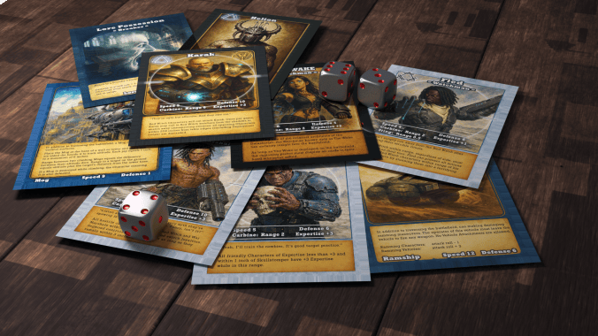
Here’s how it all happened: many years ago, my wife asked what I wanted for my birthday. I said for her and the kids to play D&D with me (which I hadn’t played since the 80’s) because I thought that would be funny and nostalgic. Then when I stepped inside the local gaming store, I saw some guys in the back playing a game involving miniature steampunk robots on a sweeping grassland with hills. I remember asking the guy at the counter as I slide my D&D starter set over to him, “What’s that back there?”
Guy said “Warmachine. Kind of like chess except with magic and battles.”
You caught the wargame fever, then?
Yeah, I obsess over new, interesting things like that. Honestly, I hadn’t heard of wargaming before that apart from dudes moving little Napoleons and cannons around. Anyway, it turned into building terrain and collecting cool mini’s from various games, eventually swelling into a personal challenge to build a cinematic experience on the tabletop. Even built a custom gaming table to do that.
Why do I tell you all that? Because I culminate things. I build to something. Can’t help it. The logical conclusion of those combined obsessions led me to the notion of building my own tabletop game around the Salt Mystic setting of a novel I’d published a few years before. And that led me to Blender.
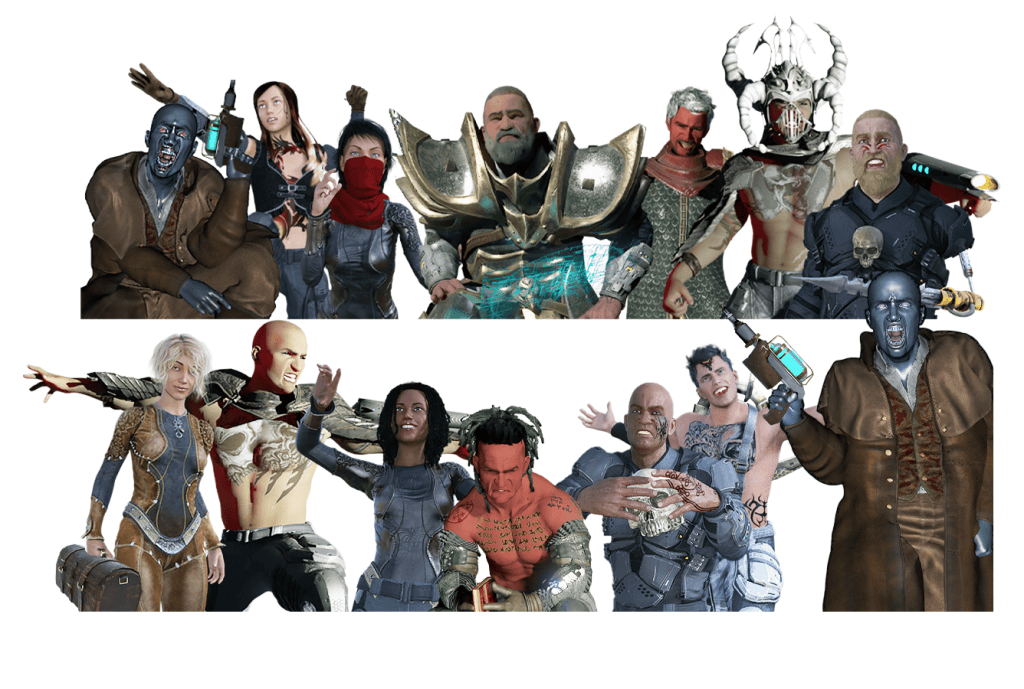
Who are these people?
Ouch. I was so proud of the art I was doing then. It hurts now to look at it, but it was cutting edge for me. Those are original character art pieces which made the cards for the first edition of Salt Mystic back in 2021.
Blender is a free 3d graphics software and I went crazy with it. I was convinced that building a character in Daz Studio, dragging it into Blender and setting up a scene for the render was as good as it could get. I collected cool poses when they were free or cheap and dabbled in building weird weapons by kitbashing any meshes that looked right. I used Substance Painter to add shiny textures and dust, slick-looking scratches on metal. I unfortunately also discovered Blender’s fog glare, which hypnotized me in how unearthly glows could be added to virtually everything.
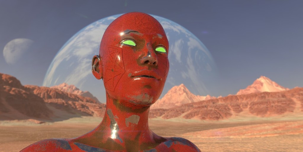
Sometimes, my efforts turned around pretty well. I got some great compliments on this one.
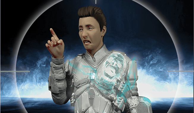
But too often it turned out like this. And I went with it anyway.
You didn’t put that guy on card art, did you?
I did. Yeah. You’ve got to understand, I was busting out the art myself, the draft ruleset, chasing down anybody who would help playtest, wearing out scissors to cut mock cards out of printer paper, and learning graphic design all at the same time. And making things shiny and scratchy and glowing with those new 3d skills was addictive, seriously. Waiting on the magic after hitting the RENDER button felt like a slot machine. I think I hit rock bottom when I discovered particle systems and started trying to grow character’s hair since the Daz hair models I had were silly-looking.
Guys, I was growing hair on people because I could!
Didn’t people tell you the art sells the game?
Oh, I heard about my art choices almost immediately after publication! One guy broke my heart when he said something like “I would have tried your game out but you really shouldn’t have gone with 3d art.” I was so exhausted by the time I went live with Salt Mystic as a tabletop wargame that I couldn’t imagine changing anything. Not for years.
And what’s changed?
Last year, I had the idea that AI might be able to build a game as if it were designed by Hannibal of Carthage, Admiral Horatio Nelson, Tolkien himself, and the Monkey King from Chinese folklore. Read about that here.
In building the assets for that prototype game, I learned how to design an art style in AI and use it to filter & transform your own artwork into something more unified & appealing. In that case, a gorgeous & simple watercolor style. The cards for that game turned out so well it got me thinking…
So what did you do?
I systematically ran my original card art through the new art style using AI, tweaking some of the compositions when they weren’t redeemable. I’ve also been using AI to critique my own new art, and one key theme in everything I make is I need to show better restraint. I fill too much space and don’t include rest areas. Anyway, I took that advice to heart in the new card art too. And since I was doing that, I tweaked the card text in a few places as well, to reflect some things I’ve picked up along the way.
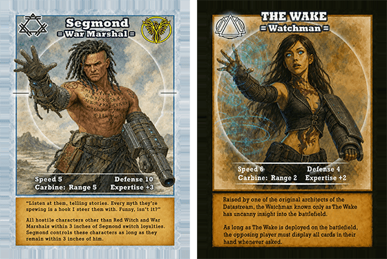
Check that out – those old Daz poses are still there! I built the forearm-mounted plasma weapons originally as squashed cylinders in Blender with some sewer drain textures over them and some Photoshopped glow on the sides. Over the years, I’ve improved the design a lot, but it’s nice to see this evolved form now on the new cards.
Why did you do this? Are you de-listing the old version?
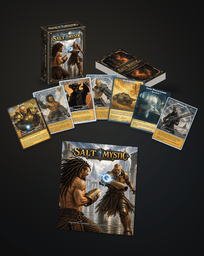
Oh yeah. I finished refreshing the cards a few weeks ago and rebuilt the rulebook from the ground up. With restraint and less over-explaining. Less noise. More focused on what the player needs to know and less lore for the sake of it. Then, since I needed a clean and professional place to store the rulebook, I refreshed the Salt Mystic landing page as well.
The tuck box design is so much cleaner and smarter now. I took almost everything off it and consolidated down to a single starter set with two factions inside ready to go. I left some cards out of the mix, which sucks, but the idea of making this easily playable with a single, simple purchase and a QR code for the rules is such a better idea than the individual war marshal decks I had before.
Is that available now?
It’s done and uploaded to DrivethruRPG but I’m waiting on the proof copy. Give me a couple of weeks to make sure everything is top notch. This will be amazing and the peak of an experience going back maybe 8 years by now. I’m very excited to hold this new version in my hand and let people see it anew.
What’s with the new logo?
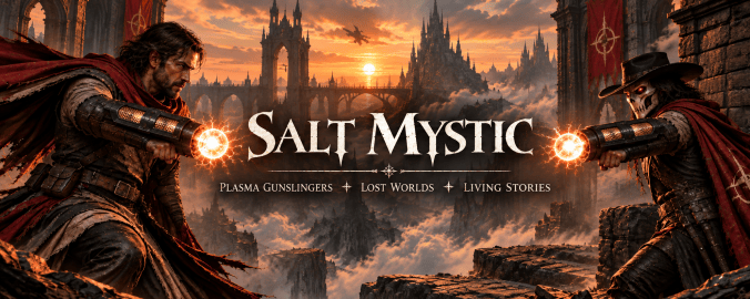
The graphic design people tell me that our previous logos are crappy to reproduce on packaging, so we’re switching that up as well. Wait till you see the new Grailrunner logo below. Pretty cool and maybe, we’re adults now.
*
And that’s what I wanted to bring you today. I hope the backstory is as interesting to read as it was to live. Till next time,