Building an indie game’s meta-story one gunslinger at a time

If this is your first time visiting Grailrunner, we make games, art, and fiction mostly set in our signature IP, a western-themed science fantasy roller coaster called Salt Mystic. In 2021, we published a tabletop skirmish game with the curious notion of telling stories with it.

Our original manifesto for the game included these three guiding principles:

  • Make the characters come alive. Combine gorgeous card artwork with gameplay mechanics that reflect who the characters are and why their stories matter.
  • Give the battles a bigger story. Create an overarching narrative that explains who’s fighting, why, and what the consequences might be whichever side wins.
  • Give everything a history. Every character, weapon, and vehicle has a backstory. Even the scratches on a cannon barrel came from somewhere.

We’re talking 8, maybe 10 years ago when I first really started thinking through how to do all that. And the first real in-game story came about in September of 2019. I wrote about that in an update on game development here. It was these guys:
Who are those two?

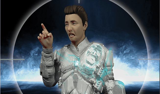
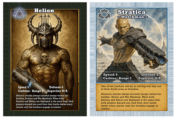
In the Salt Mystic lore, there are stories able to travel and affect the world on their own, hopping from mind to mind and even possessing people. Some are able to raise a guardian for that generation, uniquely suited with the character and charisma to change the world. Helion and Stratica were brothers living in an old shack as boys shivering on a winter evening when a mysterious hag visited their door, offering that one of them would be this generation’s guardian.

Only one of them.

I remember chuckling at how ridiculous it was to have a game mechanic where if the players put these two cards onto the table at the same time it plays havoc with the rules and starts a timer that just trashes the entire game if you don’t force these two to confront each other. I still love that, having a meta-story hovering over the game and over the background narrative.

There have been others but it struck me recently as I was refreshing the artwork for the game that there’s another meta-story building on its own that made me want to write this post.

Really? What’s that?
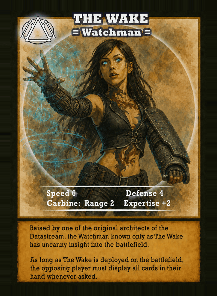
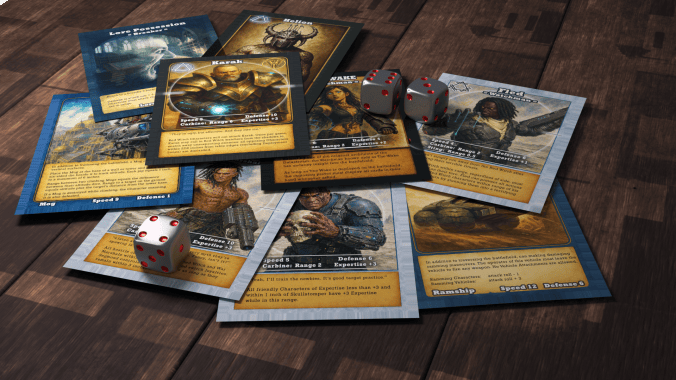
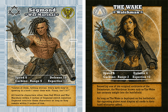
This card here represents one of my favorite characters in the Salt Mystic setting. I have a long history with her and have struggled mightily to refine the artwork over the years to match the picture in my head.

She calls herself The Wake.

With virtually every cityscape and terrain saturated with sensors and computing power, there is a ubiquitous internet called the Datastream where someone who knows how to use it can see and hear almost anything anywhere. She mastered it like no one else and brings incredible battlefield knowledge. Her game mechanic forces the opposing player to reveal cards at crucial moments.

What’s funny is how she came to be in my mind though. There was this girl on a plane in Oakland.

Are you being creepy?

No, but hear me out. This goes back to maybe 2016 or so. I was sitting on a plane waiting for everyone else to board. I noticed this lady standing at her seat as folks jostled by, 3 or 4 seats ahead of me. She was wearing a thin cotton blouse and a loose cotton pants, with part of a red dragon tattoo visible on the back of her neck. I saw the bottom of the tattoo on her lower back and the shade of it even through her blouse. Jet black hair and this audacious, stunning tattoo.

If Grailrunner teaches you nothing else, please remember what Thomas Edison said, “To invent, all you need is an imagination and a pile of junk.” I filed her away and came back to her years later when I needed an interesting look for a new character. That tattoo extending across a pretty woman’s entire torso struck me as a great idea.

Here’s ten years of trying to make her look like I thought she should:
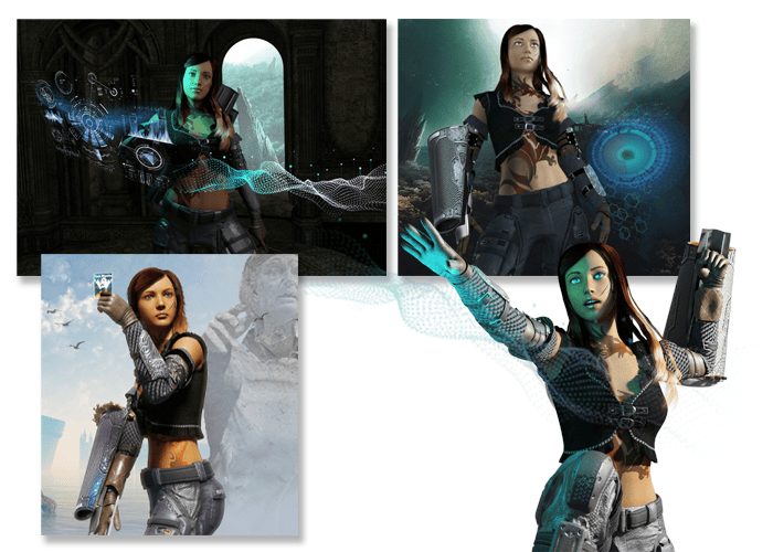
I told you a couple of weeks ago about my unfortunate addiction to Blender‘s 3d software at the time of all this. These original versions started in Daz Studio, with some hair and kitbashed clothing I’d picked up. I built the weapon in Blender out of a squashed cylinder with some textures and more kitbashing. Then I added some random backgrounds and mixed things up in Photoshop.

I definitely found gold when I learned you could stack png images onto the skin textures directly in Daz Studio and give your characters tattoos. I mean, that was just gold! If you ever wonder why so many Salt Mystic folks have elaborate tattoos, it’s because I learned how to do that in Daz and got carried away.

Blame it on the dragon lady in Oakland too, I guess.

Why are you telling us about her now?

Well, you may know we’re refreshing all the game art, the rulebook and tuck box for the Salt Mystic wargame. The proofs arrive Friday so we’ll hopefully go live next week if everything looks okay. If it doesn’t, we’ll delay to get everything right. I was writing a new lore card that sets the scene for a possible game scenario to go out in tandem with the relaunch.

Here at Grailrunner, we host a feature called the Story Arcade, where you can find illustrated flash fiction that helps us build out the Salt Mystic setting and its lore. They’re called “lore cards”. You don’t have to read these to know what’s going on but it’s another way to step inside. They’re usually a single page, something you can read in a minute or so.

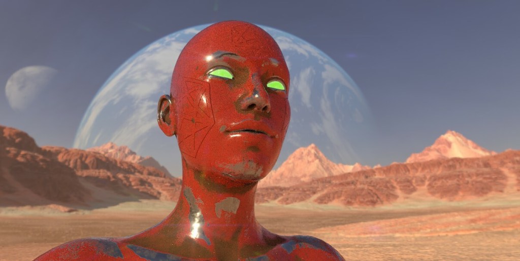
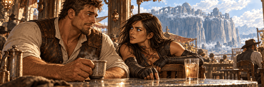
In her case, I wanted to do something different and offer something more than flash fiction with multiple illustrations included. The header image for this post is one of the illustrations and – I must say – she’s looking better these days.

Here’s the card.

You may also know I’m 60,000 words in to a new novel set in the Salt Mystic universe to be titled “Mazewater”. I know it’s been forever since I started on that but I’m working on it – believe me! It struck me as I was imagining this fellow, Auroch beside her in the story (and in that header image) that it’s the same guy as one of the characters in my novel.

Same guy, running from her. In love, but not really. Kind of afraid of her, if he’s being honest.

You’re crazy. How does that impact a game you’ve already designed?

Well, it doesn’t. But it probably affects what happens to him in the novel. Now, as I’m refining the endgame plot, I need to think about how she’ll react if he dies or if he doesn’t…if he goes back to her, or if he keeps running.

And I think I know what will be more interesting…

*

Anyway, that’s what I wanted to bring to you today – just a little background on the random quirks and twists of the imagination that wind up making it into print and onto the tabletop. At least in my case.

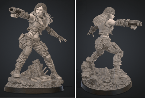
Keep an eye us for the commemorative stl file if you feel like having The Wake on your desk. we’re close to done with this, though that hair is giving us fits in making it look cool but work on a 3d printer.
Till next time,

Bad graphic design and an unfortunate addiction to lore-dumps

Last week, I told you about some questionable art decisions I made in the development of Grailrunner’s Salt Mystic tabletop skirmish game. That wasn’t my favorite thing to do, re-examining art I felt really great about back in the day but which hasn’t stood the test of five years of studying, getting critiqued, and practicing. In that case, I told you about my obsession then with the Blender 3d graphics software and a workflow involving Daz Studio and Substance Painter with Photoshop finishing.

Basically, I was doing things because I’d learned how to do them and thought they were cool rather than because they were the right tools for the job.

Anyway, I’m just waiting on final proofs now for the revitalized Salt Mystic starter set and thought it would be interesting and informative for anyone out there intrigued by indie game design to hear some things I learned from designing, playtesting, and managing art direction and graphic design on a tabletop game.

Sound okay?

Cut to the chase – what’s the biggest lesson you learned?

Graphic design isn’t about making something look cool. It’s about communicating visually. That sounds nice and plain vanilla but I’m telling you that it’s crucial. It’s everything.

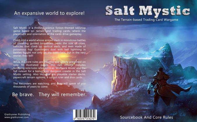
Let’s talk about the original rulebook. Here’s the cover design I commissioned from a wonderful artist named Omer Tunc:

I am entirely responsible for the art direction: the composition itself, the text and placement of it, even the lighting. He did what I asked. Grailrunner hadn’t yet put out Salt Mystic: Book of Lots to define the world’s lore and setting and I had all these amazing weapons, vehicles, creatures and people I couldn’t wait to tell everyone about. Let’s call it Founder’s Disease where you’re carried away with your own ideas and can’t throttle them down, even shoving them at a saturated audience who don’t have a reason to care yet.

What’s the matter with it?

It doesn’t clearly communicate anything, really. That’s supposed to be an underground dimensional gate to a pocket world showing a plasma gunslinger adventurer about to step down inside. But you’d never know that as it isn’t immediately relatable or recognizable as such. And it communicates precisely nothing at all about this game, major dynamics that make it unique, or even that it is a game. And this game doesn’t even emphasize exploration – it’s a wargame!

In fact, I included the sourcebook because my Founder’s Disease took over my soul and forced me to spend weeks on the art and copy to provide the mother of all lore dumps in hopes of people with wandering imaginations caring and immersing themselves in this setting. That’s a key dynamic of the game in fact, to craft a narrative for the battle using battlefield dynamics and the cards and tell a story immersively with the game’s rules. My thinking at the time was to provide the raw materials with the sourcebook so people could do that.

Yet this cover focuses on a purple-blue scene that fails to ring any recognizable bells. I gave no resonant hook and trusted to curious, imaginative people to dig inside and get excited on their own.

I see what you mean. How’d you fix that?

The original Sourcebook and Core Rules was a paid product for the last five years. I remain incredibly proud of the work that I and some very special people put into that. It just needed to come off the market and be replaced by something that knew what it was trying to do and focused on doing it.

I requested critiques pretty much page by page this time and the overwhelming direction was to simplify and streamline information. Every time I thought I was leaving too much out, I was told to strip out more. Leave white space. Let the eye breathe. It’s better to have another page that’s clean and readable than a cramped one. Just communicate what the game is, why someone would care, and simply how to play. Show examples.

How did you handle the art, then?

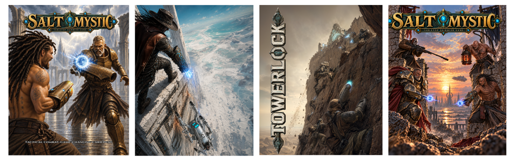
I’ve got four art pieces in the rulebook.

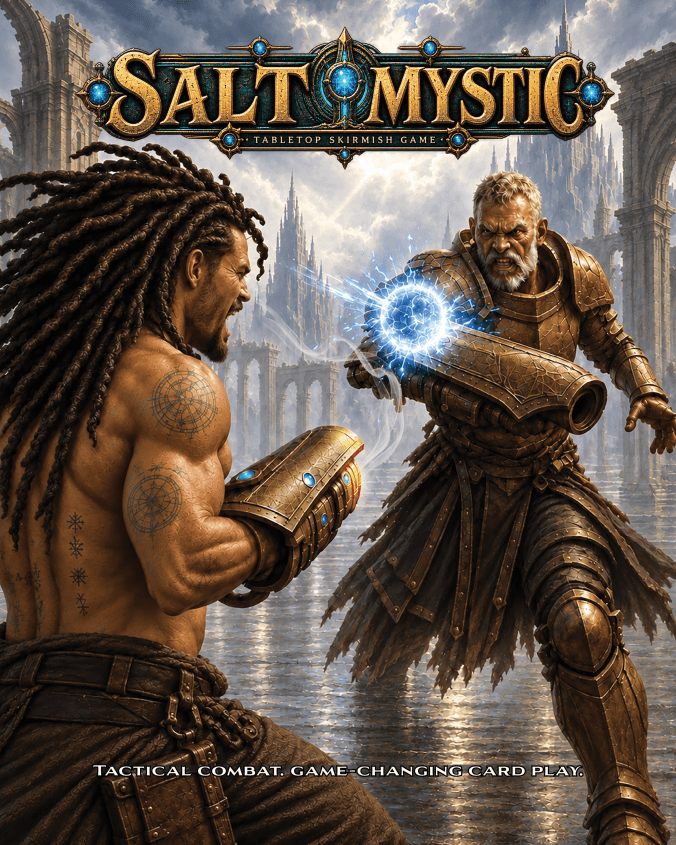
The cover is designed to do one thing and do it with emphasis: show a ball lightning carbine duel. It’s a core combat mechanism in this setting, involving a forearm-mounted weapon that fires ball lightning but can also be used to deflect incoming fire. This art hopefully looks cool too, but it exists to communicate that.

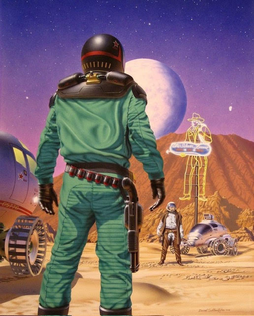
Inspiration for the composition was the original 1990 cover of Mars: The Red Planet by Mick Farren. The artist was David Schleinkofer.

What I couldn’t resolve visually for myself until I saw Schleinkofer’s piece here was how to cleanly show two guys gunfighting without a flat side-by-side scene.

What he did in this piece blew my mind, honestly. I can’t say enough about the idea of the larger, looming figure up front and how readable it is what he’ll be reaching for. The tension. The depth. The overall mood.

Just fantastic.

The other art pieces we included were similarly added for specific reasons. A distinctive vehicle used in this setting uses a vortex engine and articulated mechanical legs, able to ride up vertical walls. We included a splash page showing that to quickly communicate there is more to the combat mechanics in this game than two guys blasting each other with lightning.

We included another splash page to introduce the Towerlock scenario included with the rulebook to get a player started. In that case, the image exists to communicate the distinctive nature of the battlefields in this game and how they can be much more than a flat pieces of ground with a hill on it. The reader sees dudes and a robot climbing up a mountain face in combat and has learned something quickly and instinctively about what they’re about to see in the suggested game play.

The final splash page is a character scene showing this isn’t a dueling game but rather has multiple fighters in combat simultaneously. That one closes out the rulebook.

What did you learn designing the game packaging?

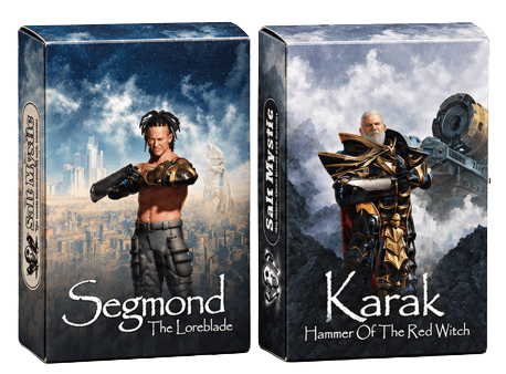
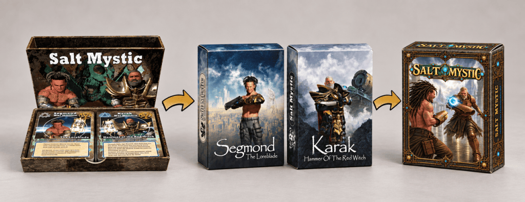
Take a look at the header image for this article. That two-deck starter set on the left was the very first offering for Salt Mystic made available back in 2020, maybe early 2021. I remember being so excited that I’d figured out how to make rust in Substance Painter that I jumped up from a hotel bed to sit down at the laptop again after midnight and genned up that cover image of the two war marshals.

I put rust all over the packaging because I thought it made the box look like metal and industrial, not because it said anything about the game or the setting. Instead, it looks brown and ugly. The overall design of the side-by-side decks with a rules pamphlet inside was way too expensive for what I was offering. I couldn’t make money selling that and it didn’t look as great as it did in my head.

What did you change?

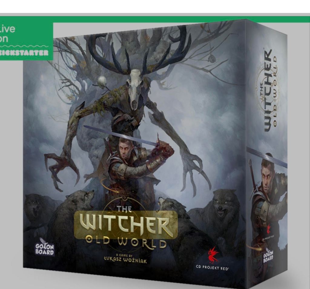
Somewhere, I came across this packaging for The Witcher: Old World and thought it was beautiful. I’m an unfortunate fan of wrap-around imagery like this and felt this was sophisticated, atmospheric, and a good model for the packaging improvement I wanted to make. This was my inspiration for whatever I was going to do.

I hired a Lithuanian artist named Roman on Fiverr to design two tuck boxes for me, one for each of the two initial factions. I provided some inspiration art and thorough briefs, and I may have even showed him this Witcher packaging. He did what I asked, so remember that. I had in mind the idea of Magic: The Gathering offering dedicated card decks for a Plainswalker and thought my war marshals might be interesting sold that way since I was planning to generate another five or six factions at least.

There’s the wrap-around imagery and the individual decks for war marshals. Their names were supposed to be intriguing, their facial expressions eye-catching. The tech and cityscape behind them was supposed to draw you in to wonder at the worlds they came from.

Instead, I believe these designs don’t communicate much at all that is really important. I’ve learned that imagery like this isn’t immediately relatable, doesn’t sell anything distinctive about the game mechanics, and doesn’t distinguish it from anything else on the shelf beside it.

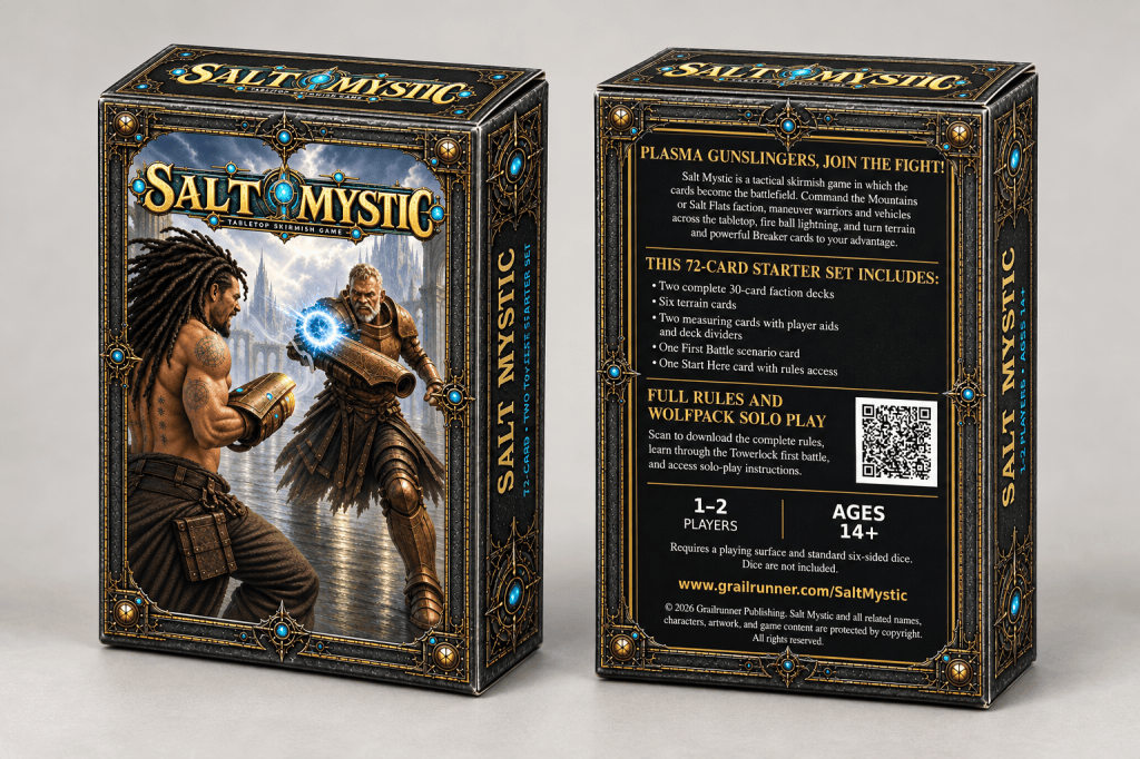
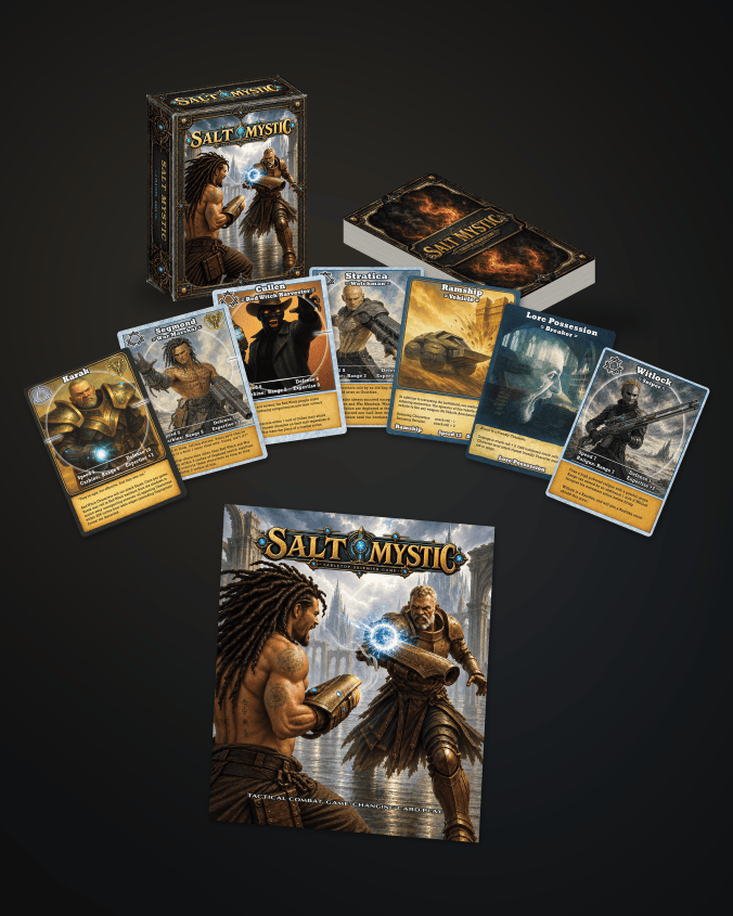
The revitalized Salt Mystic is a balanced starter set, not including the kitchen sink like before, designed with exactly what a player would need to get started. The rulebook is accessible via a QR code or URL. Much more details on the game on the back, including hooks but also with player count, age, and contents included to smooth the buying decision and set expectations.

This set includes terrain cards and a starter scenario as well as measuring cards if needed. All you need is dice. It’s just a simpler ramp for onboarding into the game. The QR code leads straight to the same cover image to avoid disorientation.

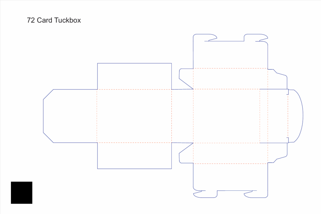
I mean, that’s the challenge, isn’t it? This template is what I had – a crazy-looking blob of lines that I had to print off, cut with scissors, and ask my wife to help me fold into the box itself so I could label for myself what faces were where to make sense of how to fit the artwork onto it. Tuck box design isn’t for chumps, I can tell you that.

*

But anyway, that’s what I wanted to bring you today. I hope it was as interesting to hear about as it was to live. Wish us luck on the revitalized game and positioning. It’s exciting to see this thing culminate after so many years.

Till next time,

Bad art direction & an unfortunate addiction to Blender

Here’s how it all happened: many years ago, my wife asked what I wanted for my birthday. I said for her and the kids to play D&D with me (which I hadn’t played since the 80’s) because I thought that would be funny and nostalgic. Then when I stepped inside the local gaming store, I saw some guys in the back playing a game involving miniature steampunk robots on a sweeping grassland with hills. I remember asking the guy at the counter as I slide my D&D starter set over to him, “What’s that back there?”

Guy said “Warmachine. Kind of like chess except with magic and battles.”

You caught the wargame fever, then?

Yeah, I obsess over new, interesting things like that. Honestly, I hadn’t heard of wargaming before that apart from dudes moving little Napoleons and cannons around. Anyway, it turned into building terrain and collecting cool mini’s from various games, eventually swelling into a personal challenge to build a cinematic experience on the tabletop. Even built a custom gaming table to do that.

Why do I tell you all that? Because I culminate things. I build to something. Can’t help it. The logical conclusion of those combined obsessions led me to the notion of building my own tabletop game around the Salt Mystic setting of a novel I’d published a few years before. And that led me to Blender.

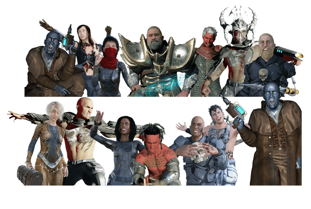
Who are these people?

Ouch. I was so proud of the art I was doing then. It hurts now to look at it, but it was cutting edge for me. Those are original character art pieces which made the cards for the first edition of Salt Mystic back in 2021.

Blender is a free 3d graphics software and I went crazy with it. I was convinced that building a character in Daz Studio, dragging it into Blender and setting up a scene for the render was as good as it could get. I collected cool poses when they were free or cheap and dabbled in building weird weapons by kitbashing any meshes that looked right. I used Substance Painter to add shiny textures and dust, slick-looking scratches on metal. I unfortunately also discovered Blender’s fog glare, which hypnotized me in how unearthly glows could be added to virtually everything.

Sometimes, my efforts turned around pretty well. I got some great compliments on this one.

But too often it turned out like this. And I went with it anyway.

You didn’t put that guy on card art, did you?

I did. Yeah. You’ve got to understand, I was busting out the art myself, the draft ruleset, chasing down anybody who would help playtest, wearing out scissors to cut mock cards out of printer paper, and learning graphic design all at the same time. And making things shiny and scratchy and glowing with those new 3d skills was addictive, seriously. Waiting on the magic after hitting the RENDER button felt like a slot machine. I think I hit rock bottom when I discovered particle systems and started trying to grow character’s hair since the Daz hair models I had were silly-looking.

Guys, I was growing hair on people because I could!

Didn’t people tell you the art sells the game?

Oh, I heard about my art choices almost immediately after publication! One guy broke my heart when he said something like “I would have tried your game out but you really shouldn’t have gone with 3d art.” I was so exhausted by the time I went live with Salt Mystic as a tabletop wargame that I couldn’t imagine changing anything. Not for years.

And what’s changed?

Last year, I had the idea that AI might be able to build a game as if it were designed by Hannibal of Carthage, Admiral Horatio Nelson, Tolkien himself, and the Monkey King from Chinese folklore. Read about that here.

In building the assets for that prototype game, I learned how to design an art style in AI and use it to filter & transform your own artwork into something more unified & appealing. In that case, a gorgeous & simple watercolor style. The cards for that game turned out so well it got me thinking…

So what did you do?

I systematically ran my original card art through the new art style using AI, tweaking some of the compositions when they weren’t redeemable. I’ve also been using AI to critique my own new art, and one key theme in everything I make is I need to show better restraint. I fill too much space and don’t include rest areas. Anyway, I took that advice to heart in the new card art too. And since I was doing that, I tweaked the card text in a few places as well, to reflect some things I’ve picked up along the way.

Check that out – those old Daz poses are still there! I built the forearm-mounted plasma weapons originally as squashed cylinders in Blender with some sewer drain textures over them and some Photoshopped glow on the sides. Over the years, I’ve improved the design a lot, but it’s nice to see this evolved form now on the new cards.

Why did you do this? Are you de-listing the old version?

Oh yeah. I finished refreshing the cards a few weeks ago and rebuilt the rulebook from the ground up. With restraint and less over-explaining. Less noise. More focused on what the player needs to know and less lore for the sake of it. Then, since I needed a clean and professional place to store the rulebook, I refreshed the Salt Mystic landing page as well.

The tuck box design is so much cleaner and smarter now. I took almost everything off it and consolidated down to a single starter set with two factions inside ready to go. I left some cards out of the mix, which sucks, but the idea of making this easily playable with a single, simple purchase and a QR code for the rules is such a better idea than the individual war marshal decks I had before.

Is that available now?

It’s done and uploaded to DrivethruRPG but I’m waiting on the proof copy. Give me a couple of weeks to make sure everything is top notch. This will be amazing and the peak of an experience going back maybe 8 years by now. I’m very excited to hold this new version in my hand and let people see it anew.

What’s with the new logo?

The graphic design people tell me that our previous logos are crappy to reproduce on packaging, so we’re switching that up as well. Wait till you see the new Grailrunner logo below. Pretty cool and maybe, we’re adults now.

*

And that’s what I wanted to bring you today. I hope the backstory is as interesting to read as it was to live. Till next time,