Last week, I told you about some questionable art decisions I made in the development of Grailrunner’s Salt Mystic tabletop skirmish game. That wasn’t my favorite thing to do, re-examining art I felt really great about back in the day but which hasn’t stood the test of five years of studying, getting critiqued, and practicing. In that case, I told you about my obsession then with the Blender 3d graphics software and a workflow involving Daz Studio and Substance Painter with Photoshop finishing.
Basically, I was doing things because I’d learned how to do them and thought they were cool rather than because they were the right tools for the job.
Anyway, I’m just waiting on final proofs now for the revitalized Salt Mystic starter set and thought it would be interesting and informative for anyone out there intrigued by indie game design to hear some things I learned from designing, playtesting, and managing art direction and graphic design on a tabletop game.
Sound okay?
Cut to the chase – what’s the biggest lesson you learned?
Graphic design isn’t about making something look cool. It’s about communicating visually. That sounds nice and plain vanilla but I’m telling you that it’s crucial. It’s everything.
Let’s talk about the original rulebook. Here’s the cover design I commissioned from a wonderful artist named Omer Tunc:
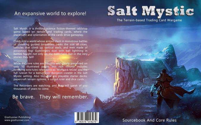
I am entirely responsible for the art direction: the composition itself, the text and placement of it, even the lighting. He did what I asked. Grailrunner hadn’t yet put out Salt Mystic: Book of Lots to define the world’s lore and setting and I had all these amazing weapons, vehicles, creatures and people I couldn’t wait to tell everyone about. Let’s call it Founder’s Disease where you’re carried away with your own ideas and can’t throttle them down, even shoving them at a saturated audience who don’t have a reason to care yet.
What’s the matter with it?
It doesn’t clearly communicate anything, really. That’s supposed to be an underground dimensional gate to a pocket world showing a plasma gunslinger adventurer about to step down inside. But you’d never know that as it isn’t immediately relatable or recognizable as such. And it communicates precisely nothing at all about this game, major dynamics that make it unique, or even that it is a game. And this game doesn’t even emphasize exploration – it’s a wargame!
In fact, I included the sourcebook because my Founder’s Disease took over my soul and forced me to spend weeks on the art and copy to provide the mother of all lore dumps in hopes of people with wandering imaginations caring and immersing themselves in this setting. That’s a key dynamic of the game in fact, to craft a narrative for the battle using battlefield dynamics and the cards and tell a story immersively with the game’s rules. My thinking at the time was to provide the raw materials with the sourcebook so people could do that.
Yet this cover focuses on a purple-blue scene that fails to ring any recognizable bells. I gave no resonant hook and trusted to curious, imaginative people to dig inside and get excited on their own.
I see what you mean. How’d you fix that?
The original Sourcebook and Core Rules was a paid product for the last five years. I remain incredibly proud of the work that I and some very special people put into that. It just needed to come off the market and be replaced by something that knew what it was trying to do and focused on doing it.
I requested critiques pretty much page by page this time and the overwhelming direction was to simplify and streamline information. Every time I thought I was leaving too much out, I was told to strip out more. Leave white space. Let the eye breathe. It’s better to have another page that’s clean and readable than a cramped one. Just communicate what the game is, why someone would care, and simply how to play. Show examples.
How did you handle the art, then?
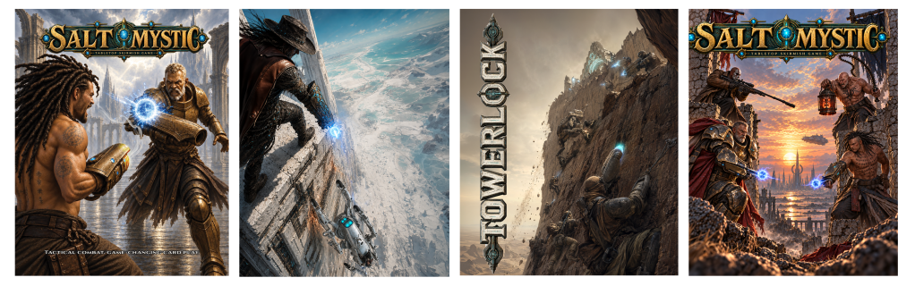
I’ve got four art pieces in the rulebook.
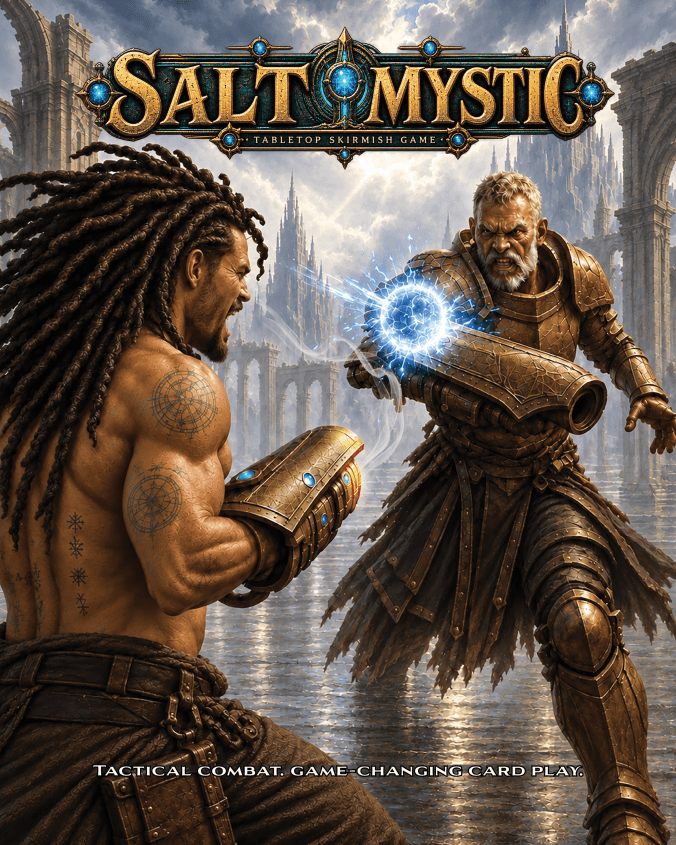
The cover is designed to do one thing and do it with emphasis: show a ball lightning carbine duel. It’s a core combat mechanism in this setting, involving a forearm-mounted weapon that fires ball lightning but can also be used to deflect incoming fire. This art hopefully looks cool too, but it exists to communicate that.
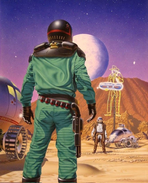
Inspiration for the composition was the original 1990 cover of Mars: The Red Planet by Mick Farren. The artist was David Schleinkofer.
What I couldn’t resolve visually for myself until I saw Schleinkofer’s piece here was how to cleanly show two guys gunfighting without a flat side-by-side scene.
What he did in this piece blew my mind, honestly. I can’t say enough about the idea of the larger, looming figure up front and how readable it is what he’ll be reaching for. The tension. The depth. The overall mood.
Just fantastic.
The other art pieces we included were similarly added for specific reasons. A distinctive vehicle used in this setting uses a vortex engine and articulated mechanical legs, able to ride up vertical walls. We included a splash page showing that to quickly communicate there is more to the combat mechanics in this game than two guys blasting each other with lightning.
We included another splash page to introduce the Towerlock scenario included with the rulebook to get a player started. In that case, the image exists to communicate the distinctive nature of the battlefields in this game and how they can be much more than a flat pieces of ground with a hill on it. The reader sees dudes and a robot climbing up a mountain face in combat and has learned something quickly and instinctively about what they’re about to see in the suggested game play.
The final splash page is a character scene showing this isn’t a dueling game but rather has multiple fighters in combat simultaneously. That one closes out the rulebook.
What did you learn designing the game packaging?
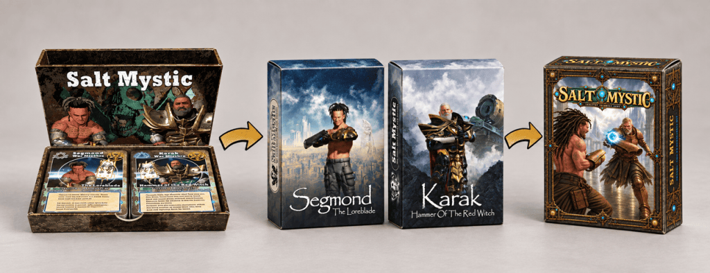
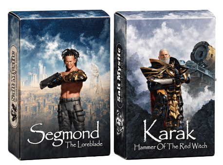
Take a look at the header image for this article. That two-deck starter set on the left was the very first offering for Salt Mystic made available back in 2020, maybe early 2021. I remember being so excited that I’d figured out how to make rust in Substance Painter that I jumped up from a hotel bed to sit down at the laptop again after midnight and genned up that cover image of the two war marshals.
I put rust all over the packaging because I thought it made the box look like metal and industrial, not because it said anything about the game or the setting. Instead, it looks brown and ugly. The overall design of the side-by-side decks with a rules pamphlet inside was way too expensive for what I was offering. I couldn’t make money selling that and it didn’t look as great as it did in my head.
What did you change?
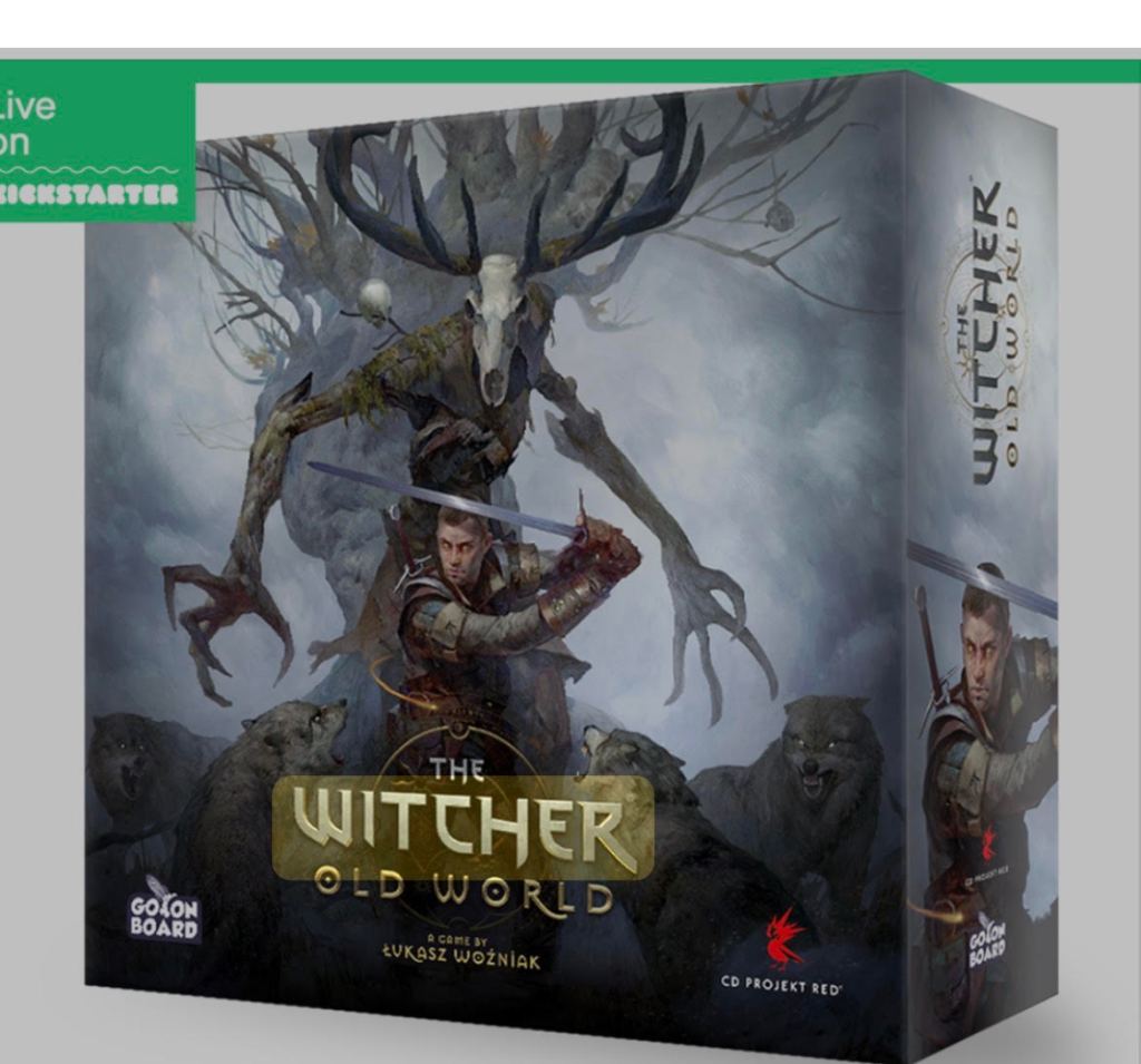
Somewhere, I came across this packaging for The Witcher: Old World and thought it was beautiful. I’m an unfortunate fan of wrap-around imagery like this and felt this was sophisticated, atmospheric, and a good model for the packaging improvement I wanted to make. This was my inspiration for whatever I was going to do.
I hired a Lithuanian artist named Roman on Fiverr to design two tuck boxes for me, one for each of the two initial factions. I provided some inspiration art and thorough briefs, and I may have even showed him this Witcher packaging. He did what I asked, so remember that. I had in mind the idea of Magic: The Gathering offering dedicated card decks for a Plainswalker and thought my war marshals might be interesting sold that way since I was planning to generate another five or six factions at least.
There’s the wrap-around imagery and the individual decks for war marshals. Their names were supposed to be intriguing, their facial expressions eye-catching. The tech and cityscape behind them was supposed to draw you in to wonder at the worlds they came from.
Instead, I believe these designs don’t communicate much at all that is really important. I’ve learned that imagery like this isn’t immediately relatable, doesn’t sell anything distinctive about the game mechanics, and doesn’t distinguish it from anything else on the shelf beside it.
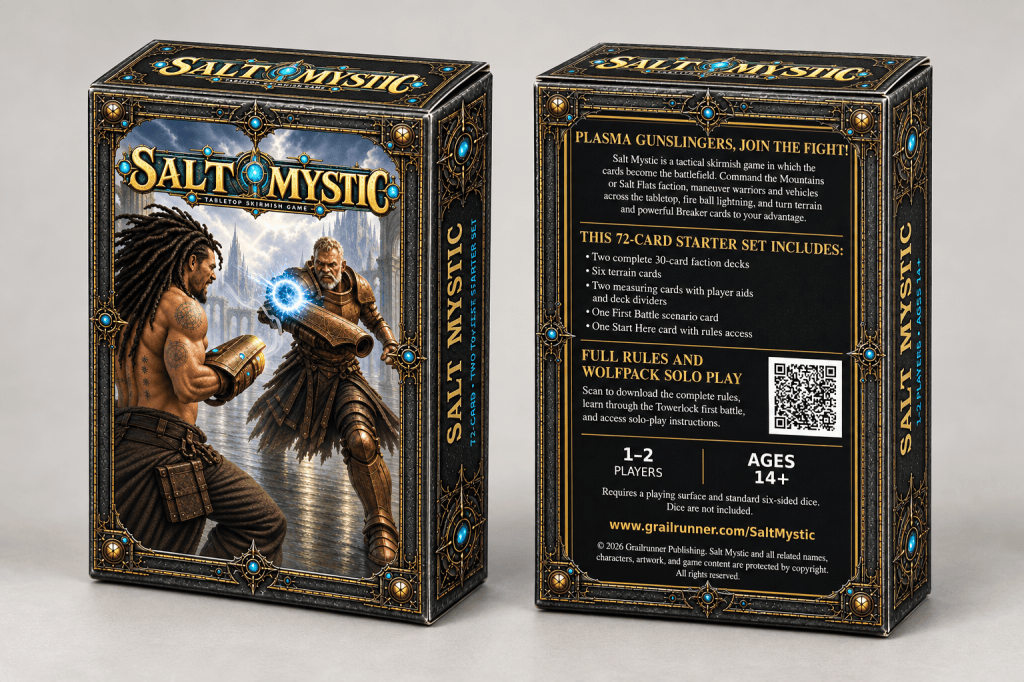
The revitalized Salt Mystic is a balanced starter set, not including the kitchen sink like before, designed with exactly what a player would need to get started. The rulebook is accessible via a QR code or URL. Much more details on the game on the back, including hooks but also with player count, age, and contents included to smooth the buying decision and set expectations.
This set includes terrain cards and a starter scenario as well as measuring cards if needed. All you need is dice. It’s just a simpler ramp for onboarding into the game. The QR code leads straight to the same cover image to avoid disorientation.
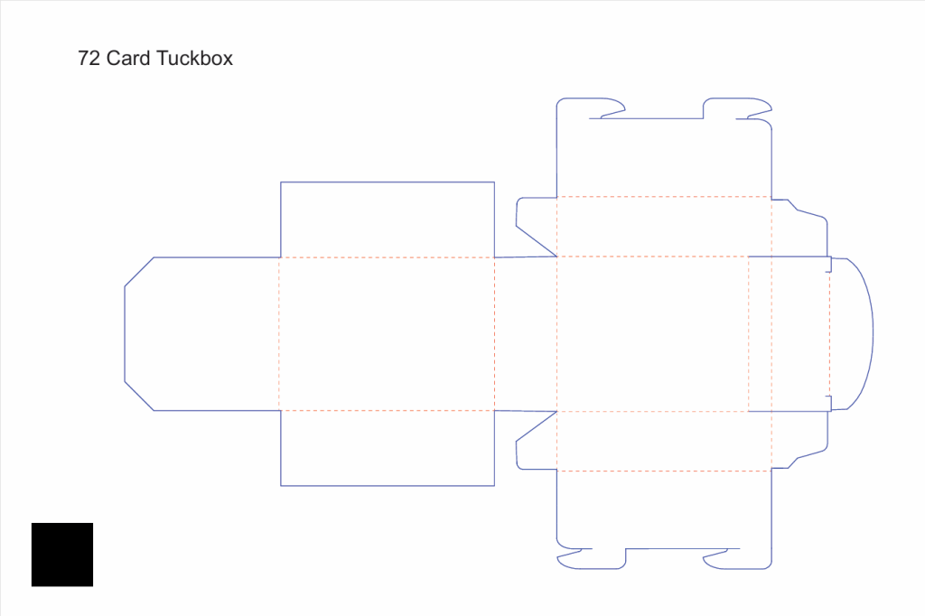
I mean, that’s the challenge, isn’t it? This template is what I had – a crazy-looking blob of lines that I had to print off, cut with scissors, and ask my wife to help me fold into the box itself so I could label for myself what faces were where to make sense of how to fit the artwork onto it. Tuck box design isn’t for chumps, I can tell you that.
*
But anyway, that’s what I wanted to bring you today. I hope it was as interesting to hear about as it was to live. Wish us luck on the revitalized game and positioning. It’s exciting to see this thing culminate after so many years.
Till next time,